
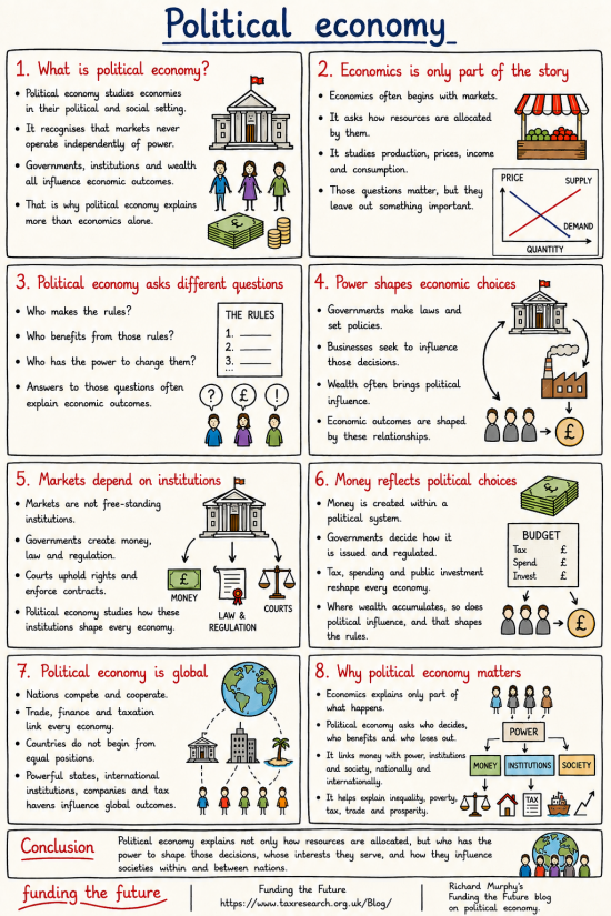
NB: This infographic has been updated. The only change is to a sketch in box 2.
This is the fourth in this series of infographics on the basics of economics.
Others in the series are:
The series will continue with:
- The household analogy
- And more.
How to expand this image
If you press CTRL or Command and Plus (+) on your keyboard, your browser should increase the size of your page every time you do this. Press CTRL or Command and the Zero (0) key together to restore the screen to normal. I can get to at least 2 times the normal size by doing this.
How to download this image.
If you right-click the image, you should be given the option to download it to your computer. So long as you do so without a view to making a profit, you may do so without further permission. Commercial use requires consent. But if you just want to share it, do so with whoever and wherever you want. That is the purpose of these infographics.
The image library
We are planning a library of these images. It will be available soon.
AI use.
In some way or other, I used AI in the creation of this post. I disclose how I use that technology here.
Thanks for reading this post.
You can share this post on social media of your choice by clicking these icons:
There are links to this blog's glossary in the above post that explain technical terms used in it. Follow them for more explanations.
You can subscribe to this blog's daily email here.
And if you would like to support this blog you can, here:

 Buy me a coffee!

Hi Richard, I’d like to congratulate the Murphy team on the continued improvements on the Website and the Blog post. The search engine is excellent but what stands out for me is the new material Infographic, which puts a bit of life into the subject of political economics. I look forward to you completing the section on how to use the site as there is a mountain of material on there and I’m probably missing out.
Many thanks, Nick. We’re trying, quite hard
A neat addition to the body of infographics
Thanks
This is going to be embarrassing if I’m wrong, but are the supply and demand lines in box 2 on the graph correctly labelled?
They are not – an auotgenerated image and I did not notice. I will correct.
[…] Political economy […]