
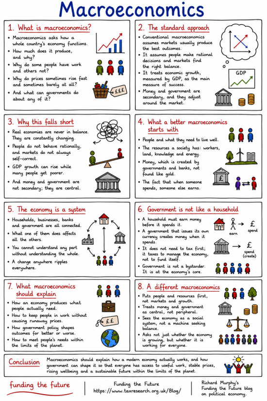
This is the third in this series of infographics on the basics of economics.
The first, on economics, has been published, as has that on microeconomics.
The series will continue with:
- Political economy
- The household analogy
- And more.
How to expand this image
If you press CTRL or Command and Plus (+) on your keyboard, your browser should increase the size of your page every time you do this. Press CTRL or Command and the Minus (-) key together to restore the screen to normal. I can get to at least 2 times the normal size by doing this.
How to download this image.
If you right-click the image, you should be given the option to download it to your computer. So long as you do so without a view to making a profit, you may do so without further permission. Commercial use requires consent. But if you just want to share it, do so with whoever and wherever you want. That is the purpose of these infographics.
The image library
We are planning a library of these images. It will be available soon.
AI use.
In some way or other, I used AI in the creation of this post. I disclose how I use that technology here.
Thanks for reading this post.
You can share this post on social media of your choice by clicking these icons:
There are links to this blog's glossary in the above post that explain technical terms used in it. Follow them for more explanations.
You can subscribe to this blog's daily email here.
And if you would like to support this blog you can, here:

 Buy me a coffee!

I have been especially looking forward to this particular infographic. Invaluable. Thank you. “Sees the economy as a social system, not a machine seeking balance” is the heart, I feel.
Thank you
I’ve been following your blog practically daily for ages now, and I’ve slowly but surely began to understand what you blog is about, but I’m unable to articulate simply and straightforwardly about MMT, etc, to others without getting my knickers in a twist. But these infographics of yours pull it all together brilliantly and so directly too. I can’t wait for the household analogy one; that should be a humdinger and a half going by the previous ones.
Does your son have a hand in them, for a detect a youthful edge and energy to the infographics. If not, then perhaps you’re entering a 2nd youthhood instead. If so, more power to your economic elbow!
The infographics were my idea. The whole team have input into design ideas since then. I write them (the hardest bit – I hacve done one on Marx now, which went through many drafts) and then I have the team, and others on occasion, check them. So they are a team effort, but I am the scribe.
We have been printing money for a long time, like most of the western world. from google. The UK M2 money supply has more than doubled over the last 20 years, rising from roughly £1.4 trillion in 2006 to an all-time high of £3.22 trillion by May 2026. [1]
Of course. But the velocity of circulation slowed considerably.
I was particularly taken by the line in box 4 “Money, which is created by governments and banks, not found like gold.”
There’s a whole story in there which could focus on the nonsense of basing your economy on how much useless, soft, shiny stuff you happen to find in a hole in the ground versus a currency who’s quantity can be controlled by a responsible government with the power to create new money and destroy it again as ever changing circumstances dictate.
This reminds me of my previous analogy of money as lubrication for the economic machine. Government can make new oil and add it where the machine needs it and remove it from the places it should not be allowed to accumulate and make a mess.
This analogy might seen at odds with Nigel Clayton’s comment at 2:16pm, but I don’t think it is if you consider the task of government cannot be to personally address the needs of every one of millions of individuals but to manage the mechanisms that make up ‘the social system’ that is then able to do so.
When I viewed the Page Source information in Firefox and searched for the png file format, I saw that there are a number of image files for the graphic, each having a different resolution. It looks to me that magnifying the image using ctr + loads a different image, rather than magnifying what appears on the screen when the page loads without magnification. In order to save a high resolution copy of the graphic, it must be ‘magnified’ to 200%, following which mousing over the image, right clicking and using the ‘save image as’ option will save a high resolution copy. Ideally, using the ‘save image as’ facility should go automatically to the highest resolution file.
Tell me how.
When the image is magnified to 200% in Firefox (on a PC), the file that is loaded is: Macroeconomics.png , which has a resolution of 1024X1535 pixels. When the page is first accessed, the file that is loaded is Macroeconomics-550×824.png (550X824 pixels). If the ‘save image as procedure’ that you have described is followed, it is that lower resolution file that will be saved and zooming in on the saved image will make it larger but will not change its resolution. The zoomed-in image will appear fuzzy.
Two approaches to the problem are:
1 Modify your ‘How to download this image’ image instruction by adding the following after the first sentence:
“For a high resolution file, expand the page to 200% first.”
or
2 Change the beginning of the first sentence to, “You can save a high resolution version of the image, so long…etc”. Hyperlink high resolution to the location for Macroeconomics.png .
I’m not a website design expert but either of the suggested alternatives should work.
I’m not sure what happened but the formatting of what I entered in the message box has disappeared in the preview.