
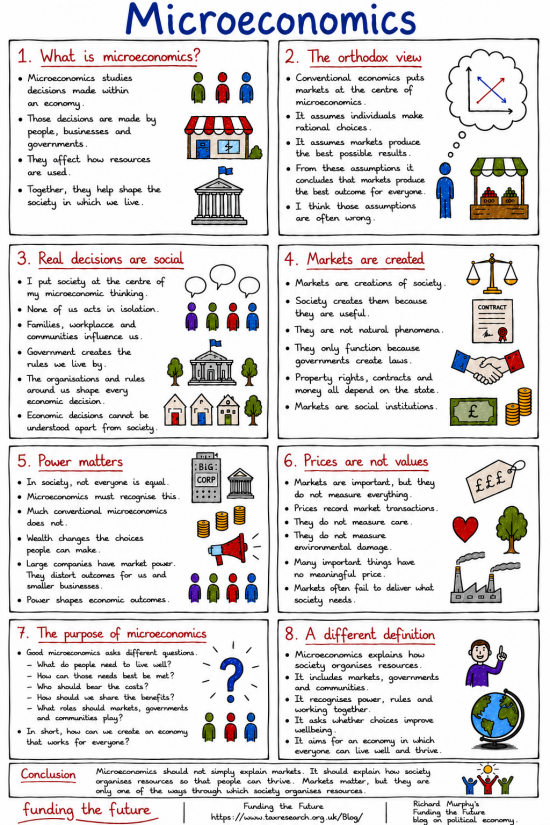
This is the second in a series of infographics.
The first, on economics, has been published.
The series will continue with:
- Macroeconomics
- Political economy
- The household analogy
- And more.
How to expand this image
If you press CTRL or Command and Plus (+) on your keyboard, your browser should increase the size of your page every time you do this. Press CTRL or Command and the Minus (-) key together to restore the screen to normal. I can get to at least 2 times the normal size by doing this.
How to download this image.
If you right-click the image, you should be given the option to download it to your computer. So long as you do so without a view to making a profit, you may do so without further permission. Commercial use requires consent. But if you just want to share it, do so with whoever and wherever you want. That is the purpose of these infographics.
The image library
We are planning a library of these images. It will be available soon.
AI use.
In some way or other, I used AI in the creation of this post. I disclose how I use that technology here.
Thanks for reading this post.
You can share this post on social media of your choice by clicking these icons:
There are links to this blog's glossary in the above post that explain technical terms used in it. Follow them for more explanations.
You can subscribe to this blog's daily email here.
And if you would like to support this blog you can, here:

 Buy me a coffee!

You were far far to kind with respect to the foundations of microeconomics: homo-economicus & fully informed market participants.
Akin to “let’s assume we have a perpetual motion machine”.
That said, still very useful.
another well-considered summary. did you deliberately downplay “supply and demand analysis” and other economic models over-used in micro economics? those curves and graphs put me off economics for 50 years!
I could not cover everything.
[…] The first, on economics, has been published, as has that on microeconomics. […]
[…] Microeconomics […]