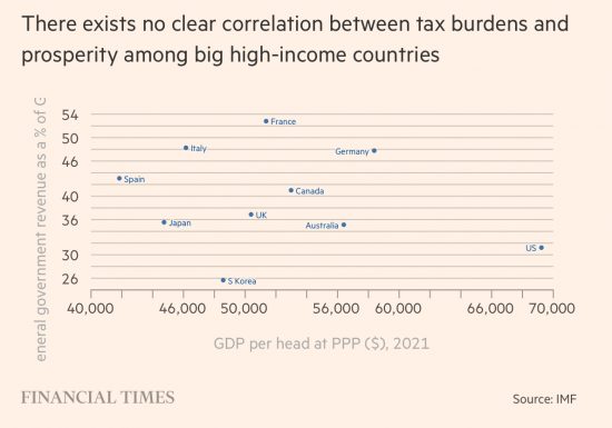
Martin Wolf's article in the FT today, in which he tears Liz Truss and her economics to shreds, includes this chart as evidence of what its title suggests:
It reminded me of a chart I put on this blog a while ago:
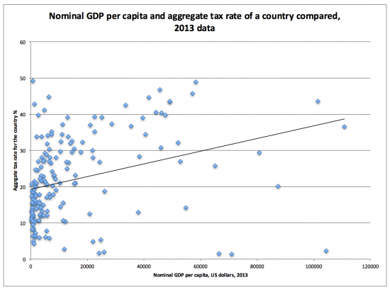
For the data sources, note the original blog. What the chart showed was that as overall tax rates in a country rise so does GDP per capita.
Durham academic Charles Adams then reconfigured that data, showing this:
Again, note the original blog for sources and the methodology used.
The evidence was unambiguous: as tax paid as a proportion of GDP rises so too does income, usually. Oil states are an exception.
The whole basis on which Truss is building her economic strategy is wrong, in other words.
High-tax states work for the good of those who live in them. Truss is wrong to claim anything else.
Thanks for reading this post.
You can share this post on social media of your choice by clicking these icons:
There are links to this blog's glossary in the above post that explain technical terms used in it. Follow them for more explanations.
You can subscribe to this blog's daily email here.
And if you would like to support this blog you can, here:

 Buy me a coffee!

The FT also pointed out that “Britain and the US are poor societies with some very rich people”. John Burn-Murdoch SEPTEMBER 16 2022
The Tories and Truss want to ensure that the rich stay rich and get richer. All this talk of growth is meaningless.
My son lives in Finland – I know it has a small population and is a young country – so perhaps can’t make a direct comparison between their economy and the UK – but theirs is a high tax, high wage economy with brilliant schools and healthcare and strong rights for employees. Every year it’s rated one of the happiest countries to live in.
It is tempting to put a single line through a scattering of points, but the truth is that there is a wide dispersion at all levels. Clearly there are high-income countries with high tax rates and high-income countries with low tax rates, and low-income countries with high tax rates and low-income countries with low tax rates. There may be some sort of trend line, but how good a fit is that line?
The stronger point is, I think, is to decide what sort of country we want to live in. Do we want a modern democracy where the state provides a wide variety of public goods to support the wellbeing of all of its citizens, including all levels of education (infant, primary, secondary, tertiary), and health and social care, and roads and other public transport, and defence and police and courts, and pensions and other safety nets to keep people out of poverty (of all sorts). Or do we want to live in the sort of country which depends on the capricious largesse of a phenomenally wealthy absolute monarch. Or a country which denies these sorts of things to its citizens, unless they have the resources to provide them for themselves, and devil take the hindmost.
Excellent point. I agree. Tax is really the marker of a bargain struck between the ruling party and its people. It specifies a level of funding. It forces both sides to agree on what services the people will get, e.g. the NHS. Without tax there is no way to enforce this agreement. If the ruling party defaults on its promise to provide an NHS, for example, the people can point to the sacrifices they are making by paying tax and ask what has happened to their hospitals. Tax forces the ruling party to keep to its promises.
My view?
High tax rates in a society awash with credit money and unable to value assets correctly is an absolute must have.
Low tax economies just punish the poor and indebted with interest rate hikes instead – so that the rich become even richer.
I see the correlation. I infer from your piece that you see high tax causing high levels of income. Could it not be the other way around? Citizens of richer countries want to get more benefits of their nation’s wealth in the form of public services and are willing to pay higher taxes for them.
I think a major problem for the Truss government, in the event that it succeeds in growing the economy, will be the public expecting to share in the benefits of the growth.
I think it a virtuous circle
I notice on Twitter you’ve made the argument that Liz Truss’s and Kwasi Kwarteng’s reversal of the NI increase benefits the lower paid by 63p whilst the richer end gets £150 per month.
This sounds like you are opposing the decision to reverse Rishi Sunak’s NI increase after opposing the increase at the time.
Have I misunderstood?
https://twitter.com/RichardJMurphy/status/1571929309149024256
Creating and reversals are not the opposite of each other
The UK has been driven by neoliberal trickle down economics since Thatcher (40 years or so) and the result is 178 billionaires and 14+ million in poverty. Does this prove the hypothesis that trickle down works?
Only for 178 billionaires……..
I think the idea is that if the 14+ million in poverty gave up their idle ways, they could be billionaires too.
This idea comes from consuming too many of Jack’s Magic Beans……
In the UK of today, such thinking is as politically real as it gets.
Only if you use a stupid definition of poverty.
Meanwhile, using the universally accepted definition of poverty from the World bank, global poverty has decreased massively in the last 200 years and at the fastest rate in the last 20-30 years.
However inconvenient that might be!
Absolute measures are meaningless
Relative measures matter
I think not dying in your first 5 years of life and having at least some years of education to learn enough skills to participate in society, that lifting out of absolute poverty that Jennifer is describing, as one of the most sensational achievements of any era.
Absolute and relative measures both matter. And so does distribution.
Absolute poverty has not decreased over the last 200 years for most of the world.
Worth reading “The Divide” by Jason Hickel at LSE.
Any reductions in poverty that have occurred have mainly been the result of government research and investment.
I felt compelled to comment on this article because from the title onward it is an example of deceitful economics and maths, truly of the snake oil variety.
1. First chart (Martin Wolf/FT). As the title suggests it shows no correlation between tax burdens and GDP per capita.
Fair enough.
2. Second chart (Richard Murphy). Here is where the fun starts. And by fun I mean total BS.
The first thing to note with this chart is that most of the data is clustered to the left hand side. Just taking that data and you would see no correlation at all. What generates an upward line for the chart are the small number of data points further to the right – giving the illusion of an upward slope and positive correlation.
It’s also worth pointing out that Murphy excluded from the data states with very low tax rates. Why should they be excluded? Other than to deliberately skew the data in the direction he wants. It’s laughable.
It is important to note that most charts of this nature in serious research would show the correlation and R2 for the data in question. I would hazard a guess that this has been omitted because correlation (R) was near zero and the R2 was high, showing large variation. Making conclusions from the data worthless. Or simply because Murphy doesn’t know how to do the basic statistics.
But then hey presto! Murphy then goes on to say “What the chart showed was that as overall tax rates in a country rise so does GDP per capita.” Which the chart does not show, and directly contradicts Martin Wolf.
3. Third Chart (Charles Adams). If anything this one is even worse. It suffers from all the same errors as the second chart, but then compresses the X axis to make the correlation look visually stronger. But funny how once again the correlation and R2 are omitted despite the author clearly knowing some statistics. This is snake oil economics at it’s worst.
4. Lastly, there is the basic premise of the argument. The case Murphy is putting forward is that as “tax rates increase so does GDP”. Which is not even what his chart shows, even if there was correlation. Which there is not.
As everyone knows, correlation does not equal causation. You could equally well argue that high GDP per capita countries can simply bear more general taxation. Which in itself does not mean that more government spending/taxation is somehow better.
Then there is another big lie. What the chart claims to show is tax rates vs GDP per capita. What he is now saying is that increasing **tax rates** increase **GDP**. Subtle change in the wording, but a totally different meaning. It also happens to be something the chart and data can’t show – so the claim is simply unjustifiable.
This is a prime example of the misuse of economics and statistics, with a few pretty charts to mislead the uninitiated in believing a false narrative. It’s basically just propaganda – as I said people peddling this stuff are little more than snake oil salesmen and should be ashamed to claim they are economists.
I’ll ignore most of your claims – because many (including those on Charles’ work, when he is a physics professor and knows rather a lot about maths) are wholly unfounded. You clearly have no knowledge of stats, including the treatment of outliers.
But let’s agree correlation does not prove causation. That’s true. But first, interpretation is permitted. You seem, like so many on the right, to not know this. And, second, the link within my data suggests higher taxed states have on average higher incomes.
So, if there is no correlation please provide the reasons for this. But I suggest you drop the abuse. It is deeply unbecoming.
Richard,
Can I suggest that if you can’t credibly address the valid challenges posed against your claims, you simply do what you normally do and avoid posting those challenges that highlight your ignorance, rather than pretending the challenges aren’t entirely valid and insulting the poster?
Otherwise you just look like a bit of an incompetent fool!
But when you post with multiple identities, as you have, I suggest you are just a troll and they get deleted
If you don’t mind me butting in, graphical correlations or not, maybe the best thing would be to accompany the chart with a graph showing the growth of foodbanks? Or how about waiting times in the NHS? Or talk to those combatting loan sharks?
It occurs to me that what most of the right-wing statistical masturbators who turn up here don’t do is get off their bottoms and have a good long walk around our cities and towns and see what is actually going on?
Because it’s there – right in front of you in plain daylight – the results of 12 years of Tory misrule.
In their weird world only stats matter
People don’t
Living and working in the Nordics, I can only say this reflects standard political philosophy in all the Nordic Countries: Strong government. High legitimacy. High tax. Big Welfare state. High living standards. High trust. Low crime. I could go on all day about it.
Ups do realise that if your only metric is relative poverty then there will also be poverty for you to complain about?
And making everyone worse off can actually improve your chosen metric?
Seems like a very poorly thought out metric to be using in my view.
Of course there I’ll always be poverty to worry about
I do despair about anyone who does not appreciate that
Especially in the U.K. right now where poverty is rampant
Don’t forget high suicide rates too.
I am astonished at your patience with trolls Richard – I really couldn’t be *rsed with posting their comments, so I’m impressed that you take the trouble.
Well done you, really apprecaite what you do (and detest the trolls)
Thanks
Thankfully, they usually out themselves quite quickly
I’d like to see some more statistical analysis but might I suggest some of the more vituperative commenters go and read the original posts in 2017.
In the comments to this one – https://www.taxresearch.org.uk/Blog/2017/04/22/why-on-earth-would-you-want-a-low-tax-economy/ – Charles Adams comments:
“The Pearson r-value is 0.4 for tax vs. log of GDP. … It rises to 0.74 if instead tax as percent of GDP is plotted vs human development index (HDI). I think a high HDI might be one of things we want to achieve via the tax system.”
Defining poverty in purely monetary terms can be misleading, especially when comparing metrics like GDP/capita translated into GBP/USD across different economies. If you do not have access to the following at a decent level I’d say there is at least a rebuttable presumption you are in poverty:
Clean water and sanitation
Food
Shelter
Clothing
Healthcare and medicines
Education for your children
There is scope to argue the toss over what constitutes “decent” and I daresay the list could be expanded but I’d say on this basis Richard’s figure of 14 million in the UK is not far off the mark.
Charles’s diagram reminds me of the rather powerful time series diagrams that Hans Rosling
would create, such as the changing life expectation and population of countries against per capita income over time. Eg. https://www.youtube.com/watch?v=jbkSRLYSojo
It would be interesting to see a time-series version of Charles’s diagram, to see if there is a consistent rise in overall tax rates as countries become wealthier.
I wonder if Gapminder or Our World In Data have done much work on taxation …
I agree with Martian wolf and the first comment from Finland