I was interviewed twice on the radio on Friday evening to discuss John McDonnell's new fiscal rule, once on LBC and the other on Radio 5. In both cases the interviewers were quite explicit in stating that it was known that Labour always borrowed more than the Conservatives and that was why the electorate could not trust them with the economy. I knew that evidence I had prepared a year ago did not support that view in recent years (post 1997) but I decided to see if this claim really had any substance to it all at all. This blog is about my findings. There is a note on data sources at the end.
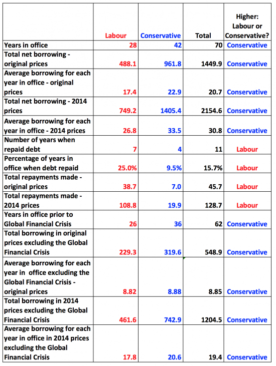
The first task was to secure data on borrowing by year from 1946/47 onwards: this data covers a 70 year period. Labour was in office for 28 of these years and the Conservatives for 42.
The next task was very simple: I calculated the total net borrowing in Labour and Conservative years and averaged them by the number of years in office. All figures are stated billions of pounds in all the tables that follow and in this case are in original values i.e. in the prices of the periods when they actually occurred:
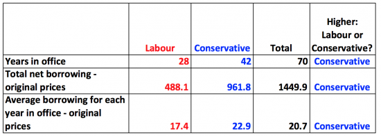
The Conservatives borrowed more, not just absolutely (which is unsurprising as they had more years in office), but on average.
This though, is a bit unfair: the value of money changes over time. So I restated all borrowing in 2014 prices to eliminate the bias this gives rise to. This resulted in the following table:
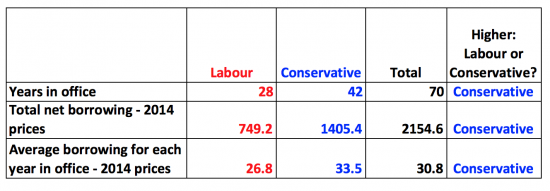
In current prices the Conservatives still borrowed more (much more) overall, and on average, by a long way.
So then I speculated that this may be distorted by events since 2008. That is what the Conservatives would claim, after all: they would say that they have spent six years clearing up Labour's mess. So I took those years out of account and looked at the first 62 years of the sample. First I did this in original prices:
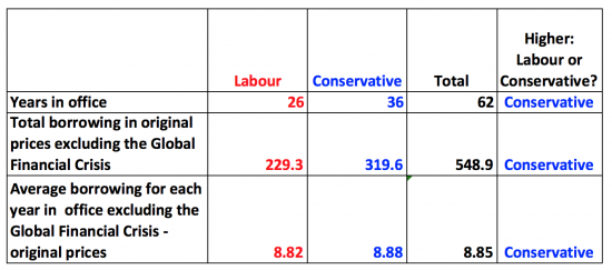
That was close! So I did it again in 2014 prices:
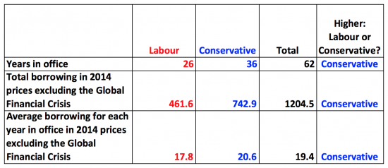
Not quite so close after all: Labour definitely borrowed less.
Then I speculated that this might be because Labour are good Keynesians: maybe they repaid national debt more often than the Conservatives. Or, to put it another way, they actually repaired the roof when the sun was shining. This is the data in terms of number of years:
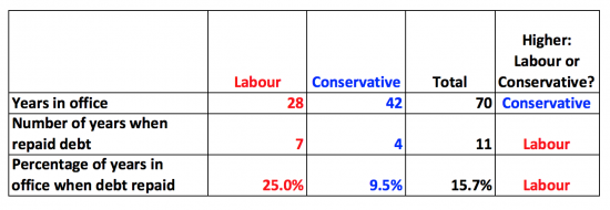
Labour do walk the talk: they repay national debt much more often in absolute and percentage terms than the Conservatives. In fact, one in four Labour years saw debt repaid. That was true in less than one in ten Conservative years.
But maybe the Conservatives repaid more. I checked that. This is the data in both original and 2014 prices:
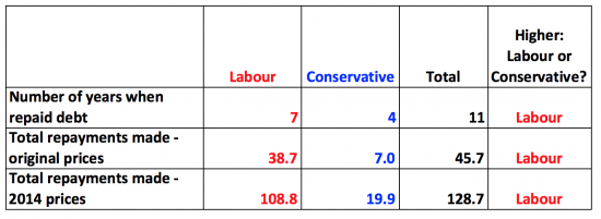
Labour not only repaid more often, it turns out: it also repaid much more in total and on average (not shown) during each year when repayment was made.
So what do we learn? Two essential things, I suggest.
First, Labour invariably borrows less than the Conservatives. The data always shows that.
And second, Labour has always repaid debt more often than the Conservatives, and has always repaid more debt, on average.
The trend does not vary however you do the data.
Or, to put it another way, the Conservatives are the party of high UK borrowing and low debt repayment contrary to all popular belief, including that of most radio presenters. Which means that the next time I am presented with that nonsense I will be very firmly rebutting it.
For those interested, this is the overall summary table: the pattern in the right hand column is really quite surprising:
Data sources
The basic data on borrowing came from the House of Commons Library.
GDP data from 1955 came from the 2015 budget GDP deflators. The 2015-16 estimate came from the July 2015 budget report. The data for the period period to 1955 came from the Bank of England. Data was checked to the Treasury Pocket Data Book: as is usual there are minor differences, but too small to worry about.
GDP deflator data came from similar sources but was estimated for 2015-16 based on 2014-15 and for the period prior to 1955 based on data for 1955 - 65. It is unlikely that this estimate materially changes any finding.
Governments in office for a year were determined in election years by the number of days each had in office: the party with the greater number being attributed the whole year.
Thanks for reading this post.
You can share this post on social media of your choice by clicking these icons:
There are links to this blog's glossary in the above post that explain technical terms used in it. Follow them for more explanations.
You can subscribe to this blog's daily email here.
And if you would like to support this blog you can, here:

 Buy me a coffee!

This is great analysis Richard. It would be really useful if you could (unless I missed it) provide the data source. The HMT ‘Pocket databank 26/2/16’ only goes back to the early/mid 1990s. I’d like to do some visualisation on it to reflect on parliaments.
How do you handle the financial years with 2 governments for any annual-level data, or is it all monthly?
I have given all data sources at the end and noted estimates where used
Ah I spotted the data line for your data!
Richard
In your analysis you acknowledge that whoever was in power post 2008 was going to have to borrow more. You also acknowledge that this would distort the results of your analysis and adjust the data to make for a fairer comparison.
However the conservatives were in power for most of the post WWII (1951-1964) rebuilding period. Another period when whoever was in power would also have had to borrow lots. How come you have made no attempt to adjust for this? The impact of rebuilding the country post WWII will have had an impact on government borrowing that was very similar in magnitude to the Global Financial Crisis.
Doesn’t this possibly lead to the classic mistake of assuming correlation = causation. The Tories happened to have been in power when the economy required massive amounts of government borrowing, rather than the Tories being a party of higher government borrowing.
I do find three things odd
The first is only Tories are complaining
Second they all want me to take Tory periods out if account
Third the message appears to be Tories want ower without responsibility
Surely that can’t be true?
I’m not a Tory. I’ve always voted Lib Dem.
I am an Actuary though and dislike the misuse of statistics and data. As stated in my 1sr comment, correlation does not imply causation and you need to look in detail at the data to find out the truth. Anything else is bad, and misleading, statistics.
You clearly have not a clue about statistics
There are no correlations here
There are just some very simple facts and all I am suggesting is coincidence, which is exactly what radio presenters were suggesting
So respectfully stop trying to pretend things that aren’t there
The Tories ‘over-spending’ and failure to pay off debt is all the more remarkable when you consider how many assets they have sold off for a lot of cash (even if well below true value)
Just for some balance on the issue of borrowing after WWII. It is well reported and known that many of the loans in the post war period were negotiated by John Maynard Keynes himself in the year after the war. Much of his work prevented the UK from going “bankrupt”.
My understanding is that these loans were not repaid until the Chancellorship of Gordon Brown.
Surprising to see the rebuiling of GB after the war being chalked up to the Conservatives from 1951 on, when the rea spade work was done in the Atlee-Bevan years 1945-51: building up state industries and giving birth to the Welfare State, most notably the NHS. That surely must have been a period requiring enormous fi9nancial resources?
You may be surprised
I used the data on public record
Richard,
Why are you attempting to make this personal? I am merely trying to talk facts with you
You are making statements based on a dataset that contains clear outliers. Any serious statistical analysis removes outliers from a data set to not prejudice the conclusions. Or do you believe that to not be true? Is my knowledge of statics flawed here?
I have excluded the GFC
I have also noted that removing a similar number of earlier years
I accepted the point that adding in PFI, spectrum sales and privatisation was appropriate and have published results
Nothing changed the outcome
But to then just randomly ignore years? No eay! That is to deny the reality on which people form opinions
We disagree, and I think your understanding is wrong on this occassion even though you use a method I use on others
The problem with this type of analysis is what really needs to be compared is what the opposition would have done in each year had they been elected. That then gives you the true comparison. Obviously this data doesn’t exist.
I wonder though whether it would be possible to do an analysis of expected borrowing for each party for each year using a combination of their actual borrowing when in power and their shadow budgets when in power. This is quite flawed in itself though as the shadow budget data is probably lacking and probably not a true guide to what parties would actually do.
My point is it’s tough to draw anything meaningful conclusions from this historic data. Again I’m Actuary and one of the 1st things you learn is that the past may not predict the future. Today’s electorate are interested in what today’s government will do and on that point today’s Labour do wish to borrow more than today’s Tories. That’s the fact that matters. It’s then a matter of opinion whether that’s good or bad for the current, and long-term, state of the economy.
What makes me most nervous is the demographic shift towards a lower ratio of workers to retirees which we are currently seeing. This significant trend, if all remains equal, will seriously deplete the per capita tax base forcing either significant benefit cuts or significant tax rises. Neither political party is really acknowledging the extent that this could affect the prosperity of future generations. It is this shrinking per capita tax base what makes me nervous about increased borrowing rather than a party political spat
If we compared with plans we would be saying there is no debt now in Osborne’s cas
ThT would be a little absurd, don’t you agree?
Or is that the outcome you want
Excuse my cynicism – but it seems you are saying I am at fault for using real rather than fantasy data
Mr Murphy, I don’t think that expensive form of borrowing used by both parties, PFI, is included? Would that change anything?
I have checked- look on the blog
It did not change the result in current prices
When I initially read the article I deemed it possibly credible. However I agree with another poster that when you decided to overlook WWII after years you are unable to state no statistical bias. Furthermore was it not a labour government that had to go to IMF in the 1970s when it nearly brought the UK to her knees. Statistics can be manipulated anyway you want.
I included all data for 70 years
How the heck is distorting anything?
But for the record – do look at my follow on blogs. I cannot change the outcome doing sensible changes to the data
Hi Richard,
Thank you for your reply.
Your own original post states that you took out the years of the credit crisis to avoid distortion. However you choose not to represent this in the after years of WWII. In fact most of Europe was heavily laden with debt after the war. If you took out those years and you ended up with the same result, then that would be credible.
Statistical analysis is supposed to use coefficient data to smooth out irregularities. I cannot see that you have done that. So to not omit a significant world event from the data will distort the figures. Whatever point you are trying to make is lost on these inactions by including that data.
Thanks
Jon
I noted in answers to questions that I saw no logic to this adjustment but did it out of curiosity anyway
It did not change the outcome
That was not surprising: Labour repaid debt in three of these years
How strange I thought labour was elected in 1945.
Massive debt and deficit.
But then NHS, housing built, education for all, investment in industry, unemployment reduced, welfare established, and debt reduced.
or would your critics get rid of this an an outrider.
If we want a future learn the lessons of history, dont deny it.
The claim made on radio 4 was that labour have got into more debt and paid back less than the tories not why that might be the case.
yer man here has shown that the claim on radio 4 was false.
job done.
not sure what you are whinging for or about.
I agree with you, ticle, and the previous comment from Tim Ellis. The problem seems to be that people just don’t want to believe the article. I’d be interested to know what _facts_ the counter-claim was ever based on. It can’t be just that “everybody knows” surely 🙂
Richard
I note that you did not post my robust comment on being accused of being a sheep in one of the posts above. Fair enough it is your blog.
There is a causal element to this however, and all I can say is, I don’t come here to be insulted and give as good as get. In future it might be wise for you not to give a platform for such derisory comments on people who follow you, buy your books and try in their own way to spread the better alternatives you put forward.
It’s just a suggestion.
PSR
I do not appreciate threats from anyone
And it is my decision alone when I think someone crosses a line
I moderate without fear or favour
Richard
Puzzled?
I’m not making threats to you or anyone else (but as you know I’ll stick up for myself if insulted and argue and defend others if something merits it).
I just do not see how people who come on here to besmirch others are allowed to be posted here in the first place.
I’ll leave it at that as I’ve already acknowledged your right to moderate as you see fit.
PSR
If I made a moderation mistake I apologise
Richard
Hi,
Nice analysis. I too would be interested in seeing some analysis of these values in the context of other world events. As a previous comment mentioned, the post-world-war-II period was one of high debt/borrowing. There have also been several booms and busts in the period your analysis covers. It would be interesting to see the effects of these in terms of borrowing and such. Maybe some kind of graph of borrowing against time with the periods of government marked out, with sub-analyses of each period?
If time permits
There is a day job to do
Many of these administrations were in office for more than one term.
If we assume that you can’t blame things on the previous administration if it was you, then how does it stack up if you only compare the performance of the second terms?
Also remember that the BANKERS caused the mess we are in, aided and abetted by Maggie Thatcher who trusted them.
Anyone else is free to do that
For me it would miss the point
I’m amused by all this.
As usual staistics bring out contrary opinions about every aspect of the data and the ‘conclusions’.
My initial reaction was ‘And?’.
Whether one party or another does or does not ‘borrow’ more than the other over time or during specific periods seems to me to be largely irrelevant to most people.
I am still trying to understand if borrowing more does or does not make a difference to the health and wealth of a nation. Any nation.
That aside:
The general perception seems to me to be that Labour are always asking for more spending on public services etc yet you suggest they spend less ‘more’ (because thay are all spending somewhat more than they receive) than Conservatives.
Equally, the general perception seems to me to be that Conservatives are always asking for less spending on public services etc yet you suggest they spend more ‘more’ than Labour.
So are Labour complaining the Conservatives are spending too much?
Are they saying the Conservatives should be spending even more than the more ‘more’?
Or are Labour saying the Conservatives should spend less than they (the Conservatives) appear?
My perception is that Labour want Conservatives to spend more than they are spending.
There seem to be endless calls from all public sector workers and employers for more cash to support their causes. Labour seem to back that up by word – if not by deed given what you say about ‘actual’ spending.
So are Labour actually NOT the public sector workers’ friend?
Is it the case in fact that Conservatives are more likely to be the public sector workers’ friend?
Now that is an amusing outturn.
I was simply pointing out a common belief is untrue
I have not offered anything else
Others might have sought to do so
Richard is merely stating the borrowing. Labour may not have needed to borrow as much as tax revenues might have been higher. As Labour tends to redistribute money to people with a higher marginal propensity to consume, more of that money goes back into the economy leading to job creation and higher tax revenues. The Tories, on the other hand, cut taxes, usually for the wealthier, so have a reduced income and may need to borrow more. It does seem rather bizarre that in today’s budget they are cutting money to local authorities and the public sector, which they know is needed, and lowering taxes for wealthier people. People who are more likely to use that money to invest in property or lock away in savings. Given that the banks aren’t lending at the moment, and that we have a housing shortage, this type of economics is not helpful to our economy. People who think the Tories are the party of the economy really ought to start reading some of the articles by modern economists! Sorry to harp on.
Most interesting.
I worked in the rail industry in the 70’s and 80’s and the popular myth at the time was that Labour were good for nationalised industries. In fact the reverse turned out to be true – it was under Conservative governments that major investment was forthcoming. Popular myth is often completely at odds with the facts…..
As to your presentation of the facts, I’d be interested to see the assesments expressed as a % of GDP at the time. That gives a somewhat better handle on how affordable the borrowing was?
It may very well be that the Tories invest in public sector infrastructure BEFORE it is privatised – as a sweetener to make the books and the assets look good?
hm
i worked in water industry (sewage, reservoirs, pipes etc).
I remember we weren’t allowed to look at and inspect the state of sewers because then we would know they were collapsing and lead to liabilities when they collapsed.
Thatcher starved that industry to death as much others elsewhere.
Incidentally if you do the net sum for nationalised industries (total contributions to exchequer (taxes, ni, vat etc) – net costs) they made net profit every year. Many billions more than net contribution when privatised and worse now with tax avoidance habitual.
That would be an interesting analysis to see…
I’ve worked a lot on outsourcing/privatisation in both private and public sectors. They are very rarely about delivering efficiencies. Mostly they are about getting people and assets off the books which improves apparent performance. At the same time, someone pays for those assets. In business that means extra profit in the short term – and executive bonuses. In public sector it’s about ‘helping’ the budget, reducing borrowing, enabling tax cuts or whatever.
In the medium term as we know from experience, costs do not necessarily go down and service quality does not necessarily go up. The private sector does not have to own up to these failures, but those in the business know. And the examples are there of services being brought back in – the private sector equivalent of re-nationalisation.
Robin, you are right, thinking of PFI and railways, getting things “off the books” appears to have a gigantic value (just not in reality).
If people are unemployed then the taxpayers support them and taxes suffer. If people are poor then they can’t buy so much. Business suffers and tax is less again. I’m not an expert but surely this sort of reasoning could explain why Labour is better at managing the economy? In this way, the economy isn’t like a household budget, but some people might intuitively think that it is, so they see Labour spending money and assuming this will make the country poorer while in fact the reverse is the case.
Would it be possible for your data to be given to the Labour Party ? They should be using data like this to hammer the tories with every single day and shared as far and wide as possible
I was told it has been sent to every Labour MP today
It’s not really a question of how much is spent but the manner in which it is spent. Public sector workers, whether employed by Labour or Tories have money to spend in the economy stimulating the demand for goods / services.
Outsourcing services and shedding public sector jobs does 3 things.
1. It decreases the amount of money spent on goods / services by virtue of the fact there are fewer decent paid workers with disposable incomes.
2. It reduces tax income as fewer workers obviously pay less income tax. As most of the outsourced work is undertaken by foreign companies i.e ATOS, G4s, Serco, maximus, Arriva etc who are all foreign companies less Corporation tax is also paid.
3. As outsourced companies need to make a profit then less is actually spent on these outsourced services as profit is taken first and the provision of services comes second.
The problem with Conservative spending is that it always seeks to put more cash in the pockets ( well offshore accounts) of those already pretty wealthy who do little to stimulate demand for goods or services. While you may say “well wealthy people spend more on goods and services” as they have more to spend you have to realise that few, if any, of today’s luxury goods are manufactured in this country from handbags to private yachts and jets almost all expensive items are made overseas.
The Conservatives have always, and always will, believe a low wage economy is the way forward for the masses, as we have seen so far zero hour contracts and part time work have mushroomed in the last 7 or 8 years with a corresponding fall in demand for consumer goods and services, not to mention the governments tax receipts.
Lower Corporation tax in itself does not provide jobs or enable businesses to expand. Businesses can only expand if there is demand, no one will make capacity to sell 2 million chocolate bars if they know only a million will be sold. Decreasing taxes further as the Tories plan will merely exacerbate an already weak economy by reducing tax take further meaning more public sector cuts and so on as above.
£12 Billion taken from welfare will remove £12 billion from the economy as this money would have been spent locally on goods and services stimulating at least some demand if not just increasing vat receipts and corporation tax receipts. £1 Billion given to bankers/directors will end up in offshore accounts accruing interest/avoiding taxes and provide no jobs, growth or stimulation to the economy in any way.
Your conclusion is absolutely right
Not quite as simple/true as it used to be though. If the goods bought are imported into the uk from overseas then the money is flowing out of the UK from those workers whilst the pretty wealthy may (not are but could) be putting their wealth in uk property which keeps the money in the country.
Also £12b taken from welfare may drive down rental values thus removing money from those buy to let owners.
But it is all conjecture
If you really want to keep the money in the UK system you need to ensure it is spent on internal goods and services which would mean re-nationalising welfare housing which after a huge cost in building/buying stock would then see the money just go around in circles and not leave the system, if all boilers and fittings were uk sourced in new builds that would keep even more in the UK. This would of course be political suicide for any party advocating it due to how many people are now buy to let landlords or aspire to be
really? what %age of the population are buy to let landlords? I know that lots of people live in bought to let properties but that isn’t the same as lots of people owning buy to let properties.
All the criticisms being made on this thread about how Richard’s analysis is flawed, seems to miss the point. The analysis is a specific rebuttal to a specific point made by 2 journalists, and so it seems, believed by many members of the public. And the analysis shows the point made to be incorrect.
If simply adding up who borrows most is a bad way to make a meaningful judgement about a party, without other contextualising data, then that seems to be more a criticism of anyone who would use that metric as a stick to bash Labour with than it is of Richard’s analysis.
Thank you
You get it
I may not have used this method for a different contention
It was appropriate for the contention I tested
seemed pretty clear to me. thanks very much for doing the piece of work.
Yes!
Alan, also, I was glad to read your explanation which is far better than my earlier attempt.
Robin Stafford: Having worked at high level on the rail sector privatisation, I agree 100% as to the motivation of privatisation. In fact it serves to obfuscate the true state of public services and public finances. In the case of the rail industry, subsidy is still required, but the assetts and especially the liabilities are no longer on the nations books. Actual post privatisation levels of investment and services can’t be compared with state sector performance as times have moved on and actions that might have been taken in the state sector are unknowable.
Obfuscation is OK up to a point. Beyond that point, decision makers can no longer see the wood for the trees. It’s a short term fix only. Long term it’s far better to have complete clarity and then take the difficult decisions that that clarity reveals to be needed.
Comparing apples with apples is one of THE most difficult tasks facing any political pundit or economist.
I support Robin Stafford’s presentation here as it includes the absolute minimum of correcting factors. If you like, it’s as close to raw data as it’s sensible to get.
Each correction and assumption added gives a political twist to the narrative that makes it easier and easier to dodge the conclusions. Far better to present raw facts and then let pundits and politicians attempt to justify the spin of corrections and justifications they apply post publication.
Raw facts have a habit of making people stop and think. This particualr analysis is incredibly powerful in that regard and deserves to have a Daily Mail (or similar) exclusive devoted to it.
Great post. As a resident of the UK for the last 5 years, I have bought the Tory discourse of Labour overspending completely. Yet, I see how the media has deceived me. Thank you Richard for this clarification.
Moving on, there is also a great misconception about debt. Debt is not a bad thing per se. Companies always recur to debt to invest. People get mortgages. The Tories have made debt a bad thing, and sadly Labour has bought the idea, probably because the public has also bought it. Debt well spent is a good thing, even more if it is cheap and inflation is low… like today. So Osborne’s austerity is a political choice and not an economic necessity, as Macdonald’s mantra correctly goes.