The Tax Gap involves big numbers.
They’re disputed numbers at that. I do not agree with HM Revenue & Customs on the size or composition of the gap, for example.
The Guardian has long taken an interest in this issue so it got David McCandless to draw the gap usng data here: http://bit.ly/taxgap and from HMRC 2010 Report on the tax gap and the appendix to that report (contains interesting figures about Tax Havens) plus TaxResearch.Org.Uk.
The result is this image:
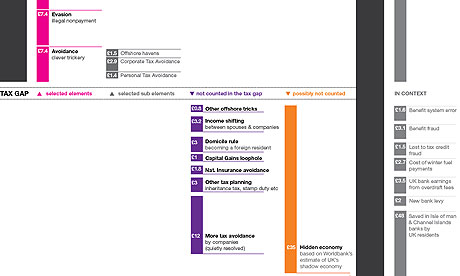
There’s a bigger version here.
I’m not sure it’s quite right: the extra corporate tax avoidance is not resolved, in my opinion.
And the additional uncollected tax not included in the HMRC data is not added in, and should be.
But it’s a useful diagram all the same.
Thanks for reading this post.
You can share this post on social media of your choice by clicking these icons:
You can subscribe to this blog's daily email here.
And if you would like to support this blog you can, here:


Richard,
Have you ever published the workings for your findings? If so, could you point me in the right direction as I’m interested to look at it in detail myself.
Thanks
Search the “Missing Billions TUC” and “PCS Tax justice” and you’ll find the evidence (the late a download on bottom right corner of page)
Thanks Richard