
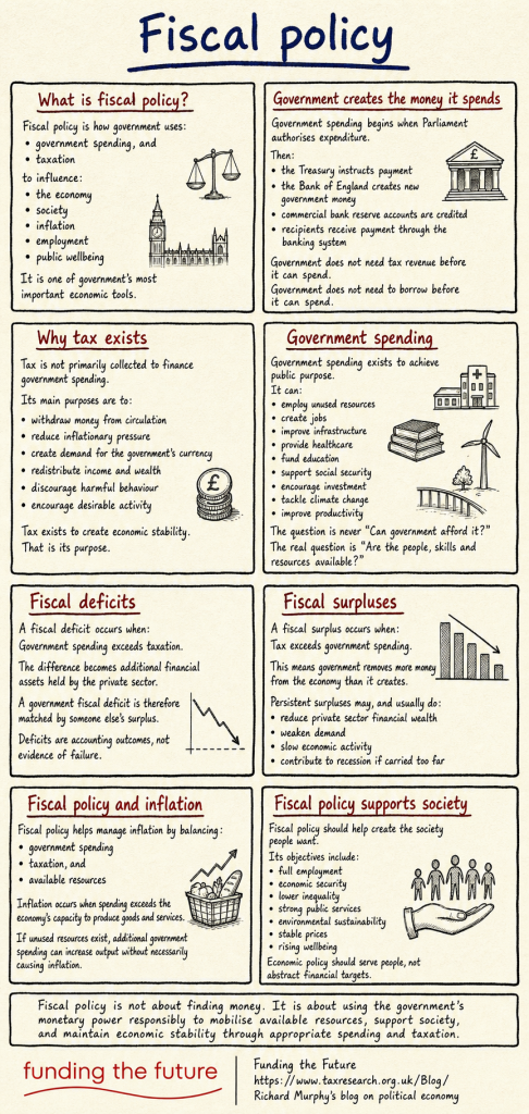
Two of the terms least understood in economics are fiscal policy and monetary policy. This deals with one of them.
Thanks for reading this post.
You can share this post on social media of your choice by clicking these icons:
There are links to this blog's glossary in the above post that explain technical terms used in it. Follow them for more explanations.
You can subscribe to this blog's daily email here.
And if you would like to support this blog you can, here:

 Buy me a coffee!

[…] These other formats can, of course, be downloaded already from the posts themselves. For example, this morning's image can be downloaded by right-clicking it and selecting "Save Image" as a .png […]
In the section on why tax exists, I note the word “primarily” in the sentence “tax is not primarily collected to finance government spending”. This seems likely to be interpreted as saying that tax does finance government spending, though it is not the main purpose. I feel sure that is not your intention. Thank you for doing these infographics. I think they will be a great benefit.
At subnational level it is to fund government spending
The wording was deliberate and carefully considered
Excellent. Not sure this one can be improved at all.
I love this. The only concern I have is the 4th box down on left. “Can increase output without necessarily causing inflation”. I think “necessarily” will be pounced on by the right. It can be removed without ruining the integrity of the sentence, though I appreciate doing so creates other problems of interpretation.
These things cannot be stated with certainty. The word was there, deliberately. Sorry.
Understood. My point was “can” arguably already does the work of “necessarily” so that latter could be deleted. But there’s no perfect solution. Language, and especially English, is very often annoyingly imprecise.
Two minor points. In the sections on Fiscal deficits and surpluses, I don’t think you need the colon at the end of A fiscal deficit/surplus occurs when, because what follows is not a bullet point, but merely a continuation of the same sentence. I also feel that the graph for Fiscal deficits is confusing, as it goes in the same direction as the one for surpluses. What is it meant to be illustrating?
Also, possibly the final standalone paragraph could be either in red, or in navy like the title, to make it more eye-catching.
Otherwise, all good! And ignore all the above if this is your definitive version!
The point on the graphic is fair, the rest I am happy with. But thank you.
So… I sent the austerity information graphic and the Government Debt graphic to a friend – both grpahics I thought were brilliant.
My friend said… Sorry, but I don’t buy a lot of it. I would need to see the source and their agenda because to be blunt everyone has one wether it be left or right.
I have passed on your blog address (which I think is on the graphic anyway) but I get a feeling they won’t be looking.
I am the source. The points is, they saw the alternative.
[…] yesterday's infographic on fiscal policy, it seemed right to do one on monetary […]
Excellent Richard – this one sums it all up very nicely. Many thanks!