David Spiegelhalter had an article in the Guardian yesterday in which he claimed we should not compare international variation in death rates from coronavirus as yet, and would not be able to do so for some time.
I have to disagree with him. I have noted the EuroMomo website that says this of itself:
EuroMOMO is a European mortality monitoring activity, aiming to detect and measure excess deaths related to seasonal influenza, pandemics and other public health threats.
Official national mortality statistics are provided weekly from the 24 European countries in the EuroMOMO collaborative network, supported by the European Centre for Disease Prevention and Control (ECDC) and the World Health Organization (WHO).
They do provide comparisons: that is their job. They do so by normalising the data using Z scores (explained here) so that comparison is possible.
This is their most recent comparison for the nations of the UK:
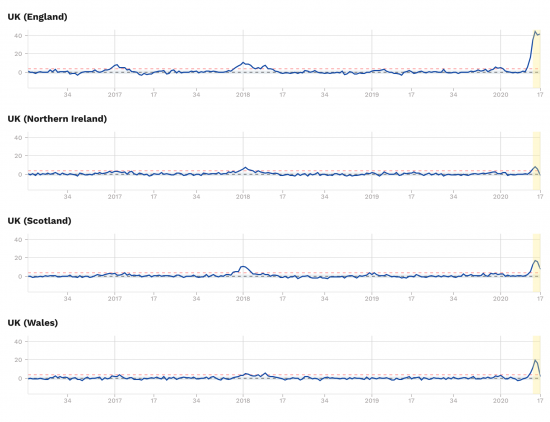
Those comparisons are real, and telling. England is doing much worse than the rest of the UK.
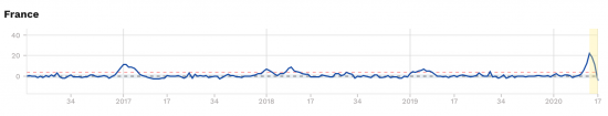
And let me add one other thing. No other country has a profile like that of England. This is France:
And this is Italy:
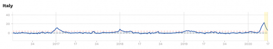
I think comparisons can be made, and something is very wrong indeed in what has happened in the NHS in England, alone.
There has to be political accountability for this. And to say comparisons cannot be made now is to seek to support the avoidance of responsibility on the part of those who have failed.
David Spiegelhalter is wrong. We should be talking about differences, now.
Thanks for reading this post.
You can share this post on social media of your choice by clicking these icons:
There are links to this blog's glossary in the above post that explain technical terms used in it. Follow them for more explanations.
You can subscribe to this blog's daily email here.
And if you would like to support this blog you can, here:

 Buy me a coffee!

Thanks for that. Succinct.
Salient – in every possible way.
Very much agree, but can you clarify do all countries use similar data sources , i.e. generated by ONS or equivalent?
This is excess deaths data
I understand, but I wanted to know whether the data is generated using similar methods and sources across countries.
I suspect not entirely
But I also suspect it is using the best data that there is – and that is excess deaths – i.e. whatever the stated cause, which is the most value free information that we have
Sorry Richard!
Vinnie again!!
A quick thought, that I am not expecting you to have the answer to! (And unrelated to the subject of the thread. Sorry!)
I watched Novara Media’s interview with George Monbiot last night.
In it they mentioned that during lockdown, the UK’s co2 emissions have dropped by 5%.
With large chunks of the economy shut down, the co2 emissions have only dropped by 5%!!!!!!
What’s creating the rest of it!!!!
If shutting down the economy only reduces it by 5%, what do we have to do to reduce co2 to sustainable levels????!!!!!
I’m not an environmentalist
I’m a finance gut with green leanings
Others need to answer that
well 5% is actually quite significant,
you have to bear in mind the UK has already plucked all the low hanging fruit,
shifting from generating electricity with coal to natural gas made a big difference,
but that was done because our coal production was in decline, the coal powered stations were old and due for replacement and we were pissing off the Scandanavians with our acid rain killing their trees,
we also scored big on CO2 reductions by dismantling British industry and simply importing the majority of goods we consume leaving the carbon bill in the country of manufacture,
since 2008 the British economy has been pretty flat with reduced prosperity, austerity and hence reduced consumption,
we could give ourselves a pat on the back for those reductions but they were only because most people couldn’t afford to emit as much!
it would be interesting to see what actually is counted as ’emitted in Britain’
it’s probably just the stuff they couldn’t find a sneaky way of fobbing off onto some other country.
one wonders which airlines count as British and which are ‘just passing through’.
if a ship is registered in a foreign flag does that flag cop the carbon bill?
commercial aviation is down 70% but I believe it’s only responsible for around 5% of emissions globally,
the bulk of emissions are domestic heat & light, agriculture and transportation and manufacturing & extractive industries including steel & concrete production,
remember we import 60% of our gas and 40% of our oil, we don’t even extract it, we import the majority of manufactured goods and a lot of our food, we even import electricity from France.
5% is quite a lot,
the global economy has been decarbonising at 2-3% annually through innovation, increased efficiency and supposedly green energy but global energy consumption has been rising at 4-5% annually so up till now we’ve been going in the wrong direction,
hence a 5% reduction is more than it appears!
think of it as 95% instead of 105%
Randall Wray said to me recently – the UK is small insignificant economy, and has no importance politically or economically globally. Hence the small emission rate, menton on here. Most american economist think the same, we are just pygmies guys.
Is it the NHS or is it the Government’s strategy of
a) Delaying the ‘lockdown’ for 3/4 weeks.
b) Minimal testing & no tracing & isolation of those infected.
c) Unrestrained & untested access to the UK, particularly via our airports.
d) ‘Managing’ the pandemic among those infected in care homes by not accepting them into hospital and
e) Discouraging the public, who are unwell, from phoning either their GP or 111, until their symptoms become distressing.
The result of the above is almost certainly more far infections than officially disclosed, more infections (& deaths) in the high risk environment of care homes, more (untested) deaths in the community and more severe patients in hospitals.
England is the second most densely populated European country after Malta and I think the Netherlands and Belgium are next.
Malta has seen hardly any change (but is an isolated island) whereas the Netherlands and Belgium do look a bit more like England – although certainly not as bad.
Maybe population density is relevant, but I’m sure ten years of austerity and wanton privatisation and gratuitious reorganisation in England’s NHS account for the rest.
I don’t really get the density issue
It may help transmission, a little
But that much? I very, very much doubt it
I stress, this is only instinct though
London has higher rates but it is also known BAME populations are badly impacted for reasons not properly understood. I would accept that as a small contribution. But still not enough, by a long way
I suggest there is something to the density issue – that’s why we’re standing two metres apart!
And don’t forget Britain, whose busiest part is England has (or had) the busiest train network in Europe, the busiest motorway network in Europe and the biggest city public transport system in Europe (in London).
And then given these risk factors of a highly mobile population, the government was woefully late to lock down – and (lack of) herd immunity hit hard and fast.
There’s something to it
But we aren’t the only place with dense conurbations
New York got badly hit by the coronavirus. If there’s an investigation there as to why this was so it will have relevance to London I would have thought. Personally I think more research has to be carried out into the virus’s ability to attach itself to particles in the air. This may take some time being confirmed but if it is any mechanical processing of air both in buildings and transportation might also be suspect as a rapid transmission facilitator particularly if current “scrubbing process” standards are judged inadequate. (Remember Legionnaire’s Disease?)
I do very well
I was a director of an environmental testing company for seven years
there are other densely populated cities but they are all wearing facemasks in public and doing a lot better than London,
a factor determining the severity of infection is viral load, do you pick up an odd few viruses outdoors and hardly notice your body fighting them off or do you sit in a car, cab, packed bus, train or underground train for 15-30minutes inhaling billions of viruses from the people around you without facemasks and end up doing a Boris?
how ‘compact & bijou’ and crowded is much of the accomodation in London?
the Chinese found people sent home to self isolate were infecting their whole families, hence the construction of a 1,000 bed quarantine hospital in a week.
Density sounds like an argument (especially to Boris apologists who say we can’t be compared to NZ), however Hong Kong – one of the densest cities in the world were almost everyone uses the subway – has ZERO cases!
The difference? HK acted early + universal masking + smart quarantine. And they aren’t even under a lockdown!
Hi Richard. It certainly looks as if England is doing badly but if you drill down on the ONS website you find London is doing particularly badly, much worse than the rest of England. Detailed investigation is required but there is already mounting evidence that urban areas are doing worse than rural and poor communities worse still. It looks on the face of it that the urban English way of life has made our population more susceptible than others. But our health authorities knew all this before the epidemic. The shocking dereliction in strategic health epidemic planning is the underlying cause and that’s down to HMG.
I just got to this and mentioned that I accept this as a factor as I also do the high BAME population of some of our contributions, who seem inexplicably vulnerable (and sadly so).
But as you say, much of this was known
The position of ethnic groups is not inexplicable. The website of the symptom tracker app Covid19 https://covid.joinzoe.com/ (to which incidentally everyone should contribute) has published findings based on over 2.5 million contributors and the largest group of studied identical twins in the world. It finds, like most issues, genes and environment account for variability to susceptibility about 50:50. Allegedly some ethic groups live in larger households with more generations present. The lockdown has ironically given the virus a massive opportunity to spread in these communities who quite possibly are more susceptible to it. Double whammy.
I’m somebody who rarely visits London but, on the rare occasions I do, have been crammed cheek by jowl with commuters and tourists on the tube on many an occasion. The incidence of the virus in London was always going to be much more widespread than most areas given the teeming multitudes crammed into public transport at any given time of the day. Not to mention of international visitors, some of whom will have brought in the disease initially.
In comparison, my small northern town has crap public transport, crap transport links, few attractions (especially at this time of the year) and is pretty much at the end of the line in every regard.
Little surprise that there have been few cases here. The relatively small number of BAME people in the area probably doesn’t have much relevance to this. More a case of not much to see or do!
I think population density/public transportation will have been one of the major factors in the spread of this virus. My guess would be that the effective R rate of reproduction is likely to be greater in cities than smaller towns or villages.
This makes for salutary reading. https://www.ons.gov.uk/peoplepopulationandcommunity/healthandsocialcare/conditionsanddiseases/articles/coronaviruscovid19roundup/2020-03-26
I live in one of the least affected areas of the country, East Lindsey but all I feel is a sense of shame that most of the people who live around me voted for this incompetent government.
every countries reported figures for corona deaths should be considered suspect due to reporting methods and patchy testing for the presence of the corona virus,
hence the only way of tracking corona deaths is through excess deaths, i.e. current deaths compared to previous years,
one also has to bear in mind that with most populations in quarantine normal accidental deaths like road fatalities and industrial accidents are probably lower than the norm at the moment,
it does look like the UK is now the worst in Europe and the USA is global #1 looking likely to exceed their deaths from the Spanish Flu pandemic of 1918,
neither the UK or the USA seem anywhere near the 70% already infected figure to achieve some form of herd immunity so we should expect the body count to keep rising,
currently the UK & USA appear to be literally dying to get back to work,
contrast this with the figures for New Zealand & Australia who haven’t been dying and are getting back to work.
nothing has gone wrong in the NHS, what the figures show is that only deaths in hospitals are being recorded not deaths at home or deaths in nursing homes,
the high excess deaths figure is because the UK locked down far to late and still hasn’t fully closed it’s borders.
the excess deaths would be even worse if a sizeable group of people hadn’t already voluntarily socially distanced & self isolated before the official lockdown was announced.
the Imperial College modelling that suggested this will carry on till probably early 2022 still seems credible,
we could lift some or all lockdown restrictions to accelerate the carnage and get it over and done with but there’s strong indications that even if everything was opened up many of the public would still stay home for quite some time,
a blog I follow commissioned a survey of attitudes and intentions, it’s US based but the findings seem plausable and could easily be translated to the UK,
https://www.peakprosperity.com/survey-results-covid-19-is-changing-the-way-america-lives-works-votes/
I’m finding independent analysis much more convincing than official narratives at the moment.
I agree with your last comment
This data is based on excess deaths and so is, I think, the most likely to be reliable
Not right, I agree
But the most likely to be reliable
Two of the worse affected areas seem to be London area and New York (state).
Both major travel hubs (financial & tourist) and densely populated. In some ways you could argue this for Brussels too.
These could be a contributing factors.
These areas should have been early adopters of lockdown (like other financial centres – HK, exception might be Tokyo).
The truth is we don’t fully know why we have done so badly, but the minimum you would expect from a functioning government is to try to find out why!
(But remember they never tried to find out why a peer review paper concluded that austerity had caused extra deaths – the health of the nation isn’t that important to them.)
Anyway – I read that article in the Guardian too and thought I wish I hadn’t bothered.
Thanks for the link EuroMono – really informative.
Broadly agree with all that Ken
Just a few general observations (not sure where to post).
Comparative accuracy can’t really be established until all the data is collected, verified and processed which won’t be at least for another 12 months, will it. In the meantime there are identifiable trends which should be sensibly investigated. Belgium (a country I know reasonably well) is an ‘interesting case’ because it has an above averagely good health service. As the cross-roads of Europe one might assume that high levels of trans-continental traffic played a part in the early stages. Plus high density of urban population – 2nd only to Monaco (which isn’t comparable) – https://en.wikipedia.org/wiki/European_countries_by_percentage_of_urban_population.
Specifically with regard to England, clearly the 10 years of austerity politics have created weaknesses in the NHS that have contributed towards its inability to deal with the Covid challenge as effectively as expected of such a wealthy nation. Of course it should be stressed that this is a purely political/management issue and not a clinical one (over the years I’ve heard very disturbing ‘inside’ stories from a friend who worked at my local hospital).
Skwawkbox today raises an important issue re the inequality factor in England – https://skwawkbox.org/2020/05/01/now-we-know-why-political-classes-think-c19-response-a-success-ons-confirms-deprived-areas-hit-over-twice-as-hard.
It would be very interesting to know if this is a factor in other comparable European economies.
I think the inequality issue is very important
Is there any data that shows the number of people who sadly passed away OF Covid-19 rather WITH Covid-19?
No one knows
Then it needs to be looked into.
Only then will it be known just how bad the virus is.
Public Health England publish this data.
When someone dies there are ICD codes that go on a death certificate.
One code relates to “with” Covid 19, it being a contributory factor. The other code relates to Covid 19 being the direct cause of death.
The UK statistics for Covid related deaths lump them all together, but from memory 85% or so of the deaths are in the first category, where Covid is a contributory factor.
On another note, I have seen you are saying that the NHS is doing worse in England than the rest of the UK.
Of the 26,771 totals deaths so far in the UK, 6067 are in Scotland and 5610 in Wales.
This means that the death rates are:
Wales: 1789 per million
Scotland: 1112 per million
England & NI: 270 per million
I wouldn’t sit there making claim about how bad NHS England is compared to Wales and Scotland based on the results if I were you.
But then, you’re using HMG data for England which no one believes
Not a good idea if you want to be taken seriously
Just for the record, when it comes to making up stats you’re good at it
Wales has today had 925 deaths and Scotland 1515
Your claims are bogus. You massively understand England and overstate the other countries and so your deaths per million are grossly inaccurate
Excuse me?
Are you accusing them of lying? What data would you use?
Or is this just you making up some sort of conspiracy theory?
Seems like all you are trying to do here is attack the Tory government whilst shielding your left winf friends in Labour and the SNP from any blame.
I am accusing the government of lying
And knowingly so
You might notice the FT is too
And what’s really amusing is you let slip that you’re just here as a right-wing troll when doing so
Please don’t call again
For the record, the FT think the UK figure is 48,500
https://twitter.com/chrisgiles_/status/1256228396708872192?s=12
The government is publishing the data directly from the office of national statistics.
The office of national statistics get their death certificate information (via a computer database) from registered medical practitioners. Doctors and ME’s mostly.
Do you think Doctors are lying?
Or could it just be that death certificates don’t instantly get registered on the system, so the ONS won’t immediately have perfectly up to date numbers.
There are also separate statistics compiled by the NHS for PHE. Which seem to tally closely to the ONS data.
But you are happy to make the false claim that NHS England is performing worse than Wales or Scotland.
Which is more likely. You lying or the government and Doctors.
If you are not aware that the ONS has recorded deaths way ahead of the government and the data from the ONS is also known to be out of date, and for the government to record it as fact is, therefore, wrong, then it really is not worth discussing this
The government has issued vast amounts of deeply misleading data on Covid 19
Today it has changed the way it records testing to save a minister’s embarrassment
But let’s be clear: the new data is also misleading
Is delivering data known to be wrong lying? You decide. At the very least it is dissembling. But I think that too kind.
The government directly reports the ONS statistics.
Are the ONS statistics out of date, as you call it. Sure. Like I said, the ONS doesn’t get the data instantly because death certificates are not registered instantly. The ONS actually adjust their data retrospectively to account for this.
So what would you have the government do? Guess? Make up numbers, because nobody knows in real time what the exact numbers are?
And what is this vast amount of deeply misleading data the government has issued. Any evidence, or should we jsut take your word for it.
Bearing in mind that you have shown yourself to be a lair by claiming that NHS England is performing worse, when in fact it is not, by misleading people on the data. And I am judging you on your own words here – you have delivered data, presenting it as evidence of something it is not.
With respect – see the data from KenM and me – England is performing worse
Now very politely stop falsifying data
My claim is correct
You will not get posted again
London is probably the worst because of its position as a major financial hub. So lots of travel between London and China, New York, Hong Kong, Singapore and the like. Things like the tube then provide an ideal infection zone. I should think the virus arrived in London first, back in mid Jan so it has also had more time to spread in London than elsewhere in the UK. In Jan / Feb there are not many tourists visiting Scotland so it got here much later.
I’d accept the tube argument
But all public transport was risky
The hun argument may be a factor
But only in London and the trend is too big to be London alone
Do you know what a Z score is and what it means in context of this data?
I ask because judging by your article and the conclusions you draw from it, I am not sure you do.
I have a good working knowledge
Tell me why I am wrong, please
Instead of lobbing bricks why not explain?
It seems to me that on a normalised basis (and I know that gross summary) we have exceptional death rates as indicated by the standard deviation from chosen norms
What are you saying?
Well, for a start, you should know that they aren’t using Z scores, which can only go from -4 to +4. They are using an approximation.
If they gave us a clean Z score we would be able to tell if the mortality rate was a statistically significant change from the mean, but because of the approximation (specifically, that they are using standard deviation of residuals, not the underlying), we can’t.
To know the Z score we need the mean and SD of the entire distribution, not just a sample as they use here.
What they do is take a sample of data (from spring and autumn) and use that to generate the population mean and SD. Now, as any statistician knows, this means you are using a Poisson and not a normal, so Z scores don’t apply. They then use a 2/3 power transformation to approximate, but this is at best a loose approximation – before allowing for the bias in the spring/autumn population set.
What they are in effect doing is comparing the variance of the variance. This is problematic for various reasons, but the main one being that larger populations are very likely to have smaller variance. Which by default means that any deviation from this variance will be much larger on their S score scale.
This problem is compounded by using daily mortality data (where you would expect more day to day variance) against the mean of aggregate weekly data (which will typically show less variance the larger the population).
You see this in their data – the larger countries by population have a lot more variance from their baseline.
It also means that you can’t compare countries to each other, as you have done. The data simply doesn’t give you that sort of information, so to claim that England is doing worse than other parts of the UK is simply incorrect. You can’t draw that sort of inference from this data.
Even less helpfully they don’t give us their S-score table (which is non-standard, given the test they use is non-standard), so we don’t have an indication of the significance of any particular result.
At most you can say that there is more variation of the test sample against the sample population.
Or in simpler, less mathematical terms, that there were more deaths than expected than the “normal” variance in death rates for a given day. This is in terms of an absolute number, so larger populations will tend to have a larger number of deaths.
I would also add at this point that EuroMomo themselves state that the corrections they are making to data in the period you are looking at will cause significant errors.
All in all, data tells doesn’t tell us very much about comparative Covid death rates. If anything it just says that the larger your population, the more deaths you are likely to see.
I would also be very careful claiming that England is doing worse than Scotland or Wales. Given England’s much larger population, and without access to the underlying S score significance table (as well as the daily corrections) it could easily show that Scotland and Wales are actually doing worse than England.
For example, data shows that the UK (as a whole) has a lower Covid death rate (per million) than Belgium, France, Spain and Italy, but this data would suggest the opposite.
Lastly, I would be very careful about making claims, as you have done, when you don’t fully understand the data or the statistical method. Even the Guardian article you refer to is very clear on the point that it is very difficult if not impossible to draw such conclusions.
You have just drawn those conclusions
You are aware of that, aren’t you?
I thought I would point it out
I also can’t see some of your claims in the data
But I accept methodological disputes in stats scar all disciplines
And then I come to my point: are you saying England is doing just fine then?
And how do you know?
I am not making any conclusions based on the data and evidence provided from EuroMomo other than:
1. The data does not adjust for population size. Larger populations are likely to have smaller variances of daily deaths. Euromomo are measuring the variance of this variance, so not adjusting for population size will affect results.
2. The data is not comparative between countries. You cannot directly compare one country with another by their methodology.
3. The data is only comparative within a country relative to the previous time series.
4. Given the data presented, it is impossible to tell if one country is performing better or worse than another country.
You make the following claim:
“I think comparisons can be made, and something is very wrong indeed in what has happened in the NHS in England, alone.”
You simply cannot come to this conclusion from this data – not least because the data is not comparative between countries. You could have only come to this conclusion and made this statement if you didn’t understand the method and statistics involved and/or you are willing to make false statements for some political end.
In answer to your question regarding England:
I don’t know, and nor have I made any claims either way on the subject. The more reliable data that does exist suggests the UK is doing better than some countries and worse than others, in a very broad sense, but any statistical significance would be limited at best.
Given that, it would be false to claim that the UK or England is doing worse (or better) than any other country, but I get the distinct impression that your goal is not a scientific one, and instead is to make the claim that the situation is worse here and then consequently apportion blame to a government you don’t like. It’s pretty transparent.
I hear what you say
I note your disagree with their methods
I have been happy to record that
I suspect they disagree with you
I am going to leave it there
As I already noted, I am familiar with such disagreements in other disciplines
Their method is designed to show when excess deaths are occurring, as an early warning indicator for pandemics. It is not designed to be a tool to compare the magnitude, effect or performance of those countries against each other. It only tests a country’s excess death rate against a simplified sample death rate for the same country.
I don’t think there would be any disagreement between myself and them as to this point.
You seem to think their method shows something different.
It is not a matter of opinion – it is a matter of what the data does and does not show.
Having covered their method and what it does and does not mean, are you still standing by your claim that it shows England doing worse than the rest of the UK? Even though the EuroMomo data does not show this?
Tell me what it does say then
And why
You say it says it’s ‘designed to show when excess deaths are occurring’ but that I am not allowed to think that it does
And given that death rates between countries don’t vary that much why is it wrong to at least ask questions based on the tract it shows what you say it does, which was, for the record, all I was doing?
“Tell me what it does say then”
I have already. To repeat though, the data will show us:
1. When the variance of mortality rates occurring against the variance of the sample mean is higher or lower. Note the variance of variance bit. This is why this data can be useful as a leading indicator for pandemics, but not as a measure of it’s magnitude.
2. Larger populations are likely to have lower underlying variance in mortality.
3. Larger populations are likely to see larger mortality rates in absolute terms (note specifically, not relative terms).
That’s it.
“but that I am not allowed to think that it does”
What has allowed got to do with anything? This is statistics, not a belief system. The data tells you what it tells you, and doesn’t tell you anything else. If you are reading other conclusions into the data, you are basically just making it up.
“And given that death rates between countries don’t vary that much why is it wrong to at least ask questions based on the tract it shows what you say it does, which was, for the record, all I was doing?”
This statement shows your lack of understanding. You cannot compare the data between countries directly, so you can’t make judgements based on that.
I will illustrate with an example.
Take two populations of mayflies, A and B. A has 1m individuals, B only 1000. Both have mean period mortality of 1%.
So, in any given period, you would expect 10,000 deaths in A, 10 in B as a pure arithmetic mean. So your argument that death rates between countries/populations is satisfied, I hope.
But the variance of those two distributions is not likely not be identical. just on balance of probability. You have more individual tests in pop A than B, so the variance is going to be lower in A than B. Think of it like this – if you flip an unbiased coin 10 times the probability of getting 5 heads is going to be the same as if you flipped the same coin 1m times and expect 500k heads, but with the larger sample the distributions of results around the mean are not the same – getting 3 heads in 10 is going to happen a lot more than 300k heads in 1m.
If the variance of A is smaller than that of B, and you are dividing by the variance to get to your S score, what do you think the effect will be?
It’s pretty obvious – larger populations are likely to have higher S scores, which makes comparing populations like for like is not possible.
It’s a shame they don’t show their underlying data, but you can see hints of it in the data. If you look at winter 2017 or2018 for example, just looking at a typical winter flu, you can see that the larger the country in population terms the larger the S score, as we would expect for this methodology.
As far as I can tell, they have done this by design, because their aim is NOT to compare different populations like for like. Their goal is to compare different time periods from the same period to see if there is a statistically significant change in the excess death rate.
In simple terms, they are not testing to if the UK or France has a higher death rate in week X, but testing to see if the UK has a higher death rate in week X than the UK in week X-1.
They have also done this because you can’t easily test both at the same time (disease didn’t start at the same time in both) and normalizing for population isn’t as simple as just dividing through by total population, when things like age and density are going to be important factors and certainly not independent of overall population size. You will notice EuroMomo make little reference to normalization of populations.
I think it just points to the fact that EuroMomo are and were not trying to create a ranking of best/worst between countries, just an indicator to indicate rate of change within a specific country.
You though, are taking their data and directly comparing two countries. So what you are doing is factually incorrect, and that you are sticking to your guns makes me question why. It can only be lack of understanding or with aim to make some political capital out of it. Or just an unwillingness to admit you were wrong, I guess.
It’s just a shame that to make your point you compared populations 1,000 times different in size
But that’s not what we’re looking at here
France, Italy and England are very similar in size. So size ceases to be an issue
I suggest it’s your claims that look dubious
You made upon the argument when the samples being looked at it are broadly similar
And I’m not saying case proven. I am saying there is a case to answer that;’s all
The politics is all yours and I am quite certain it’s inherent in your claims, which as I say, don’t stack because comparable cases don’t compare here. And please don’t tell me kr0optality rates are that different…because they’re not that much
I’ve let you make your point
I don’t think further discussion of your claim makes sense, not least when you haven’t made a case to say that I cannot ask questions using the data, which is what I did
OK I get it. You are not interested in actually having the facts right. You are more interested in scoring points.
My population example was just that, and example. To illustrate that you cannot compare any two countries based on the data provided alone. You simply cannot state which country is doing better or worse.
Nor is population alone the only issue. Various other factors will affect the data EuroMomo present, including how the data is collected, reporting periods, population density, popluation age distribution etc. EuroMomo make this clear, and their data is not designed to be comparative in the manner you are claiming.
But I would have though that anybody, by this point, could understand the data is not a direct comparison. It’s pretty obvious – you cite Italy and France as examples of similar populations as the UK, and both have much lower S scores. Yet both have very similar daily and cumulative death rates to the UK. By inference, the S score is not telling us what you say it is.
“And I’m not saying case proven”
You aren’t? So why are you saying comparisons can be made and there has to be political accountability for it?
“The politics is all yours”
Where have I gone into politics. I have very clearly stated that the data doesn’t show if the UK has done any better or worse than any other country. You are claiming that that England has preformed much worse than other countries. Why would you do that if not to make a political point? It’s no secret you are on the hard left and hate the Tories.
“And please don’t tell me kr0optality rates are that different…because they’re not that much”
If that were the case, and mortality rates are similar (not that you have any evidence for this) why are you saying England is doing so much worse?
“not least when you haven’t made a case to say that I cannot ask questions using the data”
Because you didn’t ask questions using the data. You used the data to make a statement of fact – which as it turns out was deeply misleading and false. I questioned why someone would do such a thing, surmising that it could only have been lack of understanding as to what the data was actually saying, political point scoring and then unwillingness to admit mistake. I suppose we could also add general incompetence to this list as a contributory factor.
Let’s face it. You have no interest in being even handed here. You set out to write the article with a goal in mind and a point to prove. You ignored the fairly well balanced Guardian article, and I quote ” Until then, this grim contest won’t produce any league tables we can rely on”, written by an expert, and set out to find the most damning data you could, by the look of it. Then you mangled that, got it wrong and still made false claims regarding it anyway.
Objectively – see the data from KenM here – England has done worse than other countries
I am sorry – but your claims have the smell of right-wing trope all over them
Please don’t call again. It’s you who is making up facts and claims to support a case that there is nothing wrong i9n England. I’m just saying a weight of evidence suggests there are concerns.
I would suggest that on a scale of objectivity I am winning hands down.
You’ve had your say. I will delete further comments from you. That’s called editorial freedom in chase you’re not familiar with it.
This is what the stark reality of the herd immunity that Johnson and Cummings had planned for us looks like.
Watch the video
Mourners in Brazil are being allowed 5 minutes to pay their respects at the shallow grave of their loved ones before they have to make way for the next 5 minute funeral.
President Jair Bolsonaro dismissive as overwhelmed Brazilians dig mass graves
Only small groups of family members are allowed inside the cemetery where more than 13,000 graves are being dug.
https://news.sky.com/story/coronavirus-president-jair-bolsonaro-dismissive-as-overwhelmed-brazilians-dig-mass-graves-11981428
Prof, I think that the Guardian report is skirting around the issue of undereporting of SARS-Cov-2 related deaths by the government.
An issue i have been getting a lot of flak for at OFF-G, not just by btl fleet of trolls but ‘Admins’ too!
Feel free to truncate the various selections from the FT article below the link, as I quote extensively from it.
The graphic of excess deaths is very interesting.
‘David Spiegelhalter, professor of the public understanding of risk at Cambridge university, said the daily counts in the UK, for instance, were “far too low” because they only accounted for hospital deaths.
“The only unbiased comparison you can make between different countries is by looking at all cause mortality . . . There are so many questions about the rise we’ve seen in death that have not got Covid on the death certificate, yet you feel are inevitably linked in some way to this epidemic.”
https://www.ft.com/content/6bd88b7d-3386-4543-b2e9-0d5c6fac846c
April 26 2020
Some extracts from that article.
‘The death toll from coronavirus may be almost 60 per cent higher than reported in official counts, according to an FT analysis of overall fatalities during the pandemic in 14 countries.
FT has compared deaths from all causes in the weeks of a location’s outbreak in March and April 2020 to the average for the same period between 2015 and 2019. The total of 122,000 amounts to a 50 per cent rise in overall mortality relative to the historical average for the locations studied.
The accuracy of official death statistics from the virus is limited by how effectively a country is testing people to confirm cases.
Some of these deaths may be the result of causes other than Covid-19, as people avoid hospitals for other ailments. But excess mortality has risen most steeply in places suffering the worst Covid-19 outbreaks, suggesting most of these deaths are directly related to the virus rather than simply side-effects of lockdowns.
The extra deaths are most pronounced in urban areas with the worst virus outbreaks
In England and Wales, the number of fatalities in the week ending April 10 was the highest this century. The figure was 76 per cent higher than the average for the same week in the past five years, and the number of excess deaths was 58 per cent higher than the total number of reported Covid-deaths for the same period.
“If we want to . . . [understand] the ways different countries have responded to the surging pandemic and how [it] has affected the health of the population, the best way is to count excess deaths,” said David Leon, professor of epidemiology at the London School of Hygiene & Tropical Medicine.
Thanks
I shortened, a bit…
All the time presentation before policy. Agree that excess deaths provides at least some certainty amongst a morass of twisted statistics. My understanding of the Law of Large Numbers suggests that there are real differences between England, France and Italy. The reasons? Bound to be multi-factorial, but the message “stay at home, die at home, don’t bother the NHS” is likely to be key.
The best laugh today is the change is classification of what constitutes a “test”. The next step is surely a virtual test via text, or an app, beloved by Hancock. Simples.
The post by Dr Palmer at 2:08pm cites a deaths figure from Covid19 in Scotland as being 6067 i.e. equiv to 1112 per million. He provides no source to support this, but there is a widely-followed site tracking Covid events in Scotland which shows a very different picture: 1515 deaths or 279 per million (this figure of 1515 agrees with today’s Scottish Gov data)
https://www.travellingtabby.com/scotland-coronavirus-tracker/
Scottish Gov data:
https://www.gov.scot/publications/coronavirus-covid-19-daily-data-for-scotland/
This Travellingtabby site is updated daily and reflects the most up-to-date information available. Where it mentions source as being NRS, this is the National Registers of Scotland, which gathers all data on births, deaths, marriages etc, so its data would be comparable with the ONS data if the criteria for collection, analysis etc were the same. As I understand it, the ONS data are suspected of being incomplete. The Scottish data will to an extent be incomplete, given that it operates in arrears to the events being reported, but recent changes to processes have tightened the reporting deadlines, so the NRS data should be reliable with only a small margin of error.
If we take the UK total deaths of 26711 (per https://www.chroniclelive.co.uk/news/north-east-news/coronavirus-uk-updates-live-lockdown-18116081 at 16:27hrs) and deduct the Scotland, Wales and NI totals per Travellingtabby, it gives a total deaths for England as of this afternoon of 23906 or 427 per million. Slightly different from Dr Palmer’s figure of 270/m for England and NI, where NI’s lower death/m will have further reduced his figure.
Thanks Ken
You will see I also investigated this and found the claims made were bogus and utterly incomparable
And happening to confirm the EuroMOMO concerns
Re the discussion on dodgy stats, I note this from the Mirror today:
“The Department of Health admitted ‘at home’ tests, have been counted at the point where they are delivered by courier – not when they are returned for analysis.
Previous ‘in person’ testing – performed in hospitals, at drive-through sites and by mobile testing teams – are counted later in the process, when they are analysed by lab technicians.”
This raises the very real possibility of double counting of “tests”: once when they are issued to the courier and again when the lab analysis is completed. The previously existing counting method of only counting completed tests makes it impossible to recognise kits issued but not returned. The recent amendment will automatically count these as “tests”. It’s an easy way to inflate the test figures and this Gov’t has plenty of previous when it comes to being devious, so they’re certainly not going to worry about publishing false and misleading data. What odds on them counting them out and counting them again when the lab work is completed?
As I tweeted on this, there are lies, damned lies, and Hancock’s claims that have not a shred of credibility
Professor David Spiegelhalter is a very acute and sophisticated statistician of risk, so if he is sceptical of international comparisons in this case I would hesitate before drawing the conclusion that he is wrong. I also am a little more sceptical of the general statistical pretensions of epidemiologists, especially on a matter so closely connected to the technical details of statistical sampling, if the comparison is with a rigorous, specialist statistician. I offer that opinion solely as a starting point.
Spiegelhalter provides some of the reasons for his scepticism, not just in terms of comparative ranking of the UK, but the reasons for the differences; including significant differences in the age profiles in different countries, population densities, attitudes to social distancing and other factors. Spiegelhalter is also an advocate of looking at what perhaps looks like the simplest, clearest and most compelling data – excess deaths. This is quite different from the data that is generally being used, by the UK or I hazard, elsewhere. He also closes by arguing: “my cold, statistical approach is to wait until the end of the year, and the years after that, when we can count the excess deaths. Until then, this grim contest won’t produce any league tables we can rely on”.
Z-scores provide a commonplace scale for measuring deviation from the mean in normal distributions. It uses a standard formula that takes an observation, minus the mean value, and divides the product by the standard deviation, to produce the Z-score; mostly calcualted and used with standard Z-score tables. I am not a statistician, but aeons ago even I recall using it. I say this precisely because there is nothing especially complex or difficult about this, at least in principle. Adjustments can be made for comparisons between different results in different populations, either by amending the basic data, or averaging the results to be compared, if the circumstances are similar; but not by me! I suspect the element of adjustment is far the most difficult to justify, but I am not in a postion to form an opinion on their merits. I do not believe, however that Spiegelhalter would simply ignore, or be unaware of the the Z-scores or the adjustments, and would be inclined to believe he must be unpersuaded they are sufficiently compelling to over-ride his criticisms. I stand to be corrected, but remain sceptical.
Having said all that, and setting to one side the cold statistical scepticism, I have an intuitive sense that the conclusions Richard draws from the EuroMOMO statistical comparison are probably broadly right, and there is nothing decisive in Spiegelhalter’s analysis that makes me think such an intuition is likely to be wildly wrong, whatever the statistical reservations may be required.
John
I instinctively mistrust data: as an accountant I know how unreliable it is
As such I instinctively also think that most discussion of statistical methods is about dancing on pinheads: if GIGO applied anyway who cares?
So, whichever method is used there are issues
But I mistrust those who also say – as Spiegelhalter does and commentators here suggest – that this means we cannot apply our intuition to the inference of collective evidence
And that is what I was doing
I trust that heuristic logistic based on on any one data source but on multiple indicator a lot more
And that does say that there is a problem in the NS in England
Or, at least, in England
I’d suggest both
Richard
I think that is a very fair response. Nevertheless, I am always especially uneasy if the statistics being used is of large samples (of which I assume the international data on COVID-19 is an example), and the methodology is Fisherian rather than Bayesian. I do not know the answer to that. Maybe that unease is simply my bias (I am not a statistician); but at least I recognise it, which is perhaps why I lean towards Bayes! In any case, if a serious statistician is flashing a warning (rather than selling), I would tend to heed the warning; and yet I largely share your intuition.
🙂
Thanks Richard, this is the information I have been looking for.
Very useful, very interesting. The UK gov claims 27,000 deaths. FT & others more than 50,000. Not discussed are two things:
The age profile of those dying and their voting intentions based on age.
Using Belgian data: 75%+ of deaths are amongst those 65+. It is unlikely that that is so different in the UK.
YouGov data indicates that 70% of people over 65 vote Tory.
Tory non policy is killing off a large part of their voter base.
I’m sure that was not their intention (even the Tories are not that heartless – are they?) but the outcome is “not a good look”.
I havfe noticed that the media do not seem to be inclined to discuss this – funny that.
Belgian data is here for those interested (& vastly more comprehensive than anything the fatberg gov cooks up).
https://covid-19.sciensano.be/fr/covid-19-situation-epidemiologique
Somewhere, sometime, somehow this is going to rebound on them
Labour’s not doing it
And I am not optimistic the attack will come from there
But people who I think of as Tory keep telling me how angry they are…. and most especially with posh schoolboys of glaringly obviously little competence …..but they have no idea what to do with that anger
[…] crisis itself has clearly been mismanaged. Some still try to dispute it, but it seems very likely that England (but maybe not Scotland, Wales and Northern Ireland) will suffer death rates that are aberrational […]