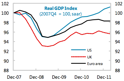
The IMF staff report on the UK is revealing in many ways. It's diagnosis is easy to summarise: they say Osborne has failed. But if you want to summarise that one graph will do. It's this one:
The US has recovered its 2007 position now.
Despite all its woes the Eurozone is trying.
And the UK? Revering well until mid 201 and from then on stuck, before heading back into crisis.
What's the one thing that explain the UK after mid 2010? Osborne. The one word explanation for why we're in deep, deep trouble compared to all others.
I guess I have the comfort of saying "told you so". The IMF haven't.
Thanks for reading this post.
You can share this post on social media of your choice by clicking these icons:
You can subscribe to this blog's daily email here.
And if you would like to support this blog you can, here:


Danny Alexander, are you listening?
You are of course dead right that the current course seems to be hell bent on a kind of ‘scorched Earth’ economy. The only slight quibble I’d have with the post is the contention that the Eurozone has done significantly better. Parts of it certainly have but I’d be interested to see Greece and Germany (for example) disaggregated. Otherwise, hard to argue against this..
Valid point
Just mulling through the Economist (I know I shouldn’t ) but the copy was lying there in the Dentist’s waiting room) – Looking in the back, worth comparing UK with either Japan or South Korea, which Really throw the lunacy if current policy direction into stark relief!