I have known Max Lawson, head of advocacy and pubic policy at Oxfam for longer than either of us probably care to recall. Most weekends he sends an email to his associates on a topic he thinks of importance. This week it was on the state of inequality. I thought the comments he made were well argued, reasoned, and needed wider consideration, so I asked if I might share his comments here. With his permission I do so:
Is inequality going up or down?
You would think a question like this would be relatively easy to answer, but sadly it is not. At Oxfam we have identified the growing gap between rich and poor and the impact of high inequality as a serious crisis. But how serious is it really?
The poverty and inequality of data on inequality
The first thing to say is that the data is not good, but that we do know that the problem is strongly biased in one direction- inequality is systematically underestimated. We also know the data for developing countries is much worse than that for rich nations. The main method used is to calculate a countries' Gini coefficient (a number between 0 and 1, where 1 is perfect inequality and 0 is perfect equality). The Gini has been criticised, and other measures like the Palma which look at ratio between the top 10% and the bottom 40% are favoured by many. Nevertheless, it remains the most widely accepted measure.
The Gini is calculated using household surveys or census data. This data has been shown to systematically underestimate the incomes of the richest part of society. For example, a study of several Latin American countries found that the richest survey respondent had a salary lower than that of a manager in a typical medium to large scale firm. The super-rich do not fill out surveys, and when they do they rarely reveal the true scale of their income.
Various methods are being pioneered to recalculate top incomes, to complement the surveys, most famously the use of tax records by Anthony Atkinson and Thomas Piketty and a group of economists behind the World Incomes Database. Another way is supplementing national accounts data for survey data. These methods, whilst themselves far from perfect, demonstrate in every country that inequality is worse than previously thought. They also have an impact on trends. Using top incomes, Brazil has not reduced inequality whereas it has if we look at the Gini.
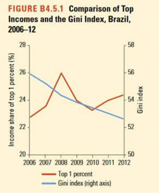
(source: World Bank Poverty and Shared Prosperity Report 2016 page 80)
Global Income Inequality Going Down
The thing that is measured most commonly is income inequality, the gap in the incomes between the richest and the poorest.
The good news is that global income inequality is very likely to be falling. If everyone on earth were the citizen of one country, then the gap between the richest and the poorest has reduced. Christoph Lakner and Branko Milanovic have pioneered work in this area, and Branko wrote an excellent blog on this this week. This is the result of growing incomes in the developing world, and particularly in China. It remains extremely high however. If the world were a country, it would have inequality levels around about the same as South Africa, one of the most unequal countries in the world.
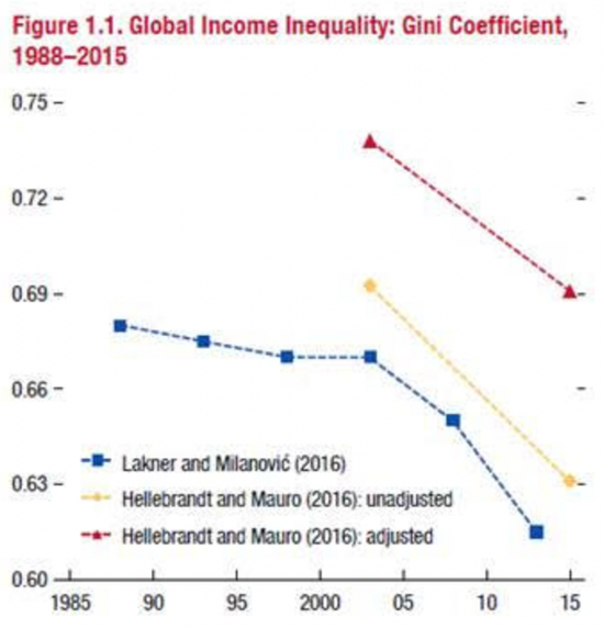
(source IMF Fiscal Monitor October 2017 page 3)
Within country income inequality
Arguably what matters to most though is the income gap between rich and poor in their country. So what has been happening here?
Using the best data available, the IMF in their excellent Fiscal Monitor released last week, try to look at how income inequality has increased or decreased in as many countries as possible- 94. They conclude that inequality has increased in the majority of the 94 countries they were able to look at over the last thirty years, but only just- 53%.
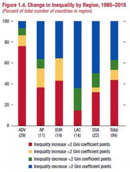
(Source- IMF Fiscal Monitor October 2017 page 4)
The regional variation is interesting. In Latin America, it has risen fast for the first twenty years, and then fell in many countries for the last ten with strong steps taken by governments to reduce inequality. In Asia it is the reverse, with equitable growth nearer the start of this period changing into a big increase in inequality in recent years. In most rich countries inequality has risen quite sharply, but not all and at different times during those thirty years. In sub-Saharan Africa, the picture is mixed. For the Middle East and North Africa, the data is simply not available.
The countries that have seen rises in inequality include China and India, and some of the other countries with the biggest populations. This means that seven out of ten human beings live in a country where inequality has risen in the last thirty years. China's inequality has reduced slightly in recent years, but remains almost twice as high as it was thirty years ago.
The IMF conclusions, which are similar to the World Bank's last year, are important. They reflect a lot of what we know already about the great efforts made in Latin America to reduce inequality, through more progressive taxation and more progressive spending. These efforts are now being threatened by a wave of new right wing governments that are opposed this action.
They also show that the picture is mixed in other parts of the world too, and this is also reflected in our Commitment to Reducing Inequality index, which highlights those countries in other regions, like Namibia, that have made strong efforts to reduce inequality. These good news stories are important, as we need to learn from them and use them to pressure the many governments that are doing the wrong thing.
Taxing and spending is not the full story though- other countries like Cambodia have seen significant decreases in inequality because the pro-poor nature of their growth, rather than any significant active intervention by government using tax or spending. This shows the crucial importance of growth that creates good jobs for those at the bottom of society.
They also show the paucity of data. In the IMF work, comparisons are only possible for 94 countries. Less than half of sub-Saharan African countries are covered, and only 11 countries in Asia and the Pacific.
Consumption versus income
There is also another crucial distinction in how income Gini coefficients are measured. In Latin America and rich countries, they are based on income, in Africa and Asia on consumption (as a proxy for income) . Consumption Gini coefficients are much lower. So comparing Africa and Asia with Latin America is to confuse apples with oranges. This is important, but rarely noticed. India for example has a consumption Gini (the official one) which is similar to Ireland's. Its income Gini is much higher, similar instead to Brazils. Whilst this does not affect the observation of trends over time in these countries or these regions, it does make global comparisons rather specious.
Wealth inequality
The other major measure of the gap between rich and poor is wealth, rather than income. Here the data is even worse. But again we know with some certainty that wealth inequality is systematically higher than income inequality.
Wealth inequality is very important because it is wealth that links most closely to political power and influence, not income. Today's income inequality also becomes tomorrows wealth inequality, as the value of wealth rises more rapidly than incomes. This is compounded by inheritance.
The best data on global wealth trends is the work by Credit Suisse in their annual report. It is this data that we use to produce our eye-catching statistics ahead of Davos each year. Data on the wealth of those at the bottom of society is not available for many countries to a decent standard, including most developing countries.
In terms of trends- it is clear from what we know that wealth inequality has risen considerably in recent decades in many countries. The wealth in the hands of the top 10% in China is now similar to that observed in the US. We also know that the wealth of the top 1% has increased, and is now higher than the whole of the bottom 99% of humanity.
We are hoping this year with the Credit Suisse report that there will be more opportunity to look at trends in wealth accumulation globally over time too.
Rich countries and developing countries
It is also the case that the basic level of inequality is significantly higher for almost all developing countries, rather than rich countries. This in turn is linked to the much greater levels of redistribution that rich countries engage in. The fiscal monitor points out that more than three quarters of the difference in income inequality between rich countries and Latin American countries is explained by the differences in the levels of taxation and spending.
We also know from other IMF work, that a Gini coefficient above 0.27 has been found to be harmful to growth. Only 11 countries in the world have inequality this low, and a number of developing countries have inequality almost twice that level.
We also know that high levels of income and wealth inequality have been linked to a large range of negative social and political outcomes. They also make it much harder to reduce poverty, as the majority of income growth is captured by those at the top.
Absolute inequality versus relative inequality
There is one final measure that deserves mention. All these other measures are relative- they measure the percentage increase for different groups in the population. So if I am poor and I get a 10% increase and the rich get a 10% increase, then relative inequality remains the same.
But if I am on ten dollars a day, and I get a ten percent increase, that is 1 dollar. If I am on 1000 dollars a day, and I get a ten percent increase, that is 100 dollars, or one hundred times as much. So absolute inequality increases. This is arguably more important, in terms of people's spending power, and in terms of how they perceive inequality, which is much more likely to be in absolute terms- they see how much more money they have to spend, and compare that to how much more the rich have.
Oxfam has shown previously that whilst the relative/ percentage income increase for those towards the bottom and middle of the global income distribution compared well over the last thirty years with the percentage increase of those at the top (represented in the famous ‘Elephant Graph' where the back of the elephant is the growth in the incomes of the relatively poor in the last thirty years, and the trunk the growth in the incomes of the richest,) the absolute increases are almost entirely captured by the ‘trunk', and the back of the elephant disappears.
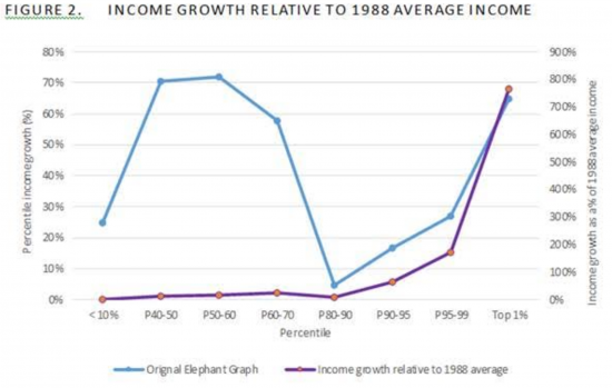
Source Oxfam: http://oxfamblogs.org/fp2p/whats-happening-on-global-inequality-putting-the-elephant-graph-to-sleep-with-a-hockey-stick/
So what can we conclude from this?
- It is good thing that global income inequality has reduced, but it remains very high indeed.
- Global wealth inequality has increased. Wealth inequality levels are systematically higher than income inequality.
- The majority of countries have seen an increase in income inequality in the last three decades, with sharp increases in the most populated countries.
- A number of countries, especially in Latin America have seen a significant decrease and we need to learn from this.
- Levels of income and wealth inequality are far too high in almost every country, and especially in developing countries, threatening growth, poverty reduction and driving a range of negative social and political outcomes.
- Data on inequality is very poor, and systematically underestimates the incomes and wealth of the rich, and with this the scale of the problem.
- Absolute levels of inequality remain dramatically high, with the vast majority of global income growth being captured by the top 10%, and the top 1% capturing more than the bottom 50%.
Thanks for reading this post.
You can share this post on social media of your choice by clicking these icons:
There are links to this blog's glossary in the above post that explain technical terms used in it. Follow them for more explanations.
You can subscribe to this blog's daily email here.
And if you would like to support this blog you can, here:

 Buy me a coffee!

Watch out for the volcanoes. It is quite possible that equality will be the least of our problems, if only because most or all of us have been made equal.
The major issue for me is wealth inequality which is going up.
The wealthy do not buy more stuff than us – they just store money – tax free too if they can get away with it (and they do). They can also use that money to influence what relief is given to the poor by funding politics and even use their money as debt which attracts interest (and so gives them a return).
The effect of their wealth on asset prices is a real problem as property prices for example affect rents and the cost of commodities (costs of living for those with less income).
Money is not just meant to be stored – its was conceived as a dynamic and ubiquitous form of exchange to be used in common circulation in society as a means to enable people to trade and to earn a living. This is really the power of money – as conceived.
What transpires to me is that the distribution of wealth is being dictated by the wealthy. Politics is now nothing more than an enabler of that. Money is really now just a commodity of power and the wealthy (and the trusts and banks who also store it) have too much of it.
The answer is a mixture of better tax collection and printing more money in a more targeted fashion than we did in 2008.
That would certainly help…
Max Lawson’s point about relative and absolute differences is very interesting and important. It is the sort of point that I would like as many people as possible to hear and think about. It is exactly the sort of thing that one should think about when being hit with statistics in economic debates and news articles.
It reminds me of discussions that I have had with people who say that the rich lost out the most during the GFC. Which may be true but if a person worth £5billion loses 80% of their fortune they’ve still got a billion pounds. If a person who is struggling to get by loses a much smaller proportion it may well mean bankruptcy foreclosure and personal devastation. Without context a face-value, relative comparison can be misleading.
The chart in this article helps to illustrate the point. It is also quite interesting in itself:
https://www.economist.com/blogs/dailychart/2011/10/income-inequality-america
A good one
Are you aware of a more up to date version?
No, but I doubt that much has changed since then. If I do find something more current I’ll let you know.
Thanks
An excellent exposition, if overall depressing. We need better data, better metrics, a better informed citizenry and a better philosophy of anti-inequality (equity?) to counter the (still) many who think inequality is a good thing – it creates a dynamism, drives technological innovation, it is the engine of growth etc etc.
Agreed
Hey ! That’s some wish list G Hewitt.
Anything else you think we could do with ? 🙂
How about peace on Earth and Goodwill to all men. We have to hope for it and work towards it. Santa ain’t gonna drop it down the chimney.
You know of course Santa’s working on his own again this year because of new employment laws regarding ‘Elfin Safety. 🙂
– informative post as always – tiny spello on line 1 – it is an old classic – pubic instead of public 🙂
Being done
That was a perfectly good typo and now you have gone and spoilt it, Anna. Oh well…
🙂
I did that on a notice board outside a meeting.
Nobody was quite sure whether I’d done it deliberately or not. See what a level of social distrust I have to endure ? 🙂
I’m beginning to wonder if it isn’t time to rethink the basic mechanisms of our democratic system.
I think maybe the Party system should be scrapped. Though it’s difficult to do because individuals would naturally form coalitions with the like-minded.
What I want, and I suspect a lot of other people might want, is to be able to elect a representative to parliament on the basis that their function is to consider issues and come to a pragmatic conclusion as to how best to address them.
Manifestos would go out of the window. They are very rarely delivered anyway.
Lobbying for influence would cease to be a problem because lobbyists wouldn’t have access simultaneously to a party machine.
The whole idea of a parliament would maybe get (back ?) to working as a body which regulated as a collective body rather than representing narrow interests which are easily influenced. (Bought)
I don’t know whether this idea has any legs.
I think we had some discussion of this elsewhere on here. Yes, get rid of parties, get rid of professional politicians. Get the citizenry involved – like jury service.
Against Elections by David Van Reybrouck
The End of Politicians by Brett Hennig
Apologies if I’m ploughing old ground. maybe that’s where I got the idea in the first place (?)
Your mistake is to think everyone thinks like you do. They don’t
People are more concerned with their own absolute lives not comparisons with other people. If their living standards rise, they are happy.
Why else has there never been a successful country in the model you’d like.
You’ll only ever be noise in the background. Squawking louder from time to time but always in the background.
You keep saying “you have a life” so can’t answer some questions but the reality is you don’t seem to have a life at all other than this blog and your quixotic quest for more tax and more control over people. My guess is you would answer every question if you could but often you just don’t understand the subject well enough to answer.
It would be sad but your vision for society is so bleak and evil that I have no sympathy for the empty existence you live.
Wow
What else can I say?
Astonishingly, most people I know don’t even know I blog
But, you who”s never appeared here before clearly knows me better than they do
But getting over the ad hominem’s you’re also just wrong: absolutes are not what matters to the vast majority of people. Precisely because they do have lives that involve engagement with others comparatives really do matter to them. Only the ultra-right think otherwise
Phil Richards’
“Your mistake is to think everyone thinks like you do. They don’t”
That’s a silly comment if you think about it. If Richard though everybody thought like he did he wouldn’t feel the need to tell everybody what they already thought because they’d already be thinking it.
For the rest of your comments I think you more closely describe your own life than Richard’s. But I’m only guessing. I’ve never met the man.
Excellent piece!
I know everyone uses it, because everyone should also be aware the the Gini index is pathological, especially in situations where the population is increasing. If you increase the number of workers at a fixed wage and GDP rises with all the gains going to a fixed number of bosses then the Gini coefficient falls even though the wage gap and inequality are rising. Coarsely, it measures something but if a politicians claims that inequality has fallen because the Gini has gone from 0.35 to 0.34 then they should be sent for maths lessons.
This is why Piketty and other focus on the income share of the 1%. As he, this article and comments point out wealth inequality is also very significant.
The Palma index is also much more telling
Looking out of the window is quite telling aswell, I find.
Putting aside Mr Richard’s rudeness, If it is only the ultra-right who think as he does, why are their so many neo-liberal governments and virtually none who follow your doctrine?
It’s a mystery I wish someone could solve.
Me too
What we have had for 35 years is a bred culture of greed
Greed – absolutely.
Greed about money in particular and therefore greed for power.