
My experimentation with infographics has continued.
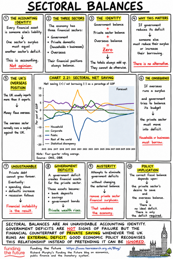
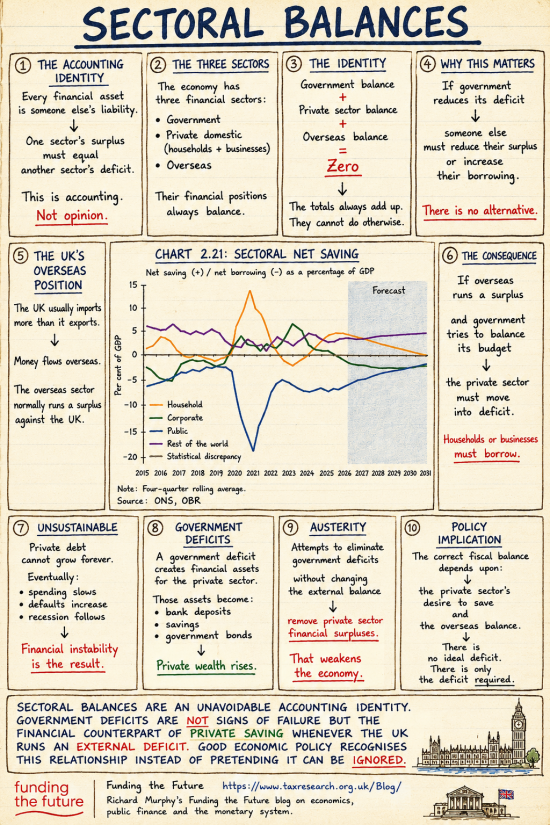
I used a more obscure subject, the sectoral balances. And I made four versions in light of the comments received.
This is the version in the first style I created:
I then tried it in the 'old-style' notebook format:
But then, having noted all the comments on the need to meet the needs of people with dyslexia, and to make the design generally more friendly, I created this:
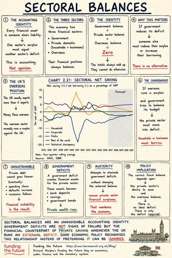
The background is paler and the text more contrasted.
Finally, I redesigned the first version with a pastel green background.
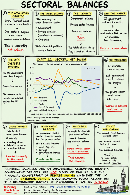
Call these A, B, C and D.
Which works best? I admit I am inclined to C. But you can disagree!
Thanks for reading this post.
You can share this post on social media of your choice by clicking these icons:
There are links to this blog's glossary in the above post that explain technical terms used in it. Follow them for more explanations.
You can subscribe to this blog's daily email here.
And if you would like to support this blog you can, here:

 Buy me a coffee!

Being one of those ‘people with dyslexia’ I still prefer the ‘old stye’. But then it may be because I’m very old!
C is winning though
Thanks to all for the combination of transparency and impact.
In reality, is it possible for politicians, the Treasury, the main stream media, academics etc. not to know the realities of sectoral balances?
In reality, no.
My wife is dyslexic and finds sentences and paragraphs that are in all capitals very difficult to read. Mixed case to her means the words have more “shape” and are more easily processed. I suspect others may differ, so just an observation.
Noted.
These infographics are just great. I’m spamming my Substack notes with them. Thanks!
Hello Richard
If I were to rank these it would be
1.C
2.B
3.D
4.A
Infographics with a white background are not for me. I’m not keen on the yellow highlighter stuff either.
Different people, different stuff, I guess. Just what works for me.
I can see these on t-shirts and mugs. As long as they could be funded. Maybe you could raise a separate fundraiser specifically for these or something? I don’t know about these things. It’s just a random thought.
Thanks
Merch would have to pay for itself…..
Hopefully there would be some sort of ‘Create on demand’ type service, people could pick a design and what they would want it on etc
That would be impossible, I think…
teemill is a print on demand service with no upfront charges, so you could produce these and only incur costs/generate revenue when they sell
I am looking at. Thank you.
I vote for beach towels!
Why did you get rid of the last graphic illustration on choice “D” and “A”?????
What is the last graphic illustration on choice “B” and “C”????
Nice chart
I like these because they are concise.
A nit pick: in box 2 you have the government sector, in chart 2.1 you have “public”. Likewise “business” and “corporate”.
More generally, box 3 essentially says money can neither be created nor destroyed, the total is always zero. Fair enough I guess and consistent with double entry bookkeeping. This implies the government’s balance at the Bank of England is total money issued but not withdrawn (via tax or gilts). It seems to me that this is potentially confusing to the uninitiated for at least two reasons. First, a layman might reasonably ask, how is always having a total of zero consistent with the MMT assertion that the government can create money? Secondly, they might point out that the government’s balance could be adjusted by an arbitrary amount, positive or negative, with no substantive effect. This, they may feel, suggests something odd, or fundamentally different about the government’s balance (and they’d be right). I wonder whether it is possible to clarify this confusion? Perhaps in another info graphic about government finance, rather than complicating this one?? It would be great to do so to facilitate understanding.
Noted, but show me how you would redraft it in the same word limits. I am curious, because i thought this the best I can do. These are not essays, remember. They are meant to introduce a topic.
Absolutely no intention to criticise – I really like the infographics This one on sectoral balance is good.
I don’t think you could effectively squeeze more words in. Trying to do so would undermine the impact.
I was, tentatively, thinking that there could maybe be another one that described how government finance works. For example how gilts work, their relationship to the Bank of England, the public debt office etc. But, to be honest, I’m not sure that’s even possible. So thanks again for the infographic. My comments were really just thoughts I hoped might be useful.
I will see…
I’ve recently been playing around with AI to produce infographics. Initially to help to visualise the ideas within a long and complex article looking at research on the different models and filters people use to determine what is truth. I then versioned the infographic using prompts for different audiences and different scenarios. ‘Bright 14 year old’ works well.
Thanks for the dyslexia prompt tip…I’ll be using.
Can you share any thinking or examples by email?
I like A – buff as it lends a sense of tradition and gravitas, if that makes sense.
Re austerity poster, and SB above is the issue that the debt has shifted onto the people eg spiralling cost of living and spiralling costs for LA schools NHS?
Is the truth that we can’t afford austerity? Austerity is very expensive for ordinary people.
The housing bill move in US is interesting, but devils may be in its details, wish Wasteminster would do something better and bolder as anti austerity action?
Would it be possible to substitute “rule” (or something else more demotic) for “identity”? This is a quite technical subject, and although I can understand pretty much all you say about MMT, gilts, bond vigilantes etc, I find this topic quite difficult. The use of accounting terminology is getting in the way of my understanding.
Just a thought.
But the whole point is it is not a rule – but is an identity. So I can’t chanhge it. Sorry.
D is the exact background colour I choose on the terminal command line app for the mac. easy on old eyes.
As Nick says “D is easy on old eyes.”
I’m a young 70 but D works best for me too.
I accept that C is the popular choice and D is not the hill I will die on!!
D was not popular including here.
Hello Richard
More nice stuff going on here!
I voted for D – not quite sure why but for me the blue background seems clearest. I have never been diagnosed with anything specific in terms of neuro-divergence but I would say that I’m slightly dyslexic but rather more something else, for which a name has not yet been coined!
My daughter is very dyslexic but generally finds that colour doesn’t affect her ability to read things. She’s also a trained illustrator, and preferred either B or C.
The only other comment I would make is that the graph is quite hard to read. If it could be bigger hat would be great, and in the best possible resolution so that it can be enlarged on screen…
Over to you!
C – I like the strong contrast (the two most unreadable samples of text I ever saw were a theatre program were given the nature of the play someone thought that blood-red text (dark) on a black background (dark) would be a good idea and a wine label where the colours involved were silver and black, but the silver was so reflective as to cancel out any advantage gained by it being a light colour compared to the darkness of the background)
C it is…
It won the vote and the support of the team here.
Richard! THANKS many times over for doing what you do! I’m a young creative and I can’t afford to buy you a coffee (an ironic comment on an econ blog!), but your recent infographics have been so effective for me that I have tried my own hand at infographic design – which was my father’s job when he was my age.
If you could help me finish my rendition by checking my work and emailing me the OBR chart, I would appreciate it very much – I would also then be able to share it with my friends!
I only say that last part because the infographics, whilst they are GREAT, unfortunately also have the “Facebook-sloppy,” “ChatGPTish” (dare I say the combination of those adjectives is “boomery”) look to them, and if I were to post or even just share them that would be, socially, a major faux pas and I would be jeopardising my place in my creative network in doing so. The font has quite a ChatGPTish look, and while the drawings are great and do fit the style perfectly, if they are AI artwork then I can’t post them for the same reason (the youth culture is explained quite well @ https://youtu.be/EfeGc02nzC4).
For my rendition, I selected the Carey typeface (late New Orleans sign painter Lester Carey) which is associated with the “Defend Post-Katrina Corner Stores Through Typography” people (https://youtu.be/6V3KuKG9AxY).
Finally, you could consider Instagram “carousel slides”, which are swiping-based posts that you might be familiar (they are considered to be a strengthening format in some circles). I have provided an example carousel post in the following Google folder.
https://drive.google.com/drive/folders/1fBNqst5Sf3fgXrRYe4buc-4h66Kmtqcs
Thanks. I note all you said, and much prefer mine. Sorry. Chat GPT or not, I don’t care. This “it’s AI so I wont’ look at it” moment will pass. These are not AI. I write them.
Understood! I never doubted who authored the textual content, to be clear.
In that case, simply consider my graphic to be a more direct form of commentary posted to your blog, in combination with my remarks. And, of course, if my inklings that the visual letter forms of the typography and the drawings are generated by ChatGPT is incorrect, then I apologise for the crudeness with which I described them.
I won’t preclude for myself receiving the benefit of your wisdom and clarity in the form of these infographics – however, I have no control over the culture that might become concerned about my association with AI if I were to share them. I also don’t have the benefit of an older perspective that might enable me to comment on whether or not that culture will change.
Perhaps the most salient point of mine was the carousel posts, then – I think the format would be the most effective way to present the diagram on a social media feed in such a way that a maximum of people would take the time to progress through each panel.
Thanks again for all you do!
Prefer C. Not sure you should state your preference up front. I would like to feel peoples votes are not swayed, it is normal behaviour for people to do this , even with the kind of audience that participate on this forum. I am hoping the purpose of these exercises are to gauge an acceptable format that expands into a concise document for folks (politicians?) to embrace the basics of MMT. As a member of the great untrained, but catching on, every day a school day and all that, I am enjoying these as I did in my previous working life . Marketeers in those businesses used them often.
Thanks
looking good
As a dyslexic I’ve ticked D. I found that the yellow highlights immediately grabbed my attention and I found the body text easier to read than the others. Having said that I’m so practiced at having reading standard all these years, the differences are pretty marginal really
Thanks
That’s great! The only thing I would consider changing would be to replace the graph, which I didn’t feel drawn to analyse in any detail, with a diagram illustrating the flows of money described in the text.
Love your infographic. I think that can go a long way providing vital information to people who would NOT otherwise read an economics’ text or even an article.
Remember the series e.g. ” X for beginners”… this series of little books? a nice compilation of these with …. “….. for beginners” would be great too.
Electronic copy for free to all colleges in the UK, subsidized by merchandising? :-)… our hope is the next generation… before they get fully brainwashed, trigger questions in their minds.. They will challenge their parents LoL. Teenagers are good at that and it will stick for the rest of their lives..
Our minds are running wild, too….but let’s walk frst
Sectoral Balances is one subject in real need of this treatment, I liked A but they all work for me to be honest.
Thanks
The title left some people mystified! I think Financial Sectors would be better. I try to teach double entry to friends and family but explanations of words like balances and indeed balance sheets need me to be a better teacher!
Accepted. But it is also the technically correct title.
Technically correct may not always be audience-appropriate. Think “will Mrs T’s housewife read this tea-towel?”
Out of interest, when time allows, will you be putting a link to all of the Infographics at the top of the page? Along with the glossary, ebooks etc.
Craig
I am working out how to do this.
Thanks, I have found them very useful
Craig
So pleased you are doing these infographics. I did try, a while ago, to create a couple of graphics to illustrate your writing but I baulked at the time taken. Great that you’ve found a way to make it manageable.
Just wondering: if you upload an example of a graphic style you like, can AI use it as a template for further creation?
I’m very hopeful that a well-placed arrow or two might simplify certain concepts. For example, I’ve long yearned for a graphic that describes the relationship of central bank reserves, the treasury and gilts.
How about asking your readers if they have any particular areas that they find difficult to understand?
Regarding the designs, my ten cents:
• Asymmetry is good. It creates a more dynamic, more memorable design, and can lead the eye to what’s important. A regular grid of panels doesn’t really do that.
• In a newspaper, the biggest headlines / photos denote the most important issue. If there are certain panels that are more significant than others, using size or colour to emphasise either the panel itself or the words in it, could help your reader, find an important overview or a particularly significant tit-bit that you don’t want them to miss.
• A background colour not only separates the graphic from the rest of the blog to create variety, it also encourages the reader to have a ‘quick dip’ because they know they are being invited to read only a small part of the whole.
• Lastly, and definitely leastly, if you’re looking for unbiased feedback, you probably don’t want to describe one version as ‘old fashioned’ 😀
Noted