
A lot of people have said positive things about the new visual image presentations of arguments I have tried over the last couple of days. I am still working on these and have significantly developed ideas around presentation, including alternative themes.
Two broad visual themes have emerged from discussion so far, which are alternatives. They are as follows, reworking of the austerity / government debt theme from this morning.
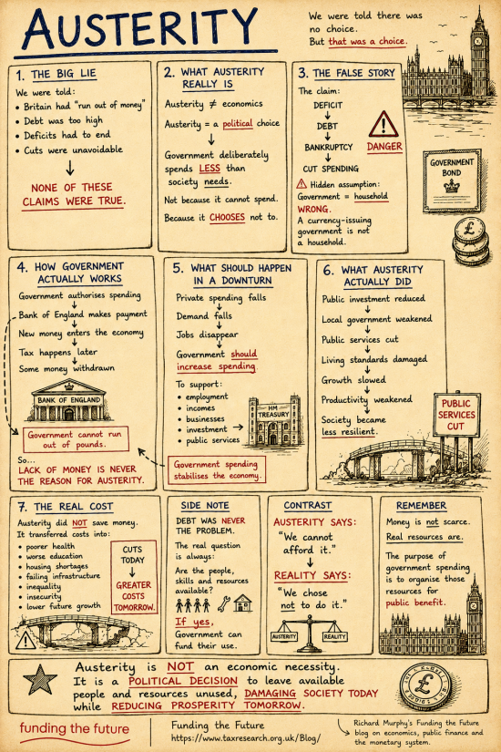
This is option A, which is popular in the team here (slightly to my surprise)
This is option B:
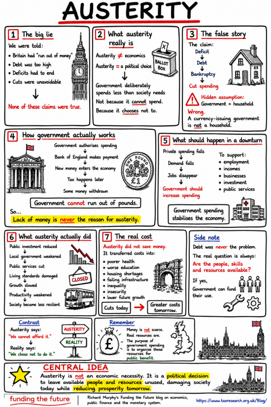
Might you please ignore any text differences at this moment? They just show one idea can be spun in more than one way. I am interested in which style you prefer, or whether you think we need to try again. Might you vote in this poll?
UPDATE
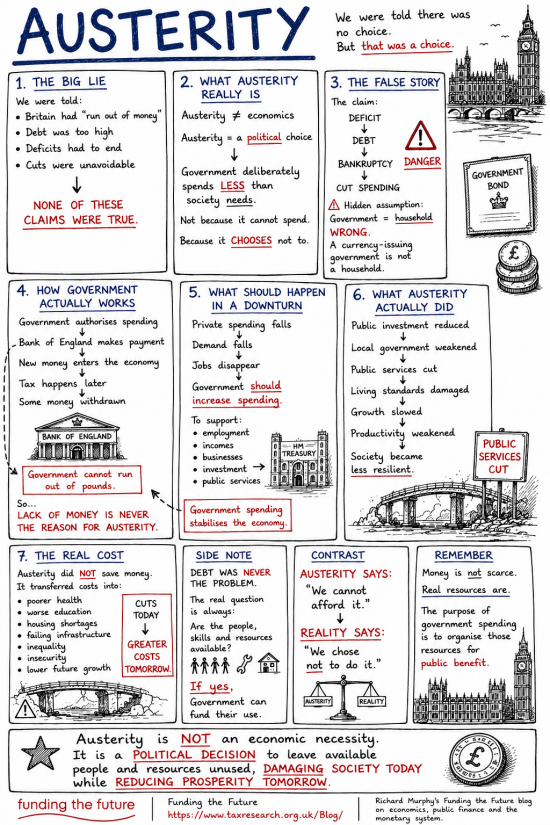
I was asked to add version C, which is the first version, but on white. This is it. The poll has now been updated to allow for this.
Thanks for reading this post.
You can share this post on social media of your choice by clicking these icons:
There are links to this blog's glossary in the above post that explain technical terms used in it. Follow them for more explanations.
You can subscribe to this blog's daily email here.
And if you would like to support this blog you can, here:

 Buy me a coffee!

I’d prefer option A layout on white paper which would, I think, have greater visual impact.
I will add this
Thanks for adding option C, I do prefer it.
But, I hadn’t thought about meeting the needs of the autistic and visually impaired, nor do I have the knowledge to know how those needs might be met. Seems an important priority to me.
The team here is ADHD, some diagnosed, some not. Maybe that’s why we all like these.
Option A or Option C works for me!
Thanks.
Me too, but B is doing well.
Maybe I do all of them!
I am not convinced that infographics help very much. These ones appear too complicated – too many words – while also simplifying the arguments.
But you are probably a better judge of what works with your social media channels, and perhaps I am not the target market. How do you intend to use them?
I have often thought about suggesting you use infographics to explain things but I am very aware of how much time you already spend doing everything you do and didn’t think you would have the capacity to produce them. But here we are and they do look good.
The second one is much easier to read (I spend a lot of time making sure info is easy to read for autistic people who need it and for people with a learning disability).
The white background definitely makes the text pop out better than the brown/sepia background.
The boxes are also laid out in a more natural way and seem to flow better from one box to the next.
Definitely heading in the right direction.
Might you look at the new option C now? Just refresh your page.
Still number 2 for me Richard. The bolder boxes make each stand out more, the numbering is also clearer.
Just my opinion but I’d rearrange the boxes into the following order to make the narrative more fluid…
1,3,5,4 (number 4 in a box spread the length of the page underneath boxes 1,3 and 5) ,2,6,7 in a row then the 3 side-notes underneath in their own row with the ‘central idea’ and footer below that.
I’d remove the Parliament graphic to the right above ‘central idea’.
No offence taken if not to your liking 🙂
The order flowed for me. I wrote it….
I think Option A looks more unique.
That being said Option C combines the best of both worlds and is somewhat easier on the eye.
In any case those infographics are an awesome idea especially to approach other audiences.
It’s like TikTok-styled videos but much more educated and in writing.
One can then only hope that those people are getting interested in your longer articles as well. 🙂
I voted for option B, which in the poll you describe as “brasher”. It didn’t strike me that way at all – for me it’s neater, more coherent and easier to grasp than either of the other two. I particularly liked the highlighted punchline in box 4, which really leapt out at me in a way that the red capitals in A and C didn’t. In fact I had to go back and check that line was actually there in A, as I didn’t even remember reading it.
The images in B also fit better with the text, but that’s probably a cosmetic point at this stage.
Thanks
I agree Therese. B appeals to me too. It’s more modern looking, in my opinion, and appears to have more white space, and be less cluttered than A & C.
Noted
I agree, it both catches my eye and up is easier to find things again. I find the extra colour helpful.
People have different learning styles, so I can see why these (based on other comments) are helpful for the more visual learners. It does leave out visually impaired people and doesn’t really help people like me who find a cartoony “handwritten text” font and extra visual clutter more difficult to parse when there is a lot of text involved like this.
The principle of breaking out and simplifying the important points, with some text highlighted, is good. An alternative (or combined) approach might be to present the points in a text outline format (readable by screen readers), perhaps in a two-column table layout so the illustrations for each section can be placed to the side of the text. Since these are sequential, numbered sections I think they’d work well in a format like that and be easy to read.
In any case, as long as the image presentations are used as supplemental learning aids and not thought of as a substitute for the more developed and accessible presentation of the material, they seem like a very good idea.
I don’t get this.
I try as hard as I can to make this site work for the visually impaired.
I write. I make the text accessible.
I make video.
We do audio.
Not all of those work for everyone.
Nothing does.
So why tell me not to do anything for visual learners, a group I have largely ignored to date?
I just don’t get it.
The goal is to try to reach as many people as possible where they are.
For a very small team with nit much money I think we do pretty well. With more money, we could do more. But we do our best and try to consult as well.
I’m taken aback by your reaction. I thought I’d made it clear that I think these are a good idea for visual learners (I said it twice). I’m surprised that you took what I said as saying you shouldn’t do them. You asked for our opinion. I gave my perspective that I liked breaking out the simplified points but that for me this style is difficult to parse and tried to describe a way of presenting the same content that would work for my type of learner. What I don’t get is why you asked for our opinion if only praise (which I gave) and nothing else was to be offered.
Sorry, I am back in discomfort tonight.
But, I am also a bit unrepentant. If this does not work for you, that’s fine, I hope lots of what we do does in that case. Wasn’t that all that needed saying then, because if it didn’t work for you, it essentially meant thereafter everything you said felt negative? Sorry, but that is how it felt. If I read it wrong, apologies.
My goal was to bring up my outline/table idea as another possible presentation method for the key points and why it might be considered, not meant to say it was better for everyone or that the image method shouldn’t be used. That I didn’t convey this well enough only means that any ideas I have regarding good ways to present information are likely not worth considering anyway, and why I’m not a writer! Meanwhile I look forward to reading more from you on these topics.
OK.
I messed up.
Sorry…
Points noted.
Sounds like glena is describing the powerpoint style cards you use on your videos. You could post them as they are, or add an image or two next to them, stock image or illustration.
Maybe…
I like these images a lot. They express a lot on just one side of A4. Churchill would have liked the format, perhaps not the ideas.
I used to use a similar thing- a brain-map, based on a book I read by Tony Buzan many moons ago. He tended to use just words or short phrases to map out ideas radiating from a central word as a topic. I’m sure I’ve seen examples in your work, but I prefer the present format. I remember I used to give them to students as aids to understanding and revision.
I fervently hope many people will see them and take an interest in the ideas these A4 sheets convey. They might be put off by a 300 page book explaining the ideas more thoroughly and entertainingly( yet always the need for good books, I feel ), but this can be scanned and mused over a long coffee. Indeed that’s why coffee is popular; it encourages musing as I’m sure you will agree.
I use mind maps, a lot, when planning work.
These could be the basis for a discussion group.
I’m dyslexic and us dyslexics always prefer a non white background. I was immediately drawn to the antique style even before reading the content. Probably worth playing around and experimenting with pastel colours as well.
If these work I might do multiple colour ways.
It seems the obvious answer.
I should have said – that wasn’t a request. Just FYI. But yes, I would say the obvious thing to do
Thanks
I’m curious about on what medium these would be shared?
Depending on the platform I could definitely picture these broken up into individual images, for scrollability and attention grabbing the algorithms, and maybe people, seem to like.
For other media, ignore me!
I am doing a post on these issues, probably in the morning. I am whacked tonight and am going offline soon.
I wonder if it is possible to explain briefly why governments choose austerity?
It would be good to hear your ideas on how you are going to use this.
Thank you all for this _ so clear and easy to understand.
I will look at that.
I am really glad you added option C – I preferred A to B but without the addition of C would have had to vote for B as I feel so strongly about backgrounds that with white background v coloured background I will always vote for white background.
Noted. Thank you.
I preferred A. I am aware that dyslexic and dysgraphic people prefer non-white backgrounds and non-black text/imagery:
For readers with dyslexia or dysgraphia, the most effective background colors are soft pastels, cream, or off-white (such as peach, pale yellow, or light green), paired with dark text like navy blue or dark grey. Pure white backgrounds are generally discouraged because the high contrast with black text can cause glare and visual stress, making text appear to blur or shimmer.
I think we will publish more than one version of each eventually.
I like B as my view is there appear to be too many words with the other versions.
But, I am not surprised that other people like the other two versions.
Craig
I like Option B the best with the yellow highlights on the principal idea.
I feel the buff background of Option A reflects austerity…but if you’re thinking of doing more of these then you’ll likely find you’ve boxed yourself into a visual corner…
The third one lacked the important ‘in your face’ attention seeking of the yellow spot highlights.
All noted
For me personally version C edges it over the others, but I am aware (having in my previous life been responsible for student support issues) that a non-white background can be helpful for certain individuals.
I am not sure how you are going to disseminate these new presentations – they don’t obviously fit easily your current blog and video media – but I think it is important to be able to present arguments in these easily consumed forms.
(I don’t intend to be too critical by saying that some of your output has seemed to me to be in need of a ruthless sub-editor. That reflects your academic background, which chimes with my own, but I am conscious of it as someone who once was – like you – editor of a student newspaper. And at a different level your detailed analyses are a big strength which sets you apart from many other economic commentators, most obviously in major contributions like your Taxing Wealth report but also in the more technical blogs like your recent one on the small company tax gap).
I will do an article about this.
But they clearly are already working here.
they would be for sharing on social media sites, e.g pinterest, imgur, tumblr. etc Im so excited
A post on this is coming…
Quick points on image 5, Austerity.
-reduce interest rates
-manage inflation
I immediately responded to A, maybe because it’s reminiscent of Marx for Beginners by Rius, a graphic style edition. It’s both informative and understandable, something that probably can’t be said of Karl himself! (Richard’s writing always has clarity.)
Would make a great poster ( and at the risk of being trite – tea towel. Sorry.)
Merch, here we come
Funny you mention merch, I was thinking exactly that before reading the comments. This should be on every mug in the house of commons tea room.
‘A’ worked best for me, I found it more comfortable to read rather than a glaring white background. Clearly there is no best colour scheme for everyone.
One of the key aims for a poster, tea-towel, Facebook meme like this is to catch enough of someone’s attention to make them follow the URL at the bottom. The infographic itself does not have to be complete on it’s own. Indeed leaving a few unanswered questions (eg ‘so why do we need taxes?’) might help lead people to the website for the answers. You might even consider extending the URL to link direct to a specific page that follows on from this graphic rather than to the home page.
You mention possible undiagnosed ADHD among the team. I’ve recently thought that might include me, it would certainly explain a lot about the last 68 years!
I am one of the undiagnosed. But experts of my acquaintance (mainly in education) are sure I am.
Richard, the basic idea of combining graphics with text is a winner—whatever tweaks you decide to adopt. The reason is that the visual organisation complements and emphasises the verbal organisation. It gives readers/viewers an immediate grasp of your argument. Full steam ahead!
My problem (only mine?) is the silence that follows the assertion that austerity, etc., is a political choice. Why, given the inevitable consequence of making such a choice, would anyone want to do so? Presumably because it will benefit someone, even as it disadvantages the rest. Does this need to be spelt out in the graphic, or is it enough to leave it to the imagination?
That is another topic.
There could be hundreds of these ….
I’d quite like to see option B on a coloured background.
How about the same colour as the FT?
I love this visual style of presentation really gets the point across.
Can I place my t-shirt order now please Richard!
Round of applause to you and your team.
Thanks
Thanks
I sparked this, I admit. But it is a team effort.
I think these are great. Economics has been made deliberately obtuse, the household analogy has filled the complex space with a simple and incorrect one.
I like these diagrams to show how the ideas fit together.
I think even simpler options are possible. Pick off one idea, like you have to spend before you can tax. I had imagined something like. “Here is a 5 dollar note (NZD) I am 50 years old. I have never made a single dollar in my life. If I had that would be counterfeiting. Every dollar I have every owned has come from 1 of 2 places, government spending e.g. money it creates or debt from a bank. How can it be that taxation funds the government, when these are the only 2 sources of money? Banks issue money on behalf of the government. Now there is only 1 source of money. How do I get a dollar before the government makes it? Perhaps there is more to the story of economics than you have have been told?”
I understand the ideas are linked. I think the entry point could be even simplier.
Thanks for all of your efforts!
As I spent some time yestrday struggling with a text on inflation, I began to agree, picking simple elements might be key. You may be right.
I love these, they are all good. It’s great to have content to share on social image sites like imgur , Pinterest, tumblr, they can even be cropped into smaller parcels of ideas. chefs kiss.
Another option is a really long image you scroll through, instead of being 3 columns across its 1 column and you scroll and scroll (Im not sure if its as common as it used to be, only works on dynamic websites fit image width to screen). A lot of people are looking at stuff on their phones and tablets so you can less columns and longer images, or if you are going for more columns make it wider if people are going to be looking at it landscape like on a computer screen, for non-printable version you can experiment with screen size and resolution. I like that the ones you have done look printable which would be useful for some people, or they could be put in an newspaper or magazine.
I think you could also post the slides you use in your videos as they are also really good, its sounds like what one of the commenters was describing, bullet point/power point style.
These will lead to scrolling versions….that is the idea….but we’re not there yet
[…] of the questions asked of me yesterday regarding the infographic diagrams I posted were whether they were easy to make and what I was going to use them for. Given the number […]
I voted for B, all were clear and easy to understand, except for “Tax comes later” “Some money withdrawn”, which left me a bit puzzled & needing more information.
Lots of enthusiastic and helpful(ish) views on these. But really, these are already the converted!. What you, and we, want to know is whether they get to people who don’t currently read/watch/listen to your pieces.
I prefer A, due to the calming colour, which also ressuringly suggests it could be a printed poster. The white backround of B and C does make the text more legible, but they lack an outer border, maybe add one. The star at the bottom needs some highlighting, which you did in B but took away in C. Maybe add a red outline, or bring back the dazzle dashes in red.
Noted.
I think these are great. My preference was A, I’m another dyslexic and found the colour scheme easier to read. A thought on box 6 – is there merit in showing it as a cycle in a circular format, i.e. a doom-loop? Public investment reduced etc. -> growth slowed etc. -> Public investment reduced -> …
Further highlights the pointlessness of continuing with austerity and need to break the cycle.
It could be
Not sure how “Check your email to confirm your subscription.” got into the message?
It is a response to any comment
I think they are all useful, particularly liked yesterday’s, and we’re (husband and I) thinking of printing some to give out when we do our monthly collection for our local foodbank on market day. I think they will come in very useful. It’s often very difficult to get ideas across on a short conversation, but people have been interested in previous leaflets about our PFI hospital which has cost more than 8 times the original estimate 0f £67m. Producing eye-catching, informative and readable leaflets is hard work, so I can’t thank you enough for your and your team’s efforts.
Would you like one on PFI?
Thank you. I think that might be very helpful. Our format, controlled by someone else, is very wordy and we have long discussions about making the leaflets more visually interesting and eye-catching, but to no avail.
Will we get a chance to comment on the wording?
No, not before publication
I cannot write by committee. I know no-one who can.
Yes, after publication.
People already are.
Well I have voted for Option B.
It reminds me of the Icon books series from the 90s, f you are familiar with them? (Beginners series which I think became Introducing, a graphic guide)
Comic style biographies about people and concepts – over 50 or so books graphic/comic style, bite size information books on Ethics, Society, Neurology, Fascism, Chomsky, Machiavelli etc.
They were good
Loving the graphics very much. Anything not on white paper as the contrast on white is hard to read please. Love the tea colour as it’s really easy to read please.
Thanks
I did not vote because I think they are all equally good.
Thank you
Option A – more impact – better for short-sighted people- white is too easy not to read properly as it is like everything else. Just change the not equal to sign / some J asked did not know what this was
Great idea with the visual representation. Printed off the three versions and overall I preferred option A. I would prefer more of this to help me with absorbing more information. Keep up the good work.
We have decided on C