We're constantly told that people in rich countries live longer and that GDP growth is therefore the route to health, well-being, and social progress.
But the evidence is far less simple than the slogans.
In this video, I use 2022 data to show four versions of the same relationship between GDP per person and life expectancy, and explain how the way economists present that data can create a misleading story.
The key point is this: the link between income and life expectancy is non-linear. Once basic needs are met, the curve flattens. Beyond that point, what matters most is not GDP but inequality, housing, healthcare access, stability, and social care, or, in other words, the politics of care.
This is why GDP fetishism is not only intellectually empty. It becomes politically dangerous.
This is the audio version:
This is the transcript:
Life expectancy matters to people. You know that. I know that. So let's talk about it, because the economics of life expectancy is very confused and seriously misstated most of the time, and I want to expose that fact and talk about why we need to be careful about data when we're discussing an issue as important as life expectancy.
Let's be clear what the issue is here. It's argued that GDP, gross domestic product per capita, that's for each of us, in other words, average income, is a big influence on life expectancy. But is that true? What do charts really say to us, and what don't they reveal? Understanding this matters, and that's what this video is about.
People love a simple story. Rich countries have people who live longer, is a very simple story, and it sounds obvious, and let's be clear, it's partly true. But it's also an argument that is routinely misused, and that's why I'm talking about it. In this video, I'm going to show you four versions of the same data. The same relationship is drawn every time, but in slightly different ways, and each changes what people think they see. This is about how bad economics can then be used to create false narratives, and that's my key issue here.
The data source that I'm using on this comes from something called Our World in Data, and there's a link down below to explain where the data comes from. It all relates to the year 2022, by the way, because that's the most recent information that we've got, and there are two comparisons being made in all the data that we look at.
The first variable is life expectancy at birth. In other words, how long might a child live in the country that we are looking at? That's it. That's life expectancy at birth. And the second variable that we are comparing life expectancy at birth with is GDP per capita.
Now, GDP is the total national income. GDP per capita is national income divided by the number of people who live in the place and there is a little twist here because it is purchasing power parity adjusted, which means that in practice, the figure is adjusted, in dollars, to reflect the cost of living in the place in question, because quite clearly you can live on a lot less in some countries than you can in others. So that is a fair adjustment to make to ensure we get comparable information when it comes to life expectancy.
Now these data sets are widely used in public debate, and they're a good starting point, and I don't think we need to get too worked up about any flaws in the data, although of course it won't be perfect.
There are two charts I want to show you. They are the initial representations of this data, and the first one is on the screen now.
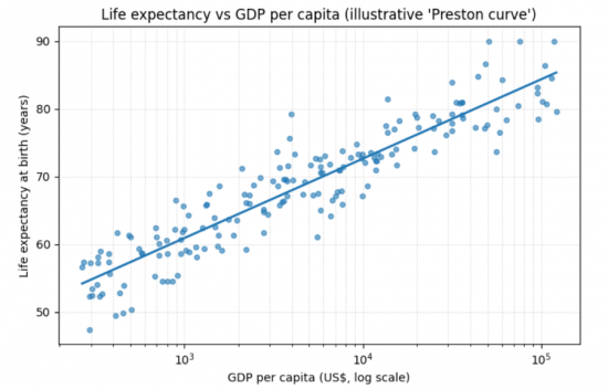
We are calling it scatterplot version one, and what it does is along the bottom line show GDP per capita. And on the Y axis, the vertical line, it's showing life expectancy and look at what it tells us. There is almost an exact correlation. As GDP per capita goes up, so does life expectancy.
But this chart is heavily distorted because that line of GDP per capita is not what we call a linear chart. In other words, it does not go up in even steps. It goes up on a log scale. Now, if you don't know what a log scale is, I'm not going to explain the maths to you now because it's pretty tedious. But the point is that this chart has been presented in this way because there are so many countries with such a low level of income that the log scale is used so that they are spread out much more widely at the lower end of the income scale, and the countries at the high end of the income scale are heavily compressed as to the amount of space allocated to them and that distortion creates this impression of a perfect straight line.
Let's redraw that chart in this chart, which is version two of that scatter diagram.
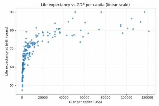
This is just the basic data redrawn with a linear line at the bottom. In other words, each of those gaps you can see represented by a grid line is of equal distance across the screen.
So now we see a very different representation from the image provided in the first graph. There is no straight line at all, glaringly obviously. There's obviously a curve going on, so just by changing the way in which we present the chart, we get a very different impression of the world, and here, what we are seeing is a cloud of points, but the trend is clear.
Higher GDP per person tends to mean higher life expectancy; this isn't an even relationship.
In that case, for people to claim that growth means people live longer and that GDP is therefore a route to well-being is not necessarily true, but that is the standard political storyline. It's one of the justifications for why GDP growth obsession exists inside neoliberal economics. The log scale chart is used to reinforce that idea, and it's wrong because the second chart shows that there is a very different story to tell.
And anyway, in that second chart, we can interpret the data in several ways. We can look at correlation, and correlation by the way, is not explanation. It's incredibly important to understand this. Correlation suggests that one variable moves in association with another variable. Now, as a matter of fact, as I used to teach my students when I was still in that occupation, there is apparently a correlation between the number of storks arriving in Denmark each year and a rise in the birth rate. That is because the number of storks arriving in Denmark each year goes up if there was a hot summer the previous year, and apparently Danes have more sex in hot summers and therefore the birth rate goes up, but storks do not bring babies.
There is a correlation, but there's no causal connection between the two, and that's what we are seeing here. GDP cannot necessarily be related to the outcome with regard to life expectancy. The relationship between these two tells us something, but not everything; remember the story of the storks in Denmark.
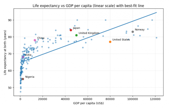
So we need to think about what this plot tells us. First of all, we can see that the curve is not straight. The gains are greatest at the lowest levels of income, and they flatten out heavily as higher income levels are reached, and that flattening is crucial. You can put a straight line correlation onto this. This is a mathematical possibility. I've done it here. I've shown this is a linear regression analysis if you want to use the technical language. It's thrown on top of the chart, and it does look as though there is an increase in life expectancy as GDP goes up, but it's a very weak association. You can measure that; I haven't bothered, but this is weak because you can see that the explanation of the variance in the plots at the high end is very weak. They're all over the place. The straight line hardly explains anything, so that straight line is misleading.
But what I have put onto here are some countries, for example, I put on some very large countries. So there's Nigeria, and there's China, and there's Japan, and there's the United Kingdom, the United States, and then there's Norway, and you will notice that these are scattered themselves, and that's important when I get to the explanation. Best fit, straightforward regression lines clearly aren't explaining what is happening between these countries. The straight fit line misleads the eye because it imposes a story that simply isn't true. The straight line says GDP buys more health. But the reality is that this is not the case. That is statistics being used as propaganda, and the US is a perfect example of this.
If we look at the chart, we will see that in practice, the US, which is a very large country, and also a very rich country, does not sit at the top for life expectancy; not by some way. That should prove to us that this naive story, that more wealth equals more health, is not true. GDP per person is not sufficient to explain that link, and it never was.
And in fact, the UK helps explain that. The UK is not as rich as the US as is very clear from the data on the chart. We are way down in terms of average income per head compared to the USA, and yet we have much better life expectancy. That's because life expectancy isn't only shaped by GDP, it's shaped by public provision and, therefore, access to healthcare, social structure and inequality, and literally the focus put upon healthcare systems inside the country in question, and we put a lot of focus on healthcare systems in the UK; the NHS is the closest thing we have to a religion.
So I redrew the chart again, and chart four shows something quite different.
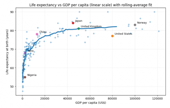
All I've done here is put a rolling average best-fit line on here. It's not a regression analysis at all. It's just looking at the average at the point in time and rolling that through the chart to see how does the average move as we increase the income that we are looking at? You will see now that we have, not a perfect curve because there are one or two bumps, particularly at the lower level, and indeed there's one a little bit before we get to the United Kingdom. But what we see is a very sharp line at very low levels of income, so there is obviously an increase in life expectancy as incomes become positive, let's be blunt. Then it begins to become a little more steady, but still rises significantly up to levels of around $20,000 to $30,000 and after around $40,000, the line is not quite flat, but it's pretty much the case that it is.
There are other factors in play that explain everything about changes in life expectancy once we reach a certain level of income, a bit over £30,000 a year in the UK context.
That is important because what this says is, if we look at GDP alone and look at that initial correlation we had in the first chart we looked at, which can be prepared by an economist using what I would call false statistical representation, you will get the impression that these two issues are directly linked one to the other and very obviously what this chart shows is that is not true. This is the honest version of the system in chart four.
The point is clear, and let's come to the politics of this. The political message in the final chart that I've shown you is obvious. Once basic needs are met, the determinants of life expectancy change. The key drivers are not availability of income and resources, but are inequality in the society, access to healthcare, housing quality, diet and environment, social security and stability. The key issue becomes the politics of care, not income, in that case, and the politics of care is what I stress is important.
So, we're coming up with a totally different narrative, and the GDP fetishism of so many politicians is shown to be literally totally misleading or just wrong. They justify austerity on the argument that if we get growth later, it's worth suffering now.
They justify over-marketisation of our lives because they claim that delivers more GDP, and that will lead to our well-being because life expectancy will be longer when in fact it is now falling in the UK.
They've used this to justify privatisation and cuts to welfare, but this is untrue. Those arguments cannot stack. In fact, they're wrong, and perversely, they're so far wrong that they can actually harm life expectancy rather than deliver it, even if GDP rises.
So the real question is not how do we raise GDP? It becomes, how do we raise the quality and security of life? And that means investing in people and not appeasing markets.
Asking the right question, drawing the same chart, using the same data, gives rise to a very different policy interpretation, and this is necessary.
I'd also mention one other thing, but I haven't done it in this particular video because, let's be candid, I think we're running out of time, and that was to weight each of the pieces of data by the size of the country in question. In the charts you've seen Luxembourg is counted in the same way as India, which is obviously absurd because they're very, very different sizes of country. That would distort the data again and probably weight it more towards the lower end, because smaller countries tend to be richer, particularly if they're tax havens like Luxembourg.
But the point is we always have to bear such issues in mind. Never accept data at face value, in other words. Ask, is it the case that the story you are being told fits with the facts that you can observe? Is the visual dominance of the slide that you are seeing, the chart you are being exposed to, really correct or could there be another answer to the phenomenon you're discussing, in this case, the relationship between income and life expectancy?
Yes, life expectancy and GDP per capita are linked, but the relationship is very definitely non-linear. The straight line best-fit charts show that they distort the truth. The plateau is what we should really be looking at, which means after a point, care matters much more than GDP, and that is where the policy issue really is. We need to care.
So, always ask about data. What does this data hide? Does it imply the story that you think the facts tell you? What story is it trying to force through as a policy issue, which is contrary to best interest as you understand it? And remember, economics often isn't wrong because of data. It's wrong because of its presentation and the ideology that is linked to that data, and that's something you have to understand.
In a politics of care, we will be careful about the way in which we use data. I'm not sure that neoliberalism is. Beware, is my word of caution.
What do you think? There's a poll down below.
Poll
Tickets are now on sale for the Funding the Future live event in Cambridge on 28 February. Tickets and details are available here.
Thanks for reading this post.
You can share this post on social media of your choice by clicking these icons:
There are links to this blog's glossary in the above post that explain technical terms used in it. Follow them for more explanations.
You can subscribe to this blog's daily email here.
And if you would like to support this blog you can, here:

 Buy me a coffee!

Because Gross Domestic Product (GDP) per capita (per person) is an average, it tells you nothing about wealth distribution.
As the economics joke goes, when Bill Gates walks into a bar, everyone (on average) becomes a millionaire.
In practice, only Bill Gates has wealth, everyone else may be socially deprived.
Bill Gates lives long and prospers, everyone else is not so fortunate.
Capitalists often claim that their policies increase GDP, neglecting to mention how that wealth is distributed.
Agreed.
I should have made that point.
What is that old saying:
There are lies.
Damned lies.
And statistics.
So true, as you so eloquently point out.
With regard to austerity, the simplistic relationship with income and life expectancy that policy makers hold dear simply distorts their perspective; it makes it look as though there is enough robustness in the economy to weather austerity, when in fact there is not.
This takes us back to the problem our society has in investing in what we have as it is always trying to sell the ‘new’ to promote growth.
A salient post.
Thanks
PSR
May I amend your post a little.
There are lies.
Damned lies.
And statisticians.
It is the interpretation of the data that produces false information, the data is neutral.
🙂
Maybe you should add economists
And politicians
It’s evidence-based scientific dishonesty.
What I find interesting, looking at the second gra[h is that there are a lot of low income countries with very similar per capita GDP’s but massivley different life expectancies eg Nigeria & India
I’ve got maths & additional maths O levels, and did a one lecture a week, one year course in statics in 1972/3. And I rember log tables and slide rules, just.
So that post is brilliant, I have just enough fuzzily rembered maths to get it.
But it’s an exzmple of somethong that would require a completely non-mathematical approach to explain on the omnibus – involving a fair bit of abuse of the whole concept of GDP. Illustrations around Judge Dredd and the UK/USA comparison and the NHS would probably feature.
Great post – but now I have to translate it!
Thanks, Robert.
These ones just take more work.