The Office for Tax Simplification published a report on capital gains tax yesterday. It included this chart:
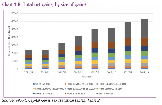
There are three things to note.
One is the almost inevitable impact of conventional quantitative easing (QE) here. The QE process has pumped money into the banking system that has assisted its asset backed lending to those engaged in speculative rather than productive activity in the main. The inevitable consequence in the form of increasing returns to capital is seen here.
Second, this is very clearly an indication of growing inequality in the UK. The increase in the proportion of very large gains is further indication of that.
Third, this does, in itself, justify the review that took place, to which I contributed comment. I will comment elsewhere on the findings.
Thanks for reading this post.
You can share this post on social media of your choice by clicking these icons:
You can subscribe to this blog's daily email here.
And if you would like to support this blog you can, here:


This only identifies the capital gains that HMRC is aware of. What about those that are concealed in trusts, overseas tax havens and by other creative means, some legal and some not?
Indeed….hence my desire for automatic information exchange
When I see stuff like this, I can only ask ‘What did you expect?’.
That’s why we talk of GND, PQE and MMT.