The IFS and the NIESR held an event on the state if the economy this week. They published their slides.
The slide pack includes this astonishing slide:
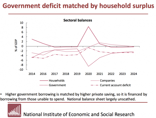
Why is this astonishing? Because it does not show the sectoral balances.
The whole point about the sectoral balances is that they balance. The logic is simple: for every borrower there must be a lender. It's really not hard to understand. Its an accounting fact. So the pattern above and below the line must balance between the four sectors indicated, which are those conventionally used.
But the NIESR chart does not balance. It's designed to show imbalance when according to sectoral balance analysis that is impossible. If in doubt look at 2024: everything is at or below 0%. That cannot happen.
So, what is wrong? It is that what is called 'the current account deficit' is shown as a negative. It isn't. It's a positive. And that is true throughout this plot: overseas holders of sterling are funding the UK, as they have done for some time. This is good ones. But it has been misrepresented as if it is not.
So why misrepresent the sectoral balances in this way? I guess there are just two options.
The first is ignorance.
The second is wilful misrepresentation of the role of the overseas sector, and the support it supplies.
I can't see any other.
But it really does make the case that the IFS is very bad at macro if it is willing to publish this when it is straightforwardly wrong.
Thanks for reading this post.
You can share this post on social media of your choice by clicking these icons:
There are links to this blog's glossary in the above post that explain technical terms used in it. Follow them for more explanations.
You can subscribe to this blog's daily email here.
And if you would like to support this blog you can, here:

 Buy me a coffee!

The IFS once again chooses to play to our irrational fears.
The IFS just seems like an accelerant – like using petrol to put out a fire.
IFS
Injecting
Fear
Surreptitiously
Perhaps it is just a simple error or misunderstanding. A negative deficit is a surplus.
I have always thought that the tendency to show deficits as a %age of GDP, rather than the quantum is deeply confusing when you try to parse relationships. How could you present debits and credits as a percentage? I have always felt this is a deeply flawed way for economists to operate. If you trawl the interent for the facts on the UK deficit it is actually quite difficult to fight your ways past the %ages, to the underlying facts.
I think the there should be an overhaul in the conventional vocabulary of economists: and they think they have wisdom in the use of mathematics applied to economics.
I agree
It’s meant to eliminate the impact of inflation
OK, restate the number series then
But I always want numbers
All it does is conflate a complex soup of intertwined and often ill-understood, hidden, esoteric relationships that is difficult enough to understand, without then putting the whole porridge in the blender and producing a neoliberal smoothie.
I agree with Andrew. For me, saying plotting a thing called “the deficit” is negative is confusing. Mind you, I often get confused in this area, but “real economists” should obviously do better. Especially when it comes to plotting a silly graph!
Correct me if I’m wrong, but the NIESR (not the IFS, to be fair) have plotted the thing called “the current account balance” as shown in the Pink Book – i.e. as negative values, but without thinking how it relates to the other financial balances.
(Note: I don’t really mean to be fair to the IFS)
But they can’t Callum this sectoral balances then!
A current account deficit is a surplus of the foreign sector. So a correct sectoral balance graph would show the foreign sector balance falling from 2016 to 2020, then rising from 2020 to 2022.
Are the IFS and NIESR trying to downplay the economy’s dependence on overseas holders of sterling, at the time of maximum disruption from a no deal Brexit? If, for any reason, increased overseas support is going to be delayed, government hopes of avoiding renewed austerity are doomed to failure.
I really don’t get what they’re about…
Mr Neale,
Would you care to tease out your argument a little more? You seem to be proposing that the avoidance of austerity relies on foreign holders of sterling (but I may have grasped the stick firmly by the wrong end, hence the need for clarification).
Looking at ten year trends of exchenge rates for the £ against $ and € suggests the £ is already trading at a substantial discount to both up to 2016 (roughly circa 20% against the $ for example?), and still a significant discount now. I am not sure how you are factoring that fact (and the prospects for the £ post Brexit and Pandemic) in.
Badly constructed sentence; the discount I am drawing attention is that between 2010-2016 and currently in 2020, when the exchange rate is roughly 20% lower.
I write too hastily too often here, and repent at leisure.
I was trying to make some sense of what the NIESR and IFS were getting at with that graph, and suspect there isn’t any. It is clear that their projections of domestic surpluses and deficits require a growing foreign sector surplus over the next couple of years. But if foreign recipients of sterling postpone re-investing in the UK, because of no-deal Brexit chaos, then something would have to give domestically.
The outcome would probably be either a bigger government deficit than they anticipate, or more unemployment, or both. I’m not sure why I suggested it would be hopes of avoiding renewed austerity that would be doomed. I’m afraid that when I try to work out what Johnson wants to achieve, my mind becomes even more muddled than usual. Can’t think why.
Thank you for such a swift, clear and indeed candid reply. Exemplary, if I may say (and if that seems pompous, I assure you it is not intended); for it is very difficult not to be confused in these strange times, and with a British Government whose main purpose seems to be to keep us permanently confused, in the hope we do not see their abject failure, it is particularly understandable.
Boris Johnson has just delivered a downbeat assessment of COVID-19, and his medical and scientific advice clearly believes there will be more spikes and lockdowns, which he admits will be “a feature of our lives for some time to come”.
There is no “risk-free next step” says chief medical adviser Professor Chris Whitty (CMO).
Yet he finishes by decreeing a Sunday celebration by clapping the NHS again; dressed as a 72nd birthday, his wording is easily interpreted (by the inattentive) as clapping because we have defeated the virus. Classic Dom?
I’ve just finished the Kelton book and see the equation:
Govt financial balance+ private sector financial balance +foreign sector financial balance =0
So the IFS/NIESR is a wilful misrepresentation.
But where is it possible to see past performance, the current position and economic projections of the total picture of the sectoral balances?
It would seem to be a role for the blog to remind us all of how the balances are moving, how they are projected to move and what could be the implications.
Or is that something that someone else : ie HM Treasury, BOE or IFS do already?
Forgive me if this is a naive question but I’m trying to catch up …
Roger
The Office for Budget Responsibility do it
Chart 2.17 here https://obr.uk/efo/economic-and-fiscal-outlook-march-2020/
Richard