These graphs all come from the Guardian this morning.
They explain populism, even though there are flaws in the Gini coefficient methodology which tends to understate inequality as a result.
This is the easiest graph to comprehend:
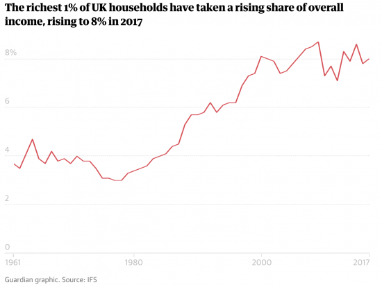 Does the injustice of the need elaboration?
In case it does this is the resulting change in the Gini coefficient, which seeks to measure inequality in a society:
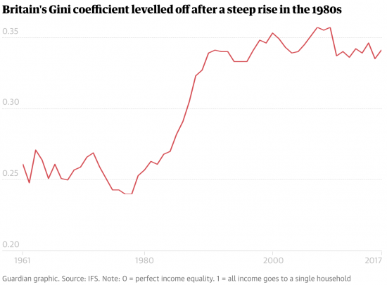
Thatcher engineered a massive redistribution in the UK. And it has become deeply embedded. Blair did not change it.
And the result is we are one of the most unequal societies in Europe:
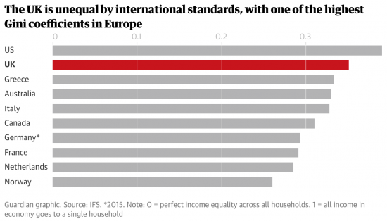
Is it any surprise that people are angry?
But let me say with absolute certainty, Brexit is not the answer.
A Green New Deal would be.
Thanks for reading this post.
You can share this post on social media of your choice by clicking these icons:
There are links to this blog's glossary in the above post that explain technical terms used in it. Follow them for more explanations.
You can subscribe to this blog's daily email here.
And if you would like to support this blog you can, here:

 Buy me a coffee!

Thanks Richard. I’m sure you are aware of John Harris’s excellent outside Westminster work. In Northumberland there are many almost shells of towns in the former coal-mining heartland, Ashington, Bedlington, Blyth for example. The report on Maidenhead was particularly disturbing https://www.theguardian.com/commentisfree/2019/apr/07/theresa-may-berks-bucks-thames-valley-tory-austerity – this is supposed to be one of the richest areas in England, but austerity is biting deep even there.
I read him…
I agree on the GND as an answer – that said, it needs to be expressed in terms that resonates with citizens – that offers them hope – a reason to vote for other than the idiots/populists. Narratives, stories etc – as a counter to the fairy tales from the populists.
Teflon Don, below at 10:44 asks the question which provides impetus to create those stories, to tell citizenry what is the problem (the actual problem) and what is a proposal for solution(s).
Spot on! I guess we should be pleased that the IFS is finally going to produce a report on inequality. A bit too late I would say. It does not need a Nobel Prize or even an economist to look at the data and see the extreme path that the UK has followed since 1980 and how political economy has led directly to the current state we are in.
I agree with you that a Green New Deal is a solution to the two biggest problems we face, climate breakdown and inequality. The greatest opportunity for my region and my community is to lead the green transition and I am chipping away day after day trying to achieve this. Meanwhile the Brexit saga rolls on as a part of the neoliberal othering strategy to deflect attention from the real issues.
How would GReen new Deal impact inequality? Through additional jobs or investment, cheaper energy?
By creating new, well paid, long term jobs right across the country
That’s for a start
I will say this.
Whoever gets in next has to print money. There is no doubt about it in mind.
The Left has to stop preaching and just effing do it. People will see the benefits soon enough if it were done properly.
Agreed absolutely PSR.
In the end money is not a ‘thing’ but a promise…
The government has to be in charge so they’ll print it – or not.
That’s why I always suggest that Osborne was an MMTer – he just used this realisation to shaft the electorate, whilst suggesting he hadn’t.
Editorial in the Guardian today, that means I’m not the only one understanding that “Populism”is a symptom, not the illness. One hopes that there is someone who knows how to fix the problem without killing the patient!
[…] of the requirements are, for our government, far too close for comfort. And note, too, some suggestions of the causes…. Posted in:Posted in: Neoliberalism Philosophy Politics […]
Superb choice of graphs!
Billionaire Dalio made the same point on growing inequality in a 60 Minute interview – https://www.cbsnews.com/news/ray-dalio-capitalism-needs-reform-wealth-inequality-is-a-national-emergency-60-minutes/
He clearly hired a group of people like you to assemble many such graphs in his April Linkedin post
https://www.linkedin.com/pulse/why-how-capitalism-needs-reformed-parts-1-2-ray-dalio/
Indeed, good graphs