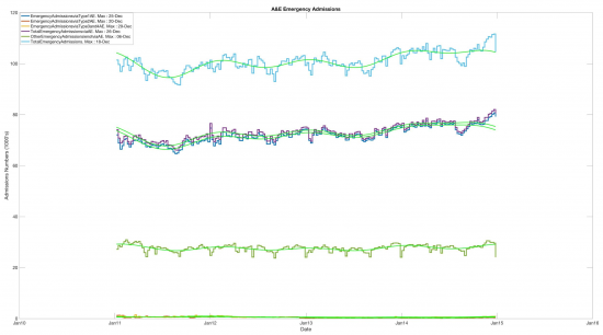
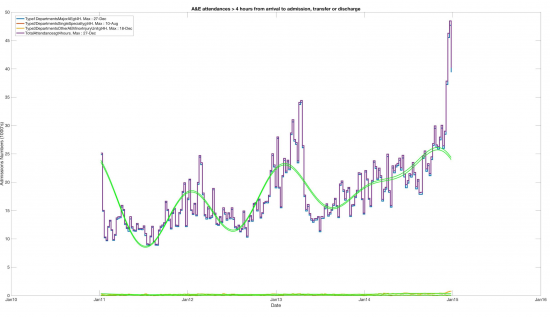
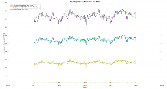
Sean Danaher has completed his review of A&E admissions data from the NHS, completing a process I started. He has summarised the findings in three charts:
And:
And
(Click on each chart and then click again on the version that then comes up to get large scale versions)
The summary is that emergency admissions peak in December: in fact Christmas Day is the peak for one type of emergency admission, but the message is clear and is that emergency admissions are a winter phenomenon exacerbated by Christmas.
One the other hand, peak admissions are in July or very early August depending on type.
This proves the point that A&E per se is not the problem for admissions or delays. Nor is it GP overflow work that is causing the A&E crisis: if such work can be easily handled in volume in the summer without ever there being a fuss no alternation in GP services is required to handle it.
Instead what is required is more chance for people to get into hospital itself or back into the community once there. And as the middle chart shows, there are increasing problems in doing this: things are getting worse.
But let's be absolutely clear: making GPs open seven days a week will have no impact on this, at all. Minor conditions that they can deal with are not causing the A&E crisis.
Thanks for reading this post.
You can share this post on social media of your choice by clicking these icons:
You can subscribe to this blog's daily email here.
And if you would like to support this blog you can, here:


A few technical details but probably too Nerdy/Geeky for most
1) The base data in original Excel format is from the NHS website https://www.england.nhs.uk/statistics/…/2015/…/2015.06.28-AE-TimeseriesBaG87.xls
2) The code is available as usual if there is interest; as previously it is MATLAB
3) The graphs in JPEG format but higher quality (vector) graphics are . available in other formats such as EPS (encapsulated PostScript)
Thanks Sean
Much appreciated
Richard
Many thanks for this analysis … we need more of this kind of data based information … unfortunately, the mainstream media rarely provide us with such analysis
Hi Richard/Sean,
I did a quick sketch around the data too – and generated a (weekly) seasonal subseries chart around the data that illustrates the seasonlity/summer uptick (in June/July at least): https://blog.ouseful.info/2017/01/18/weekly-subseries-charts-plotting-nhs-ae-admissions/
Tony
Yet more evidence
I gather Labiyr have noted this data….
Richard
I still think it would be really useful to show the data as a time series Capability Chart (Control Chart) to see what the upper and lower limits are and what the variation is, i.e. normal or special. The work of Simcox and Dodds (Journal of Improvement Science) is most useful in this regard.
I believe that a control chart would indicate the system of attendances in A&E is in control and there is no need for system change such as 7 day working etc. It works very well for LOS data.
There are no spare GPs’ available…and according to the GMC there are 4116 General Practitioners from the EEA registered to practice within the UK.
How many will remain after Engexit (AKA harikariexit) is, as yet, unknown.
Add to that the 1000 non-doctor GP assistants who will be “trained” to assist the dwindling supply of real doctors (at a cost of £50 million plus).
Then in their spare time (the 10 hours a day remaining) they will be assisting A&E by treating those who shouldn’t be at A&E….
I listen to the prats from Londinium prattling-on as if there is an endless line of waiting GPs’ at hand…..whereas my local practice gets by with “lent” doctors from other practices, and the new practice building is now converted into residences because no staff were available at the time, and no funds available either. So 4300 patients are served by what is, literally, a three-bed semi…with no parking, surrounding residences, and late-opening not allowed because of disturbance.
London really IS another world, and the rest of the dis-United Kingdom it’s chattels…
Agreed