I admit Chris Giles is not my favourite commentator in the FT, or anywhere else come to that. He has far too great an ability to reveal his true agenda behind thinly veiled gloss to ever appeal very much. Take an example from this week when he said:
One of the most irritating clichés in modern Britain is a tendency to link society's ills with rising inequality. From the rise of populism to higher levels of violence, it is rarely long before someone says a widening gap between rich and poor is to blame.
He continued:
Calling for action to help the poorest or to address inequalities is entirely legitimate, but any call to arms should not be motivated by a desire to correct a deepening gulf – because that has not happened.
His reasoning is:
Last week, for example, the official income distribution statistics were published. Before housing costs, the Gini coefficient – the most widely used measure of inequality – was no higher in 2016-17 than it was in 1991. After housing costs, inequality was at its 1994 level.
But this assumes that the Gini coefficient is a reliable measure of inequality. There are good reasons for thinking otherwise. Alex Cobham, chief executive of the Tax Justice Network is one of those who argue it is not. He has written quite extensively on the subject, often with Andrew Sumner of King's College London. I link here to a blog they wrote for Oxfam. It happens to be a more accessible form of their work. In it they explain the Gini coefficient as follows:
The Gini reflects the difference between the actual cumulative distribution of income, or anything else in a population, and perfect equality. A Gini value of zero would mean that the distribution is completely equal and a Gini value of one would mean that one person had all the income and everyone else nothing.
In principle, this sounds like a good measure. And it has been widely used. But there are real issues.
First, there is a massive problem with finding out what the rich really earn, or own. They are not inclined to tell us. Gabriel Zucamn now suggests as a result that most tax evasion (not avoidance: evasion) is by the very wealthy. That means the surveys on which Chris Giles hangs his hat may be profoundly wrong. Tax havens obviously massively exacerbate this, but so too do difficulties in establishing who really owns companies and land and buildings.
And, second, the way Gini is constructed means the data is very sensitive to changes in the middle of the index - i.e. what happens to the middle classes. I don't for a moment dismiss the importance of the middle classes. But the real issue in inequality is the extremes. And as Cobham and Sumner explain (I have edited, lightly) this is because:
[T]he ‘middle classes' — more accurately the middle income groups between the ‘rich' and the ‘poor' (defined as the five ‘middle' deciles, 5 to 9) — tend to capture around half of GNI — Gross National Income wherever you live and whenever you look. The other half of national income is shared between the richest 10% and the poorest 40% but the share of those two groups varies considerably across countries.
This then means that the real issues may not be reflected in the Gini coefficient - which is terribly convenient for those who want to dismiss the issue of inequality. There is an alternative though, which is the Palma ratio. Again, as Alex Cobham and Andy Sumner put it (again, lightly edited):
Chilean economist, Gabriel Palma suggested distributional politics is largely about the battle between the rich and poor for the other half of national income, and who the middle classes side with. So, we've given this idea a name — the Palma Ratio. It's defined as the ratio of the richest 10% of the population's share of gross national income (GNI), divided by the poorest 40% of the population's share. We think this might be a more policy-relevant indicator than the Gini, especially when it comes to poverty reduction.
Their research found three things. First, they confirmed the robustness of Palma's main results over time: there is a remarkable stability of middle-class capture across countries, coupled with much greater variation in the 10/40 ratio.
Second, they found that the Palma might be a better measure for policy makers to track as it is intuitively easier to understand for policy makers and citizens alike. For a given, high Palma value, it is clear what needs to change: to narrow the gap, by raising the share of national income of the poorest 40% and/or reducing the share of the top 10%.
And third, they found some tentative but striking evidence of a link between countries' Palma and their rates of progress on the major Millennium Development Goal (MDG) poverty targets.
Of course, this was controversial. Some people liked the findings and others did not. They set out a table of who fell into what camp:
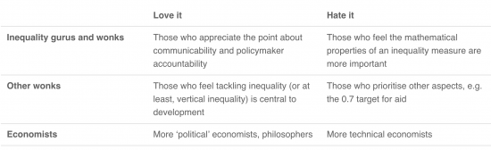
I couldn't possibly guess where Giles might fit into this. But I have a feeling the phrase 'bottom right' might have been created for this purpose.
I make three points. The first is that reliance on data alone can be wrong, especially if the data may be garbage because of flaws in underlying information collection.
Second, data is not value free.
Third, as such to say, as Giles does, that there is no issue with inequality is just wrong. To do so is to just willfully turn a blind eye. And that shoots any claim to credibility on his part on this issue to pieces.
There is another perspective on this from The Equality Trust here.
Thanks for reading this post.
You can share this post on social media of your choice by clicking these icons:
There are links to this blog's glossary in the above post that explain technical terms used in it. Follow them for more explanations.
You can subscribe to this blog's daily email here.
And if you would like to support this blog you can, here:

 Buy me a coffee!

The Gini coefficient show be banned. The Gini coefficient falls if a country adds more workers on low pay, e.g. via immigration while the bosses pay themselves more (because the bosses then make up a smaller percentage of the total population). Consequently a falling Gini coefficient does not mean falling inequality. Either the FT are not good at maths or they are being deliberately deceitful.
The wealth and income share of the top 1% or top 0.1% is simple to understand. It is difficult to justify why this should rise over time, and very easy to understand how as the 0.1% moves away from the rest this begins to destroy democracy and society in general.
And you have to look at wealth as the 0.1% typically gain significantly from asset price inflation rather than income which also has the result that their influence distorts the rules of economy in a way that is not overall beneficial.
Well said, Charles
Increasing inequality of wealth was at the heart of the Picketty revelations and it was Picketty that popularised the “call to arms” that Chris Giles is now so busy resenting. No doubt Giles knows this so “deliberately deceitful”, as you put, it is the more likely option in this case.
Charles Adams says:
“….Either the FT are not good at maths or they are being deliberately deceitful….”
A possible explanation but… could also perhaps indicate:
The FT is deliberately bad at maths and not very good at being deceitful (?)
The Palma ratio has many of the flaws of the more established method. For example, if Adele gives her marvellous voice a rest from recording and touring for a year, inequality would go down. As a whole though the UK would be worse off from the drop in her income.
If a thousand people earning 600 Euro a month in Craiova decide to up sticks and come to the UK and earn £1500 a month, then inequality in Romania would go down and in the UK it would rise on the Palma measure. Yet the UK would be better off, and the workers too assuming they have acted rationally.
What’s really needed is measures showing equality of opportunity, not outcome.
Shall we live in the real world?
“Shall we live in the real world?”
Do we have to? It’s distinctly suboptimal.
(Or as they say in these parts, ‘Shite’.
Assuming that your conclusions are right (which they aren’t, necessarily), what happens “As a whole” has no bearing on inequality. Its a moot point.
The Scottish Government has an interesting set of Purpose Targets, one of which is called Solidarity (not the usual definition!). The Solidarity Target aims to increase overall income and reduce income inequality, and the inequality measure it uses is the Palma.
The Palma results are based on Scottish Government analysis of the Family Resources Survey – as Richard might say, administrative data would be better than survey data, but it’s (possibly) better than nothing.
This was last published in 2017 at http://www.gov.scot/About/Performance/scotPerforms/purposetargets/solidarity and is due to be updated in June 2018.
Palma data is plotted there from 1999 to 2015/16.
The Palma ratio is 1.38 for 2015/16, a significant increase from 1.15 in the previous year.
For some reason, the 2017 report links to an Excel Solidarity spreadsheet with rather old 2013 Palma data from the OECD – which has the UK with Palma = 1.5, ranked at 33; Scotland had Palma = 1.12, ranked at 19.
The latest OECD data, for 2015 at https://data.oecd.org/inequality/income-inequality.htm, has the UK Palma unchanged at 1.5. Indeed the value has hovered around 1.5 since at least 2010.
The OECD does not provide a result for Scotland. However (if you trust the Scottish Family Resources Survey on Palma), it looks like despite the recent worsening to 1.38, Scotland is still a bit less unequal than the UK as a whole.
I only discovered that the Scottish Government has been using Palma by accident, and would be interested in exploring further. For example, do you know how the OECD estimates Palma? Does the UK publish Palma data?
[…] am grateful to George S Gordon for highlighting the fact that the OECD publishes the Palma Ration (explained here) for the UK and […]
In January you published a piece on the shortcomings of GDP. This on Gini suggests we need a comprehensive review and reformulation of the metrics we use to describe “how we are doing”.
Agreed
“….Before housing costs, the Gini coefficient – the most widely used measure of inequality – was no higher in 2016-17 than it was in 1991…….. After housing costs, inequality was at its 1994 level.”
I expect somebody can offer a explanation why when making guesstimates of relative wealth or poverty it is considered reasonable to ignore the (by far) largest component of most households’ regular expenditure. (?)