I am grateful to George S Gordon for highlighting the fact that the OECD publishes the Palma Ratio (explained here) for the UK and other OECD countries. This is the chart:
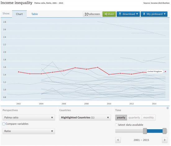
The source data is here. Only the USA, Turkey, Mexico and Chile are worse than us in OECD linked states.
This is the EU data:
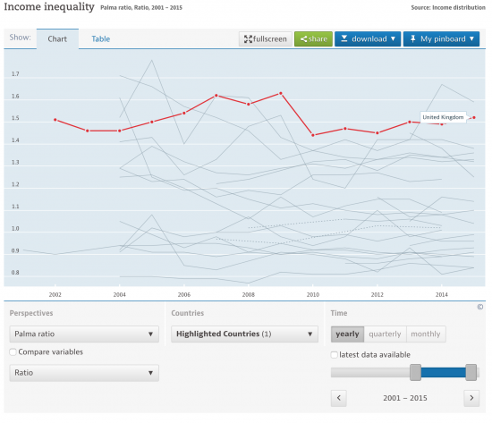
Only Lithuania is worse than us in the EU right now. And you wonder why we voted for Brexit?
And for those who think things have improved since 2008 note this data published by the Scottish government on its Palma Ratio:
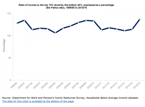
The latest data, not so far reflected in the OECD sourced charts shows a substantial increase in inequality.
It looks like Chris Giles is very wrong to say that inequality in the UK does not matter. I would say it does, very much indeed.
Thanks for reading this post.
You can share this post on social media of your choice by clicking these icons:
There are links to this blog's glossary in the above post that explain technical terms used in it. Follow them for more explanations.
You can subscribe to this blog's daily email here.
And if you would like to support this blog you can, here:

 Buy me a coffee!

Thanks Richard. I havery had debates about this with Marta Bengoa, Tomas Hirst and others on Twitter. Many of their concerns lie with the nature of wealth inequality and wage convergence with the rest of Europe, which has obvious correlations with labour productivity and savings and consumption patterns. The basic income debate is one prevalent remedy but I wonder, has anyone ever mentioned, or thought to have mentioned, the idea of a progressive or redistributive wealth transfer for the median household along the UK’s income distribution? More of a development policy but an idea that might fit into Labour’s new found form.
I keep argu8mg we need a wealth tax
Thanks for the mention Richard.
Ration is not such a bad typo when talking about inequality but …
Corrected!
These measures are based on income.
Is that gross income (before tax and before debt costs and housing costs)?
I ask because there can be big differences in the cost of housing and debt, relative to total income, between the top and bottom of the income distribution. Therefore inequality in disposable income would be even greater than for gross income.
There are also significant differences between what the bottom 40% use debt for and what the top 10% use debt for. The top 10% are far more likely to be leveraged for speculative purposes (i.e. often will add to their income and wealth overall through their debt) while the bottom 40% use debt for every day items and for their only residence (therefore their debt doesn’t provide extra income and doesn’t add to wealth in any useful way because they can’t sell their one asset to realise any gains without becoming homeless).
The same things add another intangible element to the income inequality picture that’s not captured in either ratio:
The lower 40%’s income is less stable and more precarious. This makes their actual life more precarious because their disposable income is lower relative to their fixed costs (rent/mortgage, bills and essential food and fuel) and their savings are low. Any hit to their income, even if only temporary, puts basic necessities at risk.
Is it therefore possible that when a crash comes it maybe has a bigger real life impact on the bottom 40% than on the top 10% even though the income inequality figures show a temporary improvement after each crash?
Also if we were to look at similar charts for wealth we’d expect to see the top 10% “losing” significant nominal wealth as well as income in the aftermath of crashes. However, the reality is that people in the top 10% are often able to use savings and access cheap borrowing even during a crash so can buy up real assets cheaply precisely because the precarious nature of the bottom 40% finances makes them have to sell cheaply to get out of now untenable financial positions. This sporadic transfer of real assets up the income distribution when those assets’ prices are at their nadir is also not captured in these ratios.
The financial and emotional cost of losing your home, business, vehicle or kitchen appliances and still remaining in debt even after giving up the real assets/goods is terribly scarring and that definitely isn’t captured in these inequality ratios.
He’s right. Nothing changed after 2008, banks now are every bit as liable to fail as they were and, as bet has piled upon bet, derivative upon derivative, the leaning tower of debt has got bigger and less stable so the next crash, when it comes (in five, four, three…), is inevitably going to be many times worse. Osborne’s QE gift to already wealth asset holders making them wealthier than they were is typical of what we’re seeing on a grander scale, the rich making both themselves richer and the poor poorer so when that next crash comes, the ones their politico/bankster chums who made them rich are bringing about, they’ll be the ones best able to survive it. After that, well, it’ll be a new world and it’ll be up to the survivors to make of it what they will. Till the crash then, we can expect to see inequality growing far, far worse.
From the OECD: “Income is defined as household disposable income in a particular year. It consists of earnings, self-employment and capital income and public cash transfers; income taxes and social security contributions paid by households are deducted. ”
The key difference between the UK and the rest of the EU ( with 1 exception ) is how healthcare is funded. It’s free at the point of use here, and the poorest consume more. In most of the rest of the EU you have to pay through an SHI system.
So seeing the UK near the top of the table is no surprise. The direction of travel is of more interest, and it’s no surprise to see what’s happening in Scotland with its bigger set of programmes that are of little value to the poor and high benefit to the rich. No road tolls, being one example among many.
You do realise that there is absolutely no logic (but a massive amount of prejudice) in what you have just written?
Rabbi Lionel Blair says:
“From the OECD: “Income is defined as household disposable income….” I think there might be differences of opinion as to what is meant by ‘disposable’ income. I’ve seen what I consider to be highly inappropriate uses of the term to include essential household subsistence spending. Whoop Whoop. Weasel alert.
“… how healthcare is funded. It’s free at the point of use here, and the poorest consume more…..”
Solid argument for reducing the number of poor people then perhaps ? We could save a fortune in healthcare spending. (Heaven knows, Phillock Hammond might even balance his books….?)
Please is there a figure for the modal group of income in the UK, say in £2500 intervals?
The ONS comes closest to this
The latest OECD inequality data, as in the above, is for 2015 – which I assume to mean 2015-16.
Is there UK data for 2016-17?
If not, when will it be published?
I have not checked
It is no surprise to those who are aware of stagnating wages and benefits caps, cuts and freezes, that inequality is increasing, since these disproportionately affect the poorest in society and the well-paid appear to be protected from below inflation pay-rises. However, typical government figures of income inequality appear to state that inequality is falling, mainly due to underestimates of the income of the top 1% in ONS and DWP figures, as pointed out by The Guardian last December (https://www.theguardian.com/inequality/2017/dec/03/income-inequality-is-getting-wider-if-the-stats-count-what-counts). It is good to find an inequality measure (the Palma Ratio) that shows increasing inequality even if the excessive pay received by the top 1% is watered down by the rest of the top 10% and probably still underestimated.
Furthermore, rising income inequality is just half of the picture: the rate of increase in wealth inequality is far worse. Recently The Spectator reported that wealth inequality is high even in countries with low income inequality, such as Denmark, Sweden and Norway (https://blogs.spectator.co.uk/2018/03/you-can-no-longer-reduce-wealth-inequality-by-taxing-income/). The article states, “There is no hope for a sensible discussion on inequality until we properly distinguish between wealth and income. Today, a young family whose earnings lie just within the top 10 per cent of household income (£60,000-ish) would need to spend nothing – and pay no tax – for almost 20 years to amass wealth of £1.1 million – thereby reaching the top 10 per cent of households by wealth. The idea that you can reduce wealth inequality by taxing income no longer makes sense.” Thereby the article hints at a wealth tax, although the rest of the article discusses tax relief for those with the ability to save large amounts of cash. However, it seems that low income inequality alone produces happy citizens (https://www.theguardian.com/world/2018/mar/14/finland-happiest-country-world-un-report) probably because the stress of life is far less if you can afford what you need, even if you pay rent to someone who owns vastly more than they should.
Recently there have been a number of articles focusing on wealth inequality, including those by Owen Jones in The Guardian (https://www.theguardian.com/commentisfree/2018/mar/23/labour-wealth-tax-economy), Positive Money (http://positivemoney.org/2018/02/latest-wealth-data-shows-disproportionate-gains-rich-era-qe/), Oxfam (https://www.oxfam.org/en/research/reward-work-not-wealth), and The Washington Post (https://www.washingtonpost.com/news/wonk/wp/2018/01/04/massive-new-data-set-suggests-inequality-is-about-to-get-even-worse). Wealth taxation and laws on property ownership are probably the only way to, for the former, raise money from wealth, and, for the latter, reduce wealth inequality.
By the way your link to the Palma Ratio definition does not work, but I found a good reference here: http://uncounted.org/palma/
I did some interesting maths (for some at least) on the figures from the Owen Jones article that shows the relative levels of wealth inequality between the top 1000 and everyone else:
Something is needed to reduce inequality, whether it’s a wealth tax, a truly progressive council tax, a Land Value Tax, maximum pay ratios including pension contributions and bonuses, or a combination of some or all. But this article has some amazing figures that got my mathematical mind going.
Wealth inequality is growing at an enormous rate, increased by QE and property prices even during the Credit Crunch and Great Recession. But the situation now is extreme. A mere 1000 people in the UK own 40% of the total wealth compared to 9% owned by the bottom 50% or 32.5 million. The top 10% own 45% of the total wealth.
But what is this proportionally? 9% owned by 50% is 0.18% of wealth per 1% of population. The top 1000 people are just (1000/65m) 0.0015% of the population meaning their wealth is 26,000% per 1% of population! As for the remaining 9.9985% of the top 10% that own 5% of total wealth, this is just over 0.5% of wealth per 1% of population.
But comparing these numbers shows just how immensely rich the top 0.001% really are: they are 52,000 times as rich as the rest of the top 10% and 144,444 times as rich as the least wealthy 50% of the UK!
Many thanks
The Spectator point is well made
Richard
I wonder if there’s any relationship between rising inequality and the balance of the economy? In 1948 the Service sector accounted for 48% of GDP and around 45% of workers. In 2013 it accounted for nearly 79% of GDP and around 80% of workers. There are very poorly paid workers in services, a very disparate group, as well as very highly paid people, especially in financials and other related sectors “servicing” the financials. It could be that the explosion of financial services has not only created members of 0.1% but has provided a service dedicated to ensuring that the highly paid and wealthy remain so and are able to put much of their income and wealth beyond the reach of the taxman. Meanwhile, has there been an equivalent explosion in low paid service sector jobs?
(The service sector is made up of service activities in retail, hotels, restaurants, transport, storage, IT, finance, insurance, real estate, administration and support services, professional, scientific and technical services, education, health, social work, arts, entertainment, recreation, public administration, defence etc. https://www.ons.gov.uk/economy/economicoutputandproductivity/output/articles/fivefactsabouttheukservicesector/2016-09-29)
You raise an interesting point. The expansion of financial services is, of course, related to a parallel trend toward financialism and rent-seeking.
At the bottom end end of the scale, the structural shift toward services saw a parallel rise in low-paid jobs in hospitality etc. as you say. That same shift also saw a decline in trade unionism as the unions’ predominantly male, industrial, blue collar base declined in relative terms.
That decline in blue collar union membership affected the Labour party and was one factor in the emergence of New Labour. The neo-liberal, monetarist regime(s) that encouraged financialism and de-industrialisation also dropped the commitment to full employment and instituted permanent unemployment – that too, has increased inequality, depressed wages and weakened the bargaining power of unions.
So, yeah. It all ties in.
Yes, the decline in Unions has had manifold effects, probably none of them good. In the 60’s & 70’s they were said to be too powerful, were a drag on the economy and some commentators said that their bargaining actually led to lower wages for members. Whether or not that was true they were the only thing standing between exploitation and decent working conditions. I don’t know if Thatcher planned to emasculate the Unions as a body, but she, and others, certainly determined to destroy the NUM, although you could say Scargill was also culpable. This paved the way for an all out attack on unionism, (and also Labour party funding) and a shift in the balance of power and regulation away from business and on to labour. The same happened in the USA under Reagan, and in the UK anti-worker legislation wasn’t rolled back by Blair, but quite the opposite.
So now we have millions of low-paid exploited workers, and the unemployed, represented by nobody and shunned by political parties, and we have the like of Rachel Reeves having declared that “We are not the party of people on benefits. We don’t want to be seen, and we’re not, the party to represent those who are out of work,” unaware that a lot of people on benefits are in work.
So, what I’m suggesting, perhaps, is that inequality is the result of many factors of which neoliberal economics/politics is the nexus.
Read Democracy in Chains by Nancy MacLean
The unions were tribes powerful enough to compete with the Establishment, which is why they were broken up. Much becomes clear if you consider society in terms of competing tribes.
Bill Kruse says:
“The unions were tribes powerful enough to compete with the Establishment, which is why they were broken up. ”
In the end they were won over to fighting on the enemy’s terms.
One description says they were always more concerned with establishing and maintaining ‘differentials’ than they were in seeking fair outcomes. As such they were easy prey to neoliberal infiltration and destruction.
They lost too much public support by being seen as just one more powerful vested interest group struggling to get their snouts in the trough. And having succeeded in making their Labour Party electable they allowed it to be taken from their control.
The decline and fall of trade unionism in 20th Century Britain is a sad and salutary story.
“Only Lithuania is worse than us in the EU right now”
So Bulgaria and Romania are more equal than the UK?
So what?
Are you saying we should aspire to have an economy like those countries rather than ours? That the average worker is better off there than here?
Bulgarians and Romanians flock to our country and would laugh at your whining.
You clearly see the world in black and white. I don’t. No one but a fool looks at a single indicator to assess complex situations.
That said, those who live here and have no intention of moving will perceive this inequality as a real feature in their lives. That you don’t says a lot.
No one expects complete equality. To be an outlier, as we are, suggests something deeply wrong in our society
‘Seymour Sense’ says to me. I know this is bollox, so I’m going to invent a silly pseudonym so that some may be foolish enough to infer I’m ‘clever’.
Ten out of ten for that ‘Seymour’.
Seymour sees less apparently.
His has got to be one of the dullest examples of whataboutery that I’ve seen for some time.