There has been some discussion on the blog, on Twitter and elsewhere since Saturday's debate at the Royal Society of Medicine on NHS England budgets (Wales, Scotland and Northern Ireland have their own health administrations). I thought adding some data to the debate would be useful.
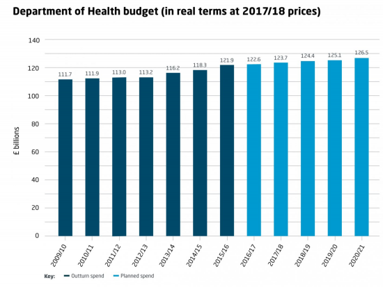
Spend, actual and projected as per the Kings Fund, all state in 2017/18 prices, is as follows:
This looks like a steady increase, but it is not population adjusted. I have used mid-year population estimates for 2009 to 2016 for this from the ONS, for England alone, and have projected average growth for 2009 to 2016 for the remaining period (which is fair given current discussion on Brexit plans). Having done this spend per head looks like this:
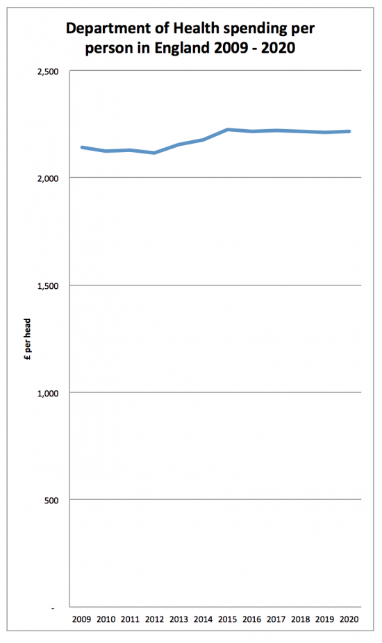
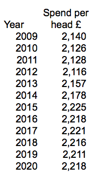
The data in tabular form is as follows:
I stress, some of that data is, of course, estimated but what is clear is that there was an era from 2009 to about 2013 when austerity really hit home; then there was an Osborne pre-election loosening, and now a slight downward turn.
The problem is that the data does not tell the whole story. The figures are in 2017/18 prices but that's adjusted by normal inflation. However, as the Institute of Actuaries have noted (and they're good with numbers) medical inflation is higher than CPI. Take this graph:
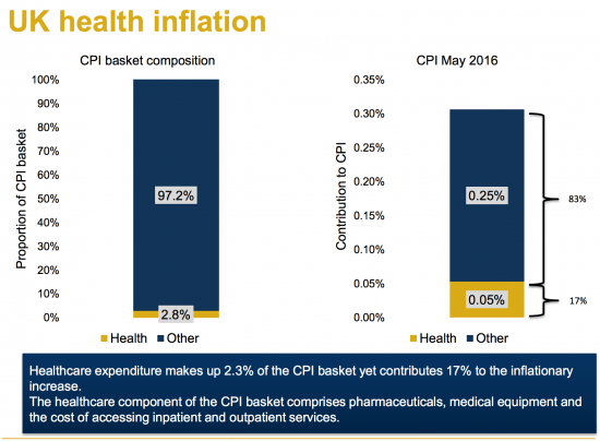
Medical inflation cannot be factored out with CPI: if the medical inflation rate was used to adjust the budget it would be markedly downward. I cannot find the chart as yet: if anyone has it, please share it.
And then there are other factors to take into account that they note, like population:
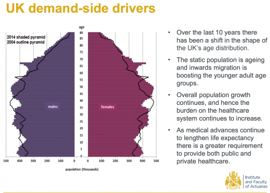
The number of expensive people in the population is growing: averaging by head doesn't give a true picture in that case. Any sensible allocation suggests that means a real cut in ability to supply those actually creating demand and so a declining budget against weighted demand.
The cost of some treatments is growing too. Take this on cancer care costs:
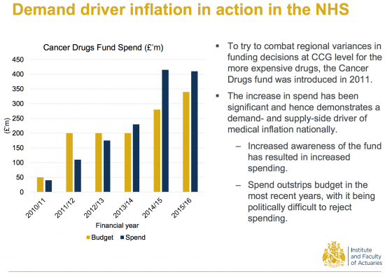
Costs per patient are rising as the possibility of treating them increases with medical advances.
The result is that other resources are reduced. Take this on the number of beds:
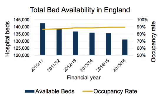
The data for that is here.
I could go on, but the point is actually a simple one, or rather a series of simple ones.
First, when health care costs are rising, and they are, a static budget means declining real care per provided per patient, and that is what is happening.
Second, when the population is ageing averaging per head gives no indication of whether the budget is adequate when the elderly cost far more per head in medical terms.
Third, when the failure to take the first two facts into account means other resources, like available beds, are reduced the result is that a system that was already working near its limits feels and behaves like one that is moving out of control, because it is.
And fourth, when the pressure on a system becomes too great it breaks. That's a simple fact. And declining health care budgets, which are what we have when healthcare inflation and ageing population are taken into account, means that the system we have will break. It's just a matter of when and not if at present.
And the problem is, as I noted on Sunday, no one is taking responsibility for this because no one now knows how to. But in the meantime the right wing ideologues who have deliberately created this situation argue that all is well as absolute spend is rising. That reveals either remarkable economic illiteracy, or remarkable indifference, or both, on their parts. But however looked at the data also shows that they are wrong. And that's why it's worth noting.
Thanks for reading this post.
You can share this post on social media of your choice by clicking these icons:
There are links to this blog's glossary in the above post that explain technical terms used in it. Follow them for more explanations.
You can subscribe to this blog's daily email here.
And if you would like to support this blog you can, here:

 Buy me a coffee!

I dare not click on that link to the Institute of Actuaries just in case it tells a different story.
Medical inflation in the private sector ( opticians, much of dentistry, slimming world classes, over the counter drugs at Superdrug, medical tourism, cosmetic surgery etc ) seems to me anecdotally to be going in the opposite way from medical inflation in the public sector.
Anecdotally! Ah well that’s all the facts that we need then.
For something not anecdotal here’s some data on medical CPI
http://www.aei.org/publication/what-economic-lessons-about-health-care-can-we-learn-from-the-market-for-cosmetic-procedures/
It’s from the USA but it shows a stark difference in medical inflation between sectors
I have to say the source and subject is pretty unreliable as far as I am concerned
Richard
Very good post. It seems that we may need some Activity Based Costing to arrive at what the required NHS budget should be. Or is ABC out of fashion now days?
Again I have to say that it is a deliberate ruse on behalf of the Tory party to make things worse in all public service areas in order to create the excuse to change the system yet again and induce further privatisation and rent seeking.
[…] http://www.taxresearch.org.uk/Blog/2017/08/22/nhs-spending-data-necessary-spend-per-person-is-fallin… […]
We need to increase the NHS budget to around 12% of GDP from the current position of around 9%, over the next 5 to 10 years.
The NHS is so brilliant and efficient that we may not need to higher and certainly – as long as we keep it public – nowhere near the levels of private healthcare systems (like 17% of GDP in the US). As US GPD per capita is higher, they spend 3 times as much as the UK per person and still end up with a worse outcome, namely lower life expectancy.
Which is pretty staggering…
I agree with your objective
But actually, I would focus on actual spend: GDP will increase as a result and the ratio will end up being what it is
The Cancer Drugs Fund bit is a bit misplaced in the context of this discussion, I think, or at least is far too complicated a beast to demonstrate the underlying point that healthcare costs are rising.
NICE act as the gatekeeper for what new medicines are funded in the UK (England and Wales), and only recommend products that meet cost-effectiveness thresholds using a universal measure of health outcomes (the quality-adjusted life year) and a standard willingness to pay threshold (around 30k per QALY, though rare/end-of-life diseases including many cancers already get special treatment with a higher threshold). This strict approach means that pharmaceutical companies have to offer their medicines to the NHS at a price that leads to it falling under this threshold if they want UK public funding, without using the somewhat optimistic assumptions in their modelling that might get accepted elsewhere but will be met with short shrift by NICE. This also means that the NHS often gets a VERY good deal compared with other markets; I work for a pharmaceutical company and on at least two products I have worked on, the discounted price offered in the UK was the lowest in Europe.
The CDF was set up as a political stunt by the Tories in response to lobbying and negative media exposure about lack of access to very expensive medicines that often did not offer significant advances in outcomes relative to the status quo, and therefore failed to meet NICE’s criteria for a positive recommendation. Cancer is a very nasty disease but there are lots of very other nasty life-threatening diseases and it is unclear why cancer deserved special treatment in this way. As drug companies knew that they could ‘circumvent’ the process , they just held out on price and waited for a negative NICE recommendation in the knowledge that they could then go on to secure funding through the CDF which was, until last year, run by NHS England (totally separate from NICE), and which had much looser criteria than NICE for funding cancer medicines.
Money spent via the CDF is therefore money that wouldn’t have been previously spent were it not for this political decision, because the drugs would not have been considered previously to represent good enough value for money. And of course CDF costs went up over time, because the fund covered an increasingly large pool of drugs over time. The spiralling costs can also be blamed, at least in part, due to the government giving drug companies a get-out clause and disincentivising companies from lowering prices.
[Note: The CDF was scrapped last year, and a new version put in place under NICE’s remit/authority]
I think figure 3 in the 2015 Kings Fund piece is illuminating, and shows that the growing problems in the NHS are no coincidence.
“As Figure 3 shows, the ten years up to 2020/21 are likely to see the largest sustained fall in NHS spending as a share of GDP in any period since 1951.”
https://www.kingsfund.org.uk/blog/2015/10/nhs-spending-squeezed-never
Hi Richard, do you have anything to say about companies like EMIS, who try to simplify routine jobs such as writing prescriptions or booking doctor appointments? We all know how hard it is to get a doctor to see you sometimes. Since I gather you are married to a GP, you must be no stranger to the pressures of handling the queue
EMIS is a practice data manage system now largely replaced by System One
There’s another effective cut that we don’t talk about: the overhead cost and the inefficiency of market approaches to healthcare in general, and the specific subtraction from patient care embedded in the profit margin taken out by private sector service providers.
Even an increase in overall funding would be a cut, with that eating away at the services.
Richard, i watched the whole thing via the facebook stream – it was a great talk from yourself.
The image of you tearing a £10 in half is a powerful one.
Someone – possibly me unless someone has done it already – needs to rip the video off the facebook stream of Just your bit explaining about how government ‘debt’ is essentially cancelled out when tax revenue is paid back.
It needs to go on youtube – its a critical, easy to digest, simple explanation you laid out for why investment and government borrowing isn’t some taboo.
It needs to be shared everywhere.
Thanks
I am not aware that anyone has done that and I do not know how to
Interesting blog, thanks for sharing. I was wondering if you could advise me on any data sets I could look at to ascertain NHS spend per capita by age, going back as far back as possible?
If anyone has it the King’s Fund will, I suspect
But I cannot be sure