The Telegraph published this infographic a few days ago. I'll take the risk of sharing it. The data was produced by Smith & Williamson, a firm of accountants and wealth managers based on ONS and HMRC data (click on the graphic for a bigger image):
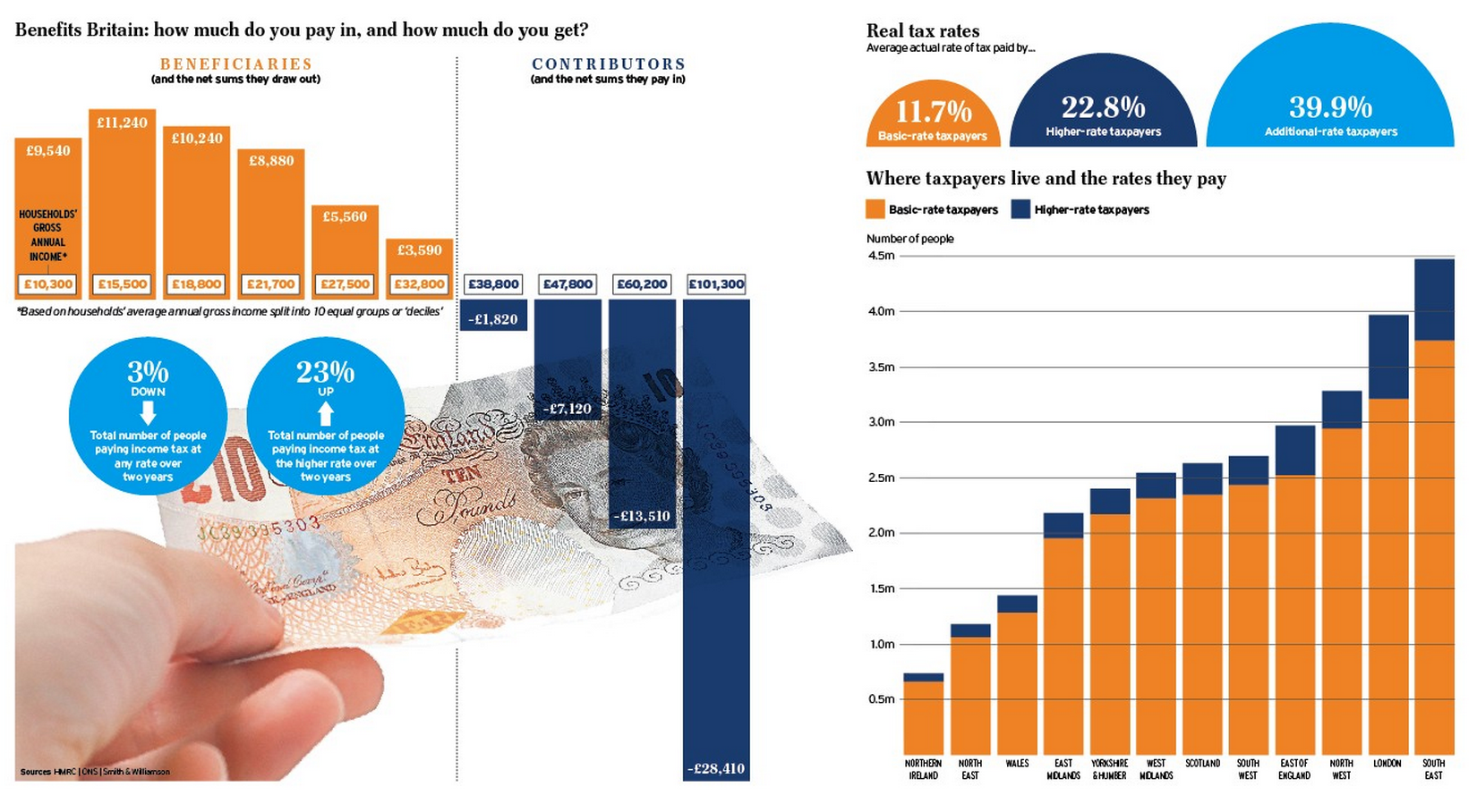
What's the point of reproducing it? Firstly, it's look at those effective tax rates. 11.7% for basic rate taxpayers and 22.8% for higher rate taxpayers. Shall we stop the myth of overtaxing?
Second, the effective tax rate of additional rate payers is highly unlikely to be 39.9%. That's the rate on their income. That ignores the fact that they will shelter income in companies, capital gains, offshore, and so on.
Third the reason why the top earners pay so much is because they can: no one else has the income to do so. That does not mean that the income does not exist. It refers to the way it is distributed. High tax has to compensate for the fact that markets inappropriately over-reward those at the top because they have control of the process of deciding who will be paid best and they decide to pay themselves.
The next result is more than half the UK draws more from the state than it pays. And if that did not happen then there'd be remarkably little wealth and an awful lot of misery left. That's what this infographic says. It doesn't say there is too much tax or how unfair it is that more than half take out more than they contribute (when you'd expect that to be half anyway). The real message is just how unequal society is that some can pay so much and how much more needs to be done to improve equality.
Thanks for reading this post.
You can share this post on social media of your choice by clicking these icons:
There are links to this blog's glossary in the above post that explain technical terms used in it. Follow them for more explanations.
You can subscribe to this blog's daily email here.
And if you would like to support this blog you can, here:

 Buy me a coffee!

This is worth a read:
http://nymag.com/daily/intelligencer/2014/02/i-crashed-a-wall-street-secret-society.html
No surprise there then!
“it’s look at those effective tax rates. 11.7% for basic rate taxpayers and 22.8% for higher rate taxpayers. Shall we stop the myth of overtaxing?”
That’s average of course. The 22.9% would include someone on £45k as a higher rate taxpayer. Someone on £120k is paying an effective rate of 34.67% (39.34% if you include NI). For someone on £150k the figures are 35.73% (and 39.9%). As you often do, you take an average and imply it applies to higher incomes. It seems there are lies, damned lies and the way you are prepared to use statistics.
“the effective tax rate of additional rate payers is highly unlikely to be 39.9%. That’s the rate on their income. That ignores the fact that they will shelter income in companies, capital gains, offshore, and so on”
“They’re all at it”. An easy assertion but one that you have no evidence for. It would be just as easy to assert that all lower paid workers are ‘doing a bit on the side’ in the black economy. Both assertions are equally fallacious.
The average is the evdience
The average income of 5 tramps and the Queen would suggest that tramps had a great lifestyle. So, no, the average isn’t ‘evidence’.
The absurd is not evidence
When I looked at this over the weekend I was surprised to see how few higher rate tax payers there are in London.
You are only surprised becasue people have this notion that everyone working in London is a City Boy earning lodsa money. In fact they’re the minority and the vast majority of people that work and live in London are just normal everyday people eraning normal everyday wages.
I am repeating myself from yesterday but much of the income of the higher groups was created by the work of the lower. The surplus value they create goes to their employer as part of their profit.
2) these sums must include all the pensions, the health and education we receive. One of my family earns less than £20,000 and as a single person, gets a lot less the £10,000 suggested by the graph. As you say these are average figures. Many individuals in the lower deciles must also be net contributors.
The wealthy love to bang on about income tax, as though it represented all taxation. As you well know and have written about time and again, NI contributions and VAT represent a greater proportion of tax income for the exchequer, and have a much greater impact on the poor than income tax. Most of the very poor don’t pay ANY income tax, and so raising the threshold does little to help these folk. On the other hand, this coalition RAISED VAT and have kept the threshold for NI contributions the same. ONS figures (which you have posted) show that the bottom decile pay proportionally more tax than the top decile when ALL taxes are taken into account.
As you point out, more income tax comes from the wealthy because they have so much of the income, but talking about income tax alone is obviously nothing more than deliberately misleading pro-wealth propaganda.
There is very little said or documented in public about the big movers and groovers, who are mainly the ones who avoid the taxes as much as possible , I am thinking of the self employed and directors, They have the ability and means to move assets and money around that the PAYE employee cannot. The PAYE employee has all their deduction taken before receiving any wages whatsoever, and has little chance of reclaiming and manipulating their finances to reduce their tax bill.