
I have posted an infographic on the household analogy this morning, but as part of our experimentation on how to turn these infographics into carousel presentations on Instagram, TikTok and YouTube Shorts, we (or actually, Sam, our summer intern) tried another version which we think might be more suited for that purpose, which is this:
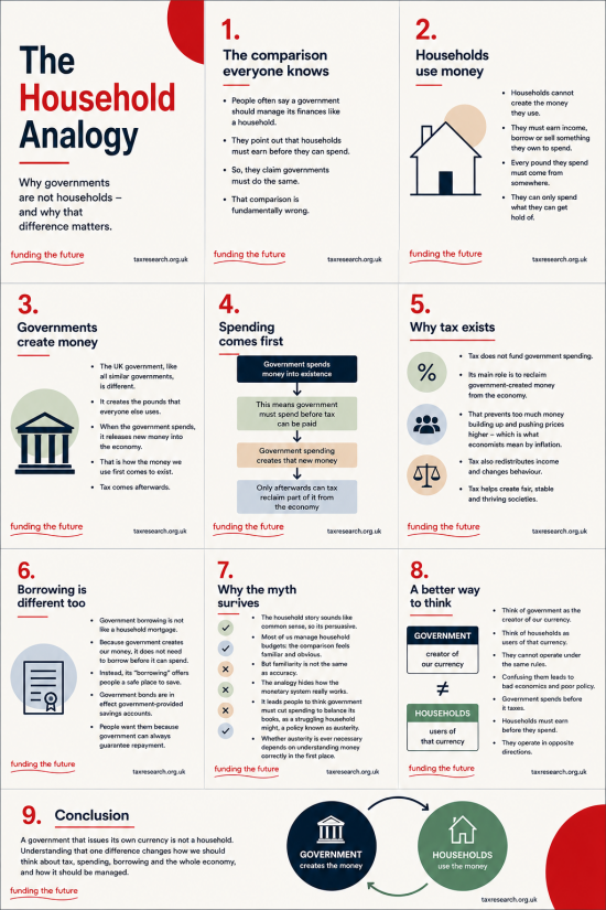
I would stress that we created this to split it into parts for social media presentation, each box being its own slide for that purpose. However, here is an obvious question to ask. Do you prefer the above print-style version or the version in the handwritten style we have been using, which is this:
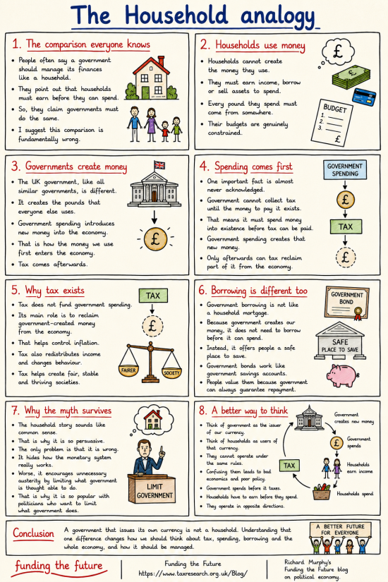
Thanks for reading this post.
You can share this post on social media of your choice by clicking these icons:
There are links to this blog's glossary in the above post that explain technical terms used in it. Follow them for more explanations.
You can subscribe to this blog's daily email here.
And if you would like to support this blog you can, here:

 Buy me a coffee!

I think 2 columns is easier to view than 3 columns.
Noted
I don’t do TikTok, but thought the 3-column version was in fact a bunch of slides? As a single page, 2 columns easier. I voted both styles, it really is in the eye of the beholder, the new one looks ‘slicker’ but that could work both ways regarding trust etc.
Thanks
I think both could find a use.
Bith will undoubntedly change and develop.
Hi Richard,
I think all your infographics are great!
However, it has occurred to me that whilst the fundamental issue of the household analogy and your explanation of the reality of MMT in a currency issuing country is helpful, there is a bit of a “so what” reaction. People need to understand better why politicians want us to see it that way.
As you and the Bank of England have explained commercial banks also create money and I think it would be helpful to explain the difference between govt creation of fiat money and bank lending. It would also be helpful to compare tax with interest on loans. It seems to me that there is a big issue with interest as it does not take money out of circulation, but instead puts it in someone else’s pocket (the bank). Tax doesn’t do that, it takes the money out of circulation. So it’s better!
Politicians like the household analogy as it lets them off the hook for unpopular fiscal decisions, as does giving the Bank of England, monetary policy and setting the base interest rate. As you have pointed out, stopping paying interest on Reserve Account balances of commercial banks would save about £20b. Shifting a certain amount of “money creation” to commercial banks is the policy you described as “The Treasury View” and it only serves to enrich the City and Bankers. It also leads to crashes like 2008.
If you could illuminate these aspects a bit more clearly, building on your explanation of the Household analogy and Monetary Policy, I think some more “lightbulbs” will come on and things might click into place for your readers! And word will spread!!!
Noted
Both infographics are very good and each can be used for different audiences, so don’t junk either!
I also like the comment about ‘so what?’ being addressed as well as an explanation of how commercial banks work… “ a man walks into a bank and asks for a £10 grand loan…” ( read that scenario somewhere else…:)
The handwritten style is more informal and better for general audiences on social media.
The print version better for people with some knowledge and would work better as part of a video
Thanks
As ever these infographics are a great idea. I voted for the Both option here as they can used for different scenarios.
Minor point with this one is maybe you should include Myth in the title as in “The Household Myth Analogy” as you’ve mentioned it in section 7?
Fabulous typo:
“edperm inenattyion” in the intro
‘Household Analogy Myth’ is good
Each style has a place but I agree 2 columns works better than three
Oops….
Now you know whey I need AI.
This one was beyond it.
I prefer the second one, it’s easier on the eye and it fits best for having all information in one place, by what I mean that its good as a single graphic.
It’s maybe a bit too old school for social media but I personally like that.
Tough, for multiple slides for use on social media I’d go with Sam and pick the first one.
It looks more modern and I guess that’s what people do watch more on Tiktok, Instagram or Youtube Shorts?
It should anyway also having someone speaking the text.
You could do it yourself but I think it would be interesting if everyone willing from your team could have a go?
We are looking at how to record a narrative as well – this is all taking time….but is part of our own self-imposed education brief.
I have been planning how to turn the infographics into presentations, so sets of slides would be useful. Choice of font depends on whether you want an informal style for, say, a group of people who are familiar with each other or a more formal style for an event open to the public. So both styles would be useful.
Line 2: “edperm inenattyion”? Apologies, but I don’t know what this means.
If we had a stable image generator I would publish it.
Presented frame by frame the printed style is probably going to hold attention better due to the variety of illustrations. A good case to use A/B testing. In this new context the first frame has to work double hard (similar to a YouTube title page). I’d retitled it as ‘The false household analory’ and experiment with a typography treatment of the word ‘false’. This sets up a question, intrigue and the promise of an answer.
With the single page infographic the complete narrative is presented altogether. Visual continuity is comforting and the content does not demand to be read in a strict linear logical way. The reader can take their own route to making sense, referring back and forth as helpful. This is especially helpful to systems learning.
Thanks, and noted.
The print style – More professional especially with pushing back against ‘think-tanks’ etc
I just wonder if the print version would allow the infographics to be more easily searched, or for the information to be included in a database?
In the longterm, I suggest this would improve the infographics utility, particularly for newcomers and students of all ages.
Thank you
It may be a matter of horses for courses. The aspect ratio of the ‘modern’ format is more appropriate to a single-phone-screen-per-box format than the other, which begs the question, should you go for a fully 9 x 16 ‘portrait’ aspect ratio for these platforms?
We will experiment. Instagram uses 4:5
I think the print version may be more accessible for people with diverse reading requirements.
I prefer the handdrawn style graphics though.
Thanks
Much as I like the hand-drawn style I think the printed one is easier to read. I also agree that it appears more professional which may then confer greater authority. That said, the handwritten ones will definitely have their place…
Thank you
I think they are too bullet point heavy? They are infographics that look like they were made by people who normally grapple with heavier texts and don’t get why other people can’t.
I think something even simpler is needed to serve the intended purpose.
That is how I learn.
And without the bullet points they are very hard to follow
I don’t feel graphic design is about preference. It’s about effectiveness.
Which do you prefer: a poem or an instruction manual? Well it rather depends on what you are trying to do.
For me:
Original
Folksy style (intimate but is the author credible?)
Personal (“I suggest it’s wrong.”)
Accountable (“Richard Murphy’s Funding the Future)
New
Corporate style (polished but what’s the corporate agenda?)
Impersonal (“It’s wrong.”)
Anonymous (“Funding the Future”)
Two things strike me:
1) Will these infographics be shared without context?
They seem to be designed that way and, if they’re popular, I’d say yes.
If so, providing that context in the graphic — i.e explaining why it exists — becomes important, e.g.
“Economic Myths #7 —The Household Analogy”.
Adding a link to funding the future (a QR code makes it easy for the reader) or even a link to the relevant section of the website would provide further context and would help the reader to delve deeper and/or see how credible the author is.
2) The ‘corporate’ style is currently more anonymous. Does that ‘answer’ the mainstream media / think tanks?
Or is knowing the credibility of the individual behind the advice more important to convince the reader?
If the latter, regardless of style, why not brand the infographics as RM’s work by including a photo (as, for example, Martin Lewis does on Money Saving Expert) and / or a professional credit (or QR code link to a biog page)?
I appreciate your commnts but they would be very time consuming and use space. But we will think about them.
I think the hand drawn one pulls you in better, but the printed one looks more professional and may be more likely taken as fact.
That is why we might use them on cynical platforms.
I voted “both”!
However, the handwritten style is more entertaining as my 7 and 8 year old buddies will attest.
Yes! I have actually had a 7 year old and 8 year old read one of the economic “cartoons” and actually ask rather intelligent questions after I explained what was being presented and discussed.
Brilliant!
@Bay TampaBay.
So it’s official! A 7 year old knows more about how the economy works than Andy Burnham.
I like your infographics but, as usual, there is a time and a place for everything.
For instance TikTok doesn’t really let you zoom in to read such material but Twitter does.
My tuppence worth is that it would be better if you broke the material down into its component parts, 1 to whatever, and do a series with your dulcet tones as a voiceover to reassure everyone that they’re not going mad.
On these platforms there would be up to ten slides, with a description.
Personally I preferred the print version but the facts are very well presented and should help those who are not fully familiar with our money creation system.
I have very much liked the original informal versions, but for this topic in particular I think the more formal design seems more authoritative and would be more effective to counter the pervasive myth of the household analogy. It’s equally clear for someone new to the topic and I intend to share it widely to friends and family. But it would be better in two columns.
I will rework it….
The infographics are a brilliant way of putting across the ideas. Do keep on experimenting and seeking opinions.
Hand-written:
Two columns are better than one. The strong borders on this version are a help to the reader – they reinforce the ideas as a set before moving on to the next panel.
The graphic elements (people, buildings) look a bit “old-fashioned” to me. I think this will be fine for ?older? readers of this blog but might get my “old-fashioned” label from younger viewers in their 20s or 30s. Who is the target audience? I agree that hand-written is less formal and perhaps more appealing to people who’ve already “bought in”.
Printed:
The graphic elements in this version look more modern to me – the presentation more formal.
The funding the future and tax research footers are a distraction. The viewer is frequently reminding themself that the footers are not part of the information content of the panel. Yes to these footers for the infographic as a whole.
Sorry, Richard,
I do understand this is not what we’re debating here, but-
could you please make clear to me …
you say tax is levied after the event/the bringing of money into existence. So what would be the scenario if the money created by government went outside the UK, as must surely happen with contracts involving organisations/traders etc. based abroad?