The Financial Times noted something this morning deeply hidden within data published by the Office for National Statistics.
This unnoticed data is represented by this chart.

It shows the ratio of what is called UK gross national debt (but which is actually nothing of the sort because a significant part of the sum is always owed by the government to itself, and the rest represents deposits placed with the government not used to fund its activity) to GDP, which is the supposed measure of our national income.
This ratio is the subject of obsession among politicians, economists and financial commentators, and this chart shows that it has stabilised at a level just below 100% of GDP, a figure it had been suggested it would long ago surpass.
In fact, the data presented here is not the same as that originally published by the Office for National Statistics. As this chart, also produced by the Financial Times but based on ONS data, shows, this ratio has been subject to frequent and significant revisions over the last few years, with the revisions almost always being downward.
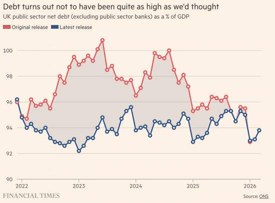
The result is that, despite all the claims made about the threats that national debt represents, and all the demands made for ever greater austerity cuts and what might properly be called fiscal punishment, that debt has not been out of control.
The Office for National Statistics, on the other hand, might have been out of control, and it has certainly produced a great deal of seriously misleading information that has resulted in very poor decision-making.
But the thing that the Financial Times does not note is what is most important about this. They correctly record that the figure that has been altered every time the data has been restated is not that for the supposed debt, but the figure for gross domestic product. It appears that we are hopelessly unable to get this, in itself nonsensical, figure right.
But, and this is my key point, there may be a very good reason for that.
The figure for GDP is always laden with estimates. It is riddled with assumptions. And the one thing that we know is that the assumptions used by the Office for National Statistics are cautious to the point of being absurd.
In particular, they ignore multiplier effects. When they record a great many types of expenditure, including much of that which the government undertakes, as well as investment expenditure, they fail to consider the consequences and benefits of what has happened. They believe that these sums are lost, forsaken and forgone when the reality is that they are incurred for future benefit, and, as this second chart shows, that benefit does arise and to a much greater degree than the Office for National Statistics ever thinks might be the case.
What is happening? It is that the ONS is persistently under-recording the creation of the literal stocks of well-being created by way of investment, mainly by public, but also some private, spending, with the result that they write off expenditure at the time that it is incurred and then appear to be continually surprised that later income is higher than they expected.
This is the real message that comes out of this chart when the finding is extrapolated appropriately. This is not the point that the Financial Times made about it. But the key issue is that the ONS is so blinded by its neoliberal assumptions, and its refusal to consider double entry when undertaking its accounting, and therefore the relationship between income and capital, and current and future returns, that it produces deeply misleading information, the consequence of which is that we all suffer excess downward pressure on government spending, quite inappropriately.
It really is time that we had an appropriate Office for National Statistics. One that understood economic reality, temporality, the relationship between income and capital, and the need for double-entry bookkeeping to ensure that appropriate checks and balances are reflected in the data that is produced.
Thanks for reading this post.
You can share this post on social media of your choice by clicking these icons:
There are links to this blog's glossary in the above post that explain technical terms used in it. Follow them for more explanations.
You can subscribe to this blog's daily email here.
And if you would like to support this blog you can, here:

 Buy me a coffee!

Bad theories backed by bad data, leading to bad decisions by a bad government.
No wonder we’re in a mess.
I was pondering a (long, boring, nerdy) comment on this…. but you have already hit the nail on the head.
Everyone with a mortgage, every business that has raised capital to buy premises and machinery, every farmer who has borrowed money to buy seed knows about spending money today to generate a return in the future. Do the people at the ONS not live in the same world? Do they not send their children to school or plant roses in their gardens?
Government debt is considered as very bad so lets consider if there was no government debt, what would be the consequences.
Richard what would the UK finances be like? Taking things to the limit is always enlightening.
It would be deeply problematic.
Government debt is simply the record of money that government has spent into the economy and not yet taxed back. It also provides a safe savings mechanism for pension funds, banks, insurers and households.
If there were no government debt at all, several things would follow.
First, the private sector would lose one of its safest assets. Pension funds and financial institutions would have fewer low-risk places to save.
Second, if government persistently ran surpluses to eliminate debt, it would be withdrawing more money from the economy than it spent into it. That would usually force the private sector either to dissave or take on more private debt.
Third, growth would likely suffer because the financial assets that underpin private sector balance sheets would shrink.
Taking this to the limit is useful because it exposes the absurdity of treating all government debt as inherently bad.
The issue is not the existence of government debt. The issue is whether government spending is creating inflation or failing to deliver productive outcomes.
Government debt is often simply the mirror image of private sector wealth. Remove one, and you damage the other.
This is all part of the way in which words that have a specific meaning for lay people are used in a different way by those who wish to deliberately confuse them. Describing all the currency that has been issued into the economy and not collected back in tax as ‘debt’ plays into the hands of those who want small government and an economy that runs by their own rules instead. As does describing bond issues with the same word. It deliberately scares people who think of debt as the road to ruin, a frightening thing to be avoided at all costs.
I am currently reading Democracy In Chains by Nancy MacLean ass recommended on this blog recently. Careful choice of names for thing is a feature of the story unfolded there. However, I am convinced that sesquipedalian obfuscation unsuccessfully disguises it’s proponents intellectual deficiencies and that the truth will out eventually.
The household analogy of finance that is constantly applied in the houses of commons seems to be an issue here. Politicians seem unable to escape it and i think a big part of the reason is the confrontational nature of our political system. The opposition (whether it was labour or now conservaties) will shamelessly attack the party in power no matter how hypocritical it makes them look. I wonder if changing that culcture would allow for a far greater number of changes to ripple through our system including the subject of this article. Maybe changing the ‘first past the post’ system of voting?
George,
It is a great shame that politicians the world over have forgotten that they were elected to be a responsible member of the governing body of their country regardless of which party they are a member, government or opposition.