I know what I said earlier, but trying to do nothing means I read the web and I could not help but notice this graph on the Guardian web site:
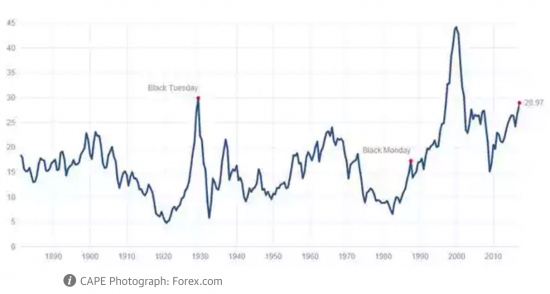
This, as they explain, is a chart of the Cyclically Adjusted price/earnings ratio (CAPE), formulated by economist Robert Shiller which is now very near its 1929 peak, itself only exceeded just before the dotcom crash of 2000.
Now, of course charts do not prove anything, and I have track record of saying markets are over valued. But then, that's usually when they are because fundamentals are being misvalued. And right now that is definitely the case, in my opinion.
I have a strong suspicion this will end in tears.
Thanks for reading this post.
You can share this post on social media of your choice by clicking these icons:
There are links to this blog's glossary in the above post that explain technical terms used in it. Follow them for more explanations.
You can subscribe to this blog's daily email here.
And if you would like to support this blog you can, here:

 Buy me a coffee!

It’ll be labours fault again.
The fallback is unions.
The solution will be less regulation of finance, more public money to the corporate elite.
I noted that practically all NHS hospitals are moving to provision of private healthcare now…look at the large hospitals in London, advertising internationally!
And more regulation of those evil TUs?
Shiller himself has doubts on the timing aspect of his indicator. It also never gave a ‘buy’ signal on the 2009 lows! Not to say stocks aren’t overbought, but there is nothing to say that they cannot get more overbought. Up around the 35-37 area with Treasury yields maybe offering a more attractive (higher yield) alternative makes more sense. Need a few more bears to convert and that would confirm the timing.
I’m with the professor’s assessment on this. I have sold the last of my stock holdings, as present PE Valuations look stretched.