The Treasury yesterday produced a distributional analysis of the Budget, plus last year's fiasco from Reeves.
They said:
This document sets out estimates of the impact of tax, welfare and public service spending decisions on household incomes, across the household income distribution in 2028-29 (the final year of Spending Review 2025).
They included this chart as their overall summary of the current impact of government activity (spending, tax and benefits) on households split into ten equal groups ranked by income in UK society:
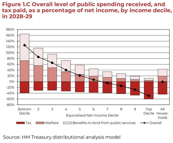
I reproduce it because it is total nonsense. How can I tell? Look at the data for the top 10% of households by income. If the presentation in this chart was to be believed, they pay 60% of their income in tax.
They don't, of course. They pay nothing like that. The data is wrong because:
- The income comparator used is net income after tax. In other words, tax paid is compared with income stated after tax is paid, meaning that the two are not statistically independent of each other in any way, making this an utterly meaningless chart.
- Income excludes capital gains and increases in the value of assets, and yet both significantly impact well-being, most especially for the well-off.
- Indirect taxes are ignored: only direct taxes are taken into account, but as a percentage of income, those on the lowest earnings pay a much higher percentage of indirect taxes and those on high incomes a low one.
Any reasonable person should think, as a result, that the Treasury has deliberately set out to produce highly misleading data on a sensitive topic.
So why would they do that? Could it be that they want to:
- Suggest the best off pay uch more tax than they do?
- Extra taxes on wealth are not needed?
- Claim the overall system is heavily redistributive when taking all sources of increased financial well-being and taxes owed into account, it is hardly so at all, as I showed in the Taxing Wealth Report?
- Those on the lowest incomes are better off than they really are?
It would seem so to me. And I sense a profound pro-wealth agenda underpinning all this, which is deeply unsavoury, and should not exist in national statistics produced by HM Treasury.
Comments
When commenting, please take note of this blog's comment policy, which is available here. Contravening this policy will result in comments being deleted before or after initial publication at the editor's sole discretion and without explanation being required or offered.
Thanks for reading this post.
You can share this post on social media of your choice by clicking these icons:
There are links to this blog's glossary in the above post that explain technical terms used in it. Follow them for more explanations.
You can subscribe to this blog's daily email here.
And if you would like to support this blog you can, here:

 Buy me a coffee!

Felt Creative: Thanks Mr Murphy.
The Ballad of the Equivalised Decile Cake
The Treasury baked a Budget cake, then iced it with “impact,”
Ten slices neat as Sunday best, each labelled very exact.
“Behold!” they cried, “redistribute! Observe the moral force!”
(And wheeled in Figure 1.C like scripture on a horse.)
The poorest slice got towers tall—of welfare, kind and keen;
The richest slice got crimson tax, a fearsome biting sheen.
“Sixty per cent!” the graph implied, “they’re paying through the nose!”
The top decile looked saintly, tithing cash in heavy flows.
But here’s the trick, the conjurer’s wink, the spreadsheet’s little laugh:
They measured tax against your net—then called it “proper maths”.
A rabbit pulled from after-tax, a hat that’s missing before:
Statistical independence? Shoved behind a closing door.
And in this land of “income,” where the well-off never trip,
Capital gains float by unseen in their invisible ship—
Asset values swell like soufflés (no one counts the rising crust),
While “income” stands politely still, and that’s apparently “just.”
Meanwhile VAT and duties—those quiet little gnats—
Are waved away as if they’re not taxes, only mild old chats.
The poorest pay them, drip by drip, on heat and bread and light;
The richest pay them too, of course—then don’t lose any sleep at night.
So on the chart the system purrs: how generous, how fair!
A benevolent machine that hugs the bottom in its care.
And if you wonder why it’s drawn to flatter wealth’s self-view,
The answer comes in civil font: “because it’s what we do.”
For somewhere deep in Whitehall’s vaults, where acronyms breed and bite,
A teller counts the story first, then makes the numbers “right”:
“Suggest the rich pay loads already—shoo the wealth tax chat;
Call it ‘highly redistributive’—and there, we’re done with that.”
And out it goes: a polished piece of national-stat sheen—
A graph that says “we’ve solved it all,” in tasteful Treasury green.
But look again: the decile cake is frosted with a lie—
Not wicked like a pantomime; just useful as it slides by.
Very good
Brilliant!!
No wonder the cynical aphorism ‘lies, damned lies, and statistics’ exists! They are basically trying to show they are somehow balancing the books…which they are clearly not.
Reminds me of the Darrel Huff book ‘How to lie with statistics’ or the chapter title of Tim Harford’s ’How to make the world add up’ which was also ‘how to lie with statistics’…the fundamental point of his book is that statistics can be hugely valuable but only if the data and sound statistical reasoning is applied. The book aims to give an insight into how you can evaluate and challenge – as you have done – statistical data. The government and Reeves should read Tim’s book instead of lying to us via meaningless statistics.
This is wealth porn at its worst – making out than everyone else is their burden. It sanitizes greed.
Simple as that. The misrepresentation needs to be got out there more widely.
You should send this to the Treasury (and maybe to Tim Harford’s ‘More or Less’ programme) and ask for their comment . Its such a glaring mistake to set tax paid against a ‘net income’ which itself is an ‘after tax’ figure.
But will anything happen?
Money is debt. Government money creation for public purposes – to pay for employment and output – spurs prosperity. But in its present form, private-sector debt creation has become largely extractive, and thus leads to the opposite effect: debt deflation.
Governments can pay public debt without defaulting, as long as this debt is denominated in their own domestic currency, because the governments can always print the money to pay. To the extent that public debt results from spending that supports output, employment and growth, this process is not inflationary. The government gives value to money by accepting it in payment of taxes. So the monetary system is inherently bound up with fiscal policy. The classical premise of such policy has been to minimize the economy’s cost structure by taxing mainly unearned income (economic rents), not wages and profits in the production-and-consumption sector.
The problem nowadays is private debt. Most such debt is created by banks. This bank credit – debts owed by bank customers – tends to increase faster than the ability of debtors to earn enough income to pay it.
Surely the budget is to authorise spending and other measures to meet the government’s policy objectives. I feel there’s a tendency to put the cart before the horse.
The NHS, infrastructure, energy, education, housing, criminal justice, child poverty, food security etc. and changes over the Tories must surely be key factors in how we judge the administration’s performance while also of course analysing the tools they are using.
The Spectator is sticking the boot into Modern Monetary Theory
“MMT is simply nonsense and the policies that are derived from it are insane.”
“Zack Polanksi’s insane economics” (27 Nov 2025)
https://www.spectator.co.uk/article/zack-polanksis-insane-economics/
They really are getting very frightened fo Zack. It looks as though I need to do more on MMT
I can easily believe that the top decile DO pay 60% of their NET income in tax but this is extremely misleading.
Why do I say this? If one pays 40% of your gross income in tax (your income being above £100k), plus 2% NI, that leaves 58% net. Then, simple arithmetic says, you would be paying 42%/58% = 72% of your net income in tax and NI.
But this ignores other factors such as salary sacrifice (just reduced in the budget, which is good), pension contributions (with tax relief still at 40%), dividend and capital gains tax thresholds, unrealised capital gains, and probably several other sources I can’t immediately think of.
For most people the chart would suggest that the top decile are paying a lot of tax. But this is a slight of hand by reducing the denominator (NET income) which misleadingly appears to increase the percentage of tax paid by the wealthy.
This is a disgusting misrepresentation.
Thanks
Plus, if they’re going to count “Benefits-in-kind from public services”, shouldn’t they also discount the extent to which people actually provide them? After all, it’s not the Health Secretary who dresses your wound; not Bridget Phillips who teaches your kids; etc. It’s people from other households who create the value. For “All Households”, it should balance out.
But this is a micro analysis, not a macro one, so it does not balance. That6 is the problem with micro.
The stats also don’t properly show the welfare spending on the rich in a second hand or indirect manner.
As you have pointed out before, Universal Credits and welfare spending is often because companies, that these rich people own in part, don’t pay enough. This is directly given to the lowest 10% but doesn’t acknowledge that it indirectly benefits the rich in society and is a consequence of the rich wanting more money.
Correct
Ed Davey writes that: “I wish I was surprised. Buried in this Budget is a plan to slash the Digital Services Tax, giving a multi-billion tax cut to US tech giants and the likes of Elon Musk.” Reference: https://x.com/EdwardJDavey/status/1993975611505651732
But I could not find a source in the Government’s documents.
https://www.gov.uk/government/publications/budget-2025-document
That is worrying.
I have not seen this anywhere else.
If it is true, this is giving in to Trump’s bullying.
Propaganda.
When you are next interviewed Richard, as sure as anything, some idiot will assert this chart “see the Treasury chart shows that the top 10% pay 60%” etc etc. The problem then is you enter explaining territory (as Ray-gun once said: “if you are explaining you are losing”). The FinMin did this because they don’t want the rich taxed. end of – so they lie wrt how much tax the rich pay. They are liars & need to be called as such. Ditto any MP or minister that uses the figure – liars – intentionally & knowingly misleading the public.
Agreed
That is the problem