We have changed the style of our YouTube thumbnails as of this morning.
Over the past nine months, Thomas and I have learned a massive amount about YouTube, whilst picking up 110,000 followers and more than 9 million views over that period.
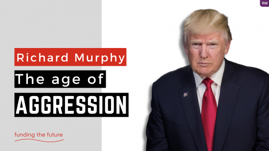
I admit we have struggled to find the right formula for thumbnails, which are the images published on and promoted by YouTube to attract traffic to a video.
All YouTube advice is that these are critical, but at first, we ignored that.
Then we settled on a formula of a picture of me on the left over a background, nature-orientated photo, which avoided us having to fund topical images, with a text box highlighting the video title on the right.
Now, we have decided we have to succumb to something that looks more like the YouTube norm. That, for videos of the sort we make, has the title on the left. It has to jump off the page. There needs to be a topical image. The whole thing has to be simple. We've ended up with the above image, which was developed from a Canva template.
Comments are welcome.
If we settle on this, we might replace the thumbnails on some earlier, more successful videos to be consistent. But that will require time, which we do not currently have.
Thanks for reading this post.
You can share this post on social media of your choice by clicking these icons:
There are links to this blog's glossary in the above post that explain technical terms used in it. Follow them for more explanations.
You can subscribe to this blog's daily email here.
And if you would like to support this blog you can, here:

 Buy me a coffee!

I wonder how long before Google/YouTube bends the knee and starts to shadow ban criticism of the Trump regime.
If the aim is clarity for the casual YouTube browser, it succeeds.
Thanks
You know your audience (potential audience, which is the one that matters, the ones who aren’t watching YET).
You (yr team) also know the platform.
Looks good to me but don’t worry about me, I don’t watch them. I just approve of you doing them.
I hope you are researching the alternatives to YouTube, for when YouTube is censored more heavily than it is now. In particular, they might decide to prevent monetisation via the YouTube platform as an early form of restriction of your material.
It depends on how much “doing evil” Be**s decides to commit Alph***t to doing.
Let’s see
Without monetisation I would have to appeal for more support.
And I hope you get it. For encouragement, study what individual small donations raised for Jeremy Corbyn’s legal fees when he needed it.
RobertJ,
I think you mean Sundar Pichai (CEO of Alphabet). Bezos is Amazon, the Washington Post and Blue Origin (space rockets).
Thanks for the correction. I shoud have checked.
I think the new approach you are taking makes sense. With YouTube, it is important to have both text and topical image that indicates what the video is about. It is just how it is, but On YT, the image can sell the video.
It looks good. As the saying goes, it does what it says on the tin!
Thanks. Appreciated.
Nice try Richard but you are competing with forces beyond your control. My peer group in the US have been knocked sideways. They failed to recognise that the intellect of the voting population of the US, is far lower than they calculated. As one of my colleagues state side says; it is accepted as lifeforms crawled out of the primeval swamp, they would all be Conservative / Republican voters.
What has that to do with this post?
Just an opinion and not based on any specific knowledge of what does or doesn’t work but, if thumbnail topical pic and text work then it’s clearly the way forward. I would, however, suggest working towards establishing and immediately recognisable format/brand as I have no idea if people find you by searching or browsing a topic or seek what you say about a specific topic. I hope that makes sense!
Most get the video because Youtube recommend it to people who have been before or subscribe (there’s 110,000 of them). But others get it a little more randomly, bevaise YouTube think they might be interested. They are who this is aimed at.
I get it
Plenty of thinking folk like me use YouTube as a means to actively reject UK MSM. Best quality alternative journalism there is to be had is out there is on YT, e g Max Blumenthal, Aaron Mate, Judge Napolitano, and sites like Neutrality Studies, Dialogue Works, The Grayzone, Electronic Intifada, Naked Capitalism, our very own UK based Novara Media, and many more. It’s these vital truth tellers most endangered by censorship. So let’s drop the ever so slightly patronising tone toward YT users. Go Richard, be as available as you can be to the searchers !
Many thanks. I love making them. I admit working with my son on them has been fun. He is becoming a tech geek perfectionist. I like that.
I had a quick look at some of the canva templates. The ones that work best are those with the text on the left…probably because we read from left to right and don’t want to be sent hunting round the screen for information. The red and black colours is striking with the underlying grey showing seriousness and gravitas. The minimalist layout reflects your clear explanations and delivery.
It works for me (female, 67, arty, somewhat activist). (Hope that wouldn’t put your other audience members off, but these things are important to know in ‘marketing’ I believe)
You are my audience! 50% of views are from older people (and we are).
Layout is clear and topic easy to read. My comment is based on a screen design class in 1987. Around 8% of men and 0.5% of women are red / green colour blind so these are best avoided. I lean towards standing out from the crowd with a recognizable brand identity.
Thanks
The new format is much better, Richard. More likely to catch the attention of new followers.
I love it!