I write this as part of the background data for the Taxing Wealth Report 2024 that I am now working on and thought it worth sharing here:
If you ask most people in the UK about taxes the one tax they will, almost invariably, think of is income tax. So do most politicians and commentators. That is why it is incredibly common to hear the claim that the wealthiest one percent of people in the UK pay more than 25% of all tax[1]. This is based upon the proportion of income tax that they supposedly pay, when it is unlikely that they pay nothing like the same amount of any other tax.
There are, in fact, very many taxes in the UK, even if none is as big in terms of revenue raised as income tax.
The data
The following chart summarises, the total sum paid for all the major UK taxes in the year to March 2023[2]:
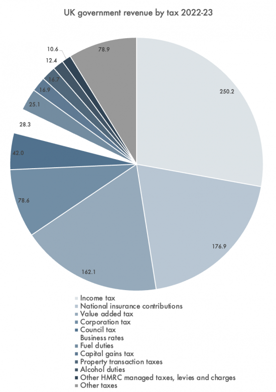
The taxes paid are listed below the chart in order of size, working clockwise round the chart.
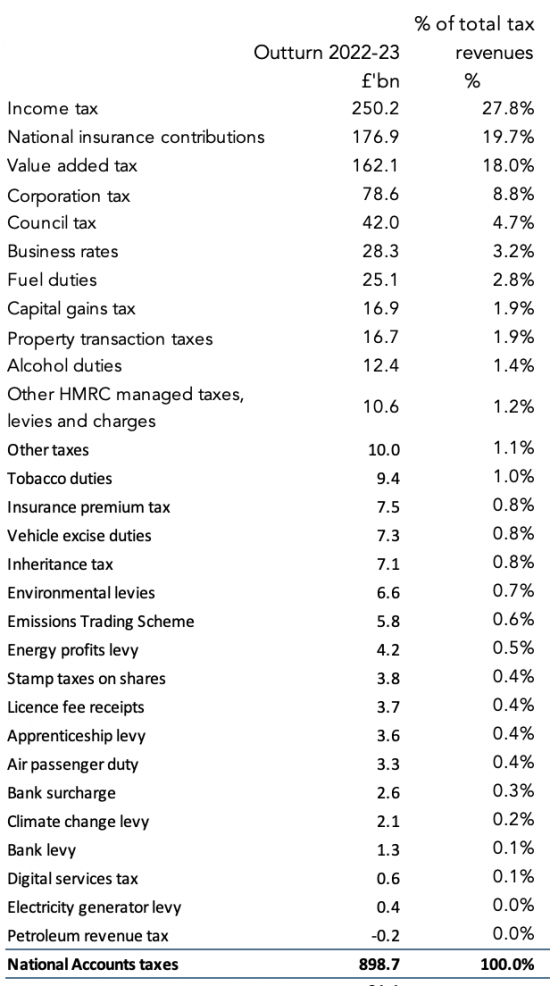
A more detailed list is as follows:
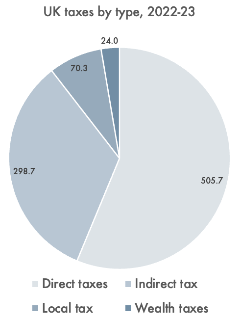
UK taxes paid by type 2022-23
Categorisation by type of tax
Of these taxes, some are described as direct taxes. This means that they are taxed on income, whether of individuals or of companies. Income tax, national insurance and corporation tax are the most significant direct taxes.
Some taxes are local. Council tax and local business rates are by far the most significant of these.
Others are described as indirect taxes. They are, broadly speaking, charged on the value of sales made. Some are, in effect, charges. The largest of these are VAT and duties, but stamp duties can also be put in this category. Most of the smaller taxes listed are indirect taxes.
Few of our taxes are charged on wealth. Both inheritance tax and capital gains tanks could be described as direct taxes, however, they might be better to described as taxes on either wealth, or income derived from wealth.
Using these categorisations, total UK tax paid looks like this:
The Taxing Wealth Report 2024 is unsurprisingly, given its title, concerned with the taxes paid by the wealthiest people in the UK. However, because there are no taxes not paid by wealthy people, that means that every tax is potentially within its scope. That said, because of the difficulties that direct taxation of wealth creates, it has limited its focus to increasing the amounts of tax that might be paid by those with wealth in the UK that can be achieved by modifying existing taxes, or by reducing tax reliefs given by law at present that reduce the amount of tax paid.
Given that the aim is on revenue raising this does, inevitably mean it has also focussed on the largest taxes in the UK as noted above.
Footnotes
[1] The figure is itself uncertain. It depends on the basis of calculation. What is undoubtedly true is that the top 3% or so of income earners pay 25% of all income tax, but it is most likely that they pay much less of overall tax than that.
[2] Based on table A5 here: https://obr.uk/download/economic-and-fiscal-outlook-november-2023/?tmstv=1701349270
[3] This note is also available as a PDF here.
Thanks for reading this post.
You can share this post on social media of your choice by clicking these icons:
There are links to this blog's glossary in the above post that explain technical terms used in it. Follow them for more explanations.
You can subscribe to this blog's daily email here.
And if you would like to support this blog you can, here:

 Buy me a coffee!

Hi Richard.
Regular reader/follower/lurker, so sorry to moan, but … it can’t just be me who dislikes single-colour pie charts? I’ve always found them difficult to read!
Sorry……
This is a tricky thing with detailed charts on the web (and visual materials more generally).
For me, as an Anomalous Trichromat (weakened green peak sensitivity, like about 5% of the population), coloured charts frequently have sections which appear to be the same colour but different categories – however monochromatic charts are easier to distinguish. I’m used to it (though it’s frustrating when there’s no textual/tabular context, and I’m grateful that Richard usually includes the tabular).
Useful link (though I’m sure Richard is invested in accessibility): https://www.designmantic.com/community/website-design-guide-color-blind.php
I found it difficult too, but then there is the list below which was easier to read.
Doesn’t matter how you do a pie chart, how you colour it, there will always be some problems. Same is true of bar charts etc. Presenting information in blogs, powerpoints or anything is always tricky.
I think Richard has done the right thing by listing the amounts below as well as using the pie chart, though I think there are too may slices of pie in the first one.
I like charts
I hate not having the data
Colour or not, thanks for providing the detailed breakdown. I read your blog daily because it’s refreshing to read views of similar thinking individuals. You do fabulous work Richard and I’m grateful and in awe of how much.
Thanks
does this include the tax brakes that are available to top 3%?
This is taxes actually paid
Worth mentioning I think, that despite all these tax revenues, none of it is required for government spending. Thatcher famously stated that there is no government money, only taxpayers’ money, which is wrong. When taxes are received, they pay towards a tax liability which is extinguished, and the money is deleted.
Parliament alone decides government spending which adds money to the economy, enabling the economy to work. It increases government debt, which is a necessity. Taxes take money out of the economy. The amount the government spends and taxes is a political decision. Not enough money in the economy means it can not grow, if it can function efficiently at all. To much money can always be removed by increasing taxes.
True
But it is necessity to control inflation.
Thanks Richard. Just want to add a positive comment. I find the chart easy to read. Appreciate the design – clockwise in decreasing order of size – with a table below for those who prefer lists. You are an excellent teacher / communicator.
Thank you
The tax that always irks me is employer’s NI. It is, very obviously, only a tax on jobs.
What I don’t understand is why Government bodies pay it. Take the NHS – the funding supplied by the government is used, in part, to pay employer’s NI to the government. Make them exempt from it and you remove that circular payment link.
Similarly, VAT is paid by the NHS on non-exempt supplies, but I don’t think they can reclaim any of it as they have no VATable supply.
Apart from the fact that it would reduce Treasury income, why can’t government bodies be exempt from paying these taxes?
The VAT involved is identified in government budgets and exceeds £25 billion pa