This chart has been published by the Guardian this morning:
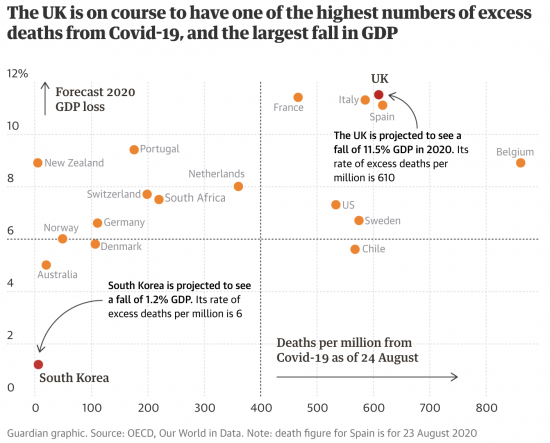
It might be said to be the graphical presentation of failure. It's hard to interpret it any other way.
Thanks for reading this post.
You can share this post on social media of your choice by clicking these icons:
You can subscribe to this blog's daily email here.
And if you would like to support this blog you can, here:


What happens when the government think the free market will accomplish everything, so they don’t have to do any governing.
“… what Smith was trying to do when he wrote “The Wealth of Nations” … was an attempt to establish the newfound discipline of economics as a science. This meant that not only did economics have its own peculiar domain of study–what we now call “the economy,” though the idea that there even was something called an “economy” was very new in Smith’s day–but that this economy operated according to laws of much the same sort as Sir Isaac Newton had so recently identified as governing the physical world. Newton had represented God as a cosmic watchmaker who had created the physical machinery of the universe in such a way that it would operate for the ultimate benefit of humans, and then let it run on its own. Smith was trying to make a similar, Newtonian argument. God–or Divine Providence, as he put it–had arranged matters in such a way that our pursuit of self-interest would nonetheless, given an unfettered market, be guided “as if by an invisible hand” to promote the general welfare. Smith’s famous invisible hand was, as he says in his Theory of Moral Sentiments, the agent of Divine Providence. It was literally the hand of God.”
From David Graeber’s book “Debt: the first 5000 years” Chapter Three, page 44
Spot the problem in Adam Smith’s thinking (and he should have recognised it in his “Theory of Moral Sentiments” but didn’t) why then the need for moral compasses since one of the uses of these is to ensure equitable access to resources hence the development of democracy!
However, it has to be said that the idea of an invisible hand is deeply insignificant in The Wealth of Nations, and almost an aside at that. So I am not sure that David is not overstating his case
I disagree. I think it’s important to forget the nuance and for us all to see clearly that we are currently doing with in the UK and USA is the revenge of Adam Smith’s “market fundamentalism” (Libertarian “Britannia Unchained”) over John Maynard Keynes “social justice” (concern for full employment which now takes the shape of Post-Keynesian MMT).
Correction: “currently dealing with”
Also in short at this stage of human development our major problem is not understanding that market fundamentalism has to be integrated with social justice.
Indeed amazingly most don’t even recognise that market fundamentalism required sovereign government to be able to have a monopoly over reserves creation from thin air for the optimal functioning of the payment settlement system involving private bank currency creation.
Hasn’t this already been explained by the ONS, linked to their treatment of education etc compared to other countries?
The graph does not compare like-for-like.
I accept it’s an issue
But do others agree?
It appears not…..
If you accept it’s an issue, why did you use the flawed graph to score cheap political points without sort of caveat?
Which ‘others’ don’t agree with the methodology?
The OECD by the look of it
In fact, anyone who reports GDP by the look of it
Land of hope and glory?
I think not.
The UK appears to be full of intellectually challenged individuals who can’t even figure out there’s a connection between understanding democracy and how sovereign monetary system works.
For example, if democracy has a primary objective of ensuring equitable access to resources how come so many traditional manufacturing jobs have disappeared from the UK on the flimsy basis that in an era of floating currencies the Invisible Hand will ensure no country will deliberately interfere with their country’s currency floating mechanism?
There are many other other examples of the failure to think in the UK the big one being of course not understanding that if private banks are allowed to create currency from thin air then it’s essential for control purposes and ensuring the use of resources to meet the need of public goods and services the government is able to do so too!
Correction. Should read “how a sovereign monetary system works.”
I would be interested to know the figure for what the GDP drop would be if the ONS hadn’t included the change in Government output.. wouldn’t you?
Yes
I have no desire to defend this U.K. government but looking at the graph objectively we are looking at a failure of much of Western Europe, so the U.K. is not in this alone. Though no doubt we will be looking to find our own way out. It’s looking like we are going to have to admit we are a bunch of fat b******s and that is half the problem. Johnson is already on the road to recognising that the free market will be of no help in getting our collective weight down and reducing our susceptibility to death by COVID.