I was reading the Mirrlees Review of taxation, published by the Institute for Fiscal Studies in 2011 this morning (such things are my day job) when this chart jumped out:
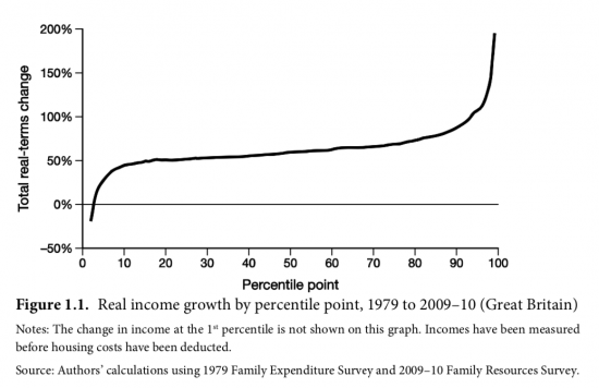
If you want an explanation of the consequence of neoliberalism that's it: over the thirty years when it ran rampant the higher your income was the larger the increase in it was too.
No wonder we have seen an increase in inequality.
Thanks for reading this post.
You can share this post on social media of your choice by clicking these icons:
You can subscribe to this blog's daily email here.
And if you would like to support this blog you can, here:


Hi Richard,
Quite shocking.
If a similar graph was constructed that included the impact of housing costs then I suspect an even more stark picture would emerge.
Agreed
As I said in another thread I’m almost through Daniel Dorling’s Injustice and he makes the same point with more graphs and explanation. That book is from 2010 so that he made use of a similar if not the same data set is not unexpected.
He makes the point that housing costs on the poor, especially in England and Wales have been rising relentlessly. It’s less bad here in Scotland simply because we have higher availability of Social Housing, both traditional Council Houses and Housing Corporation Housing.
Scotgov banned the sale of Council Houses and Housing Corp houses were never subject like they now are in England. Scotland took a bigger proportion of Syrian refugees because we had a lot of empty Council Houses in various places. Those refugees are contributing, many have started businesses. Scotgov was proactive in getting healthcare workers qualified with mentors and working in our NHS with help with English lessons as well.
Did we get thanks from UKGov or the UK MSM? A couple of puff pieces when they arrived but precious little followup. Immigrant success stories let alone refugee success stories are not wanted and do not sell advertising in the current climate. So just TheNational.Scot then.
This has almost certainly got worse since 2009-10 as well because austerity only started after 2010. I’m working with the FES back to 1979 for another project I’m working on, so I’ll update this graph to show trends to 2017-18 at some point (relatively easy to do it after housing costs as well).
That would be great Howard. Thanks
Richard
Criminal.
It’s the profile of greed.
Do we know what the graph looks like in the 30 years before 1979/80?
Has it always been the case that economies operate the Matthew Principle and favour those that have, but that neoliberalism turbo-charged the discrepancy?
Well, inequality fell in that period….
Think the answer is here:
https://www.nytimes.com/interactive/2017/08/07/opinion/leonhardt-income-inequality.html?smid=tw-share