The World Bank has been looking afresh at the issue of growth and has been seeking alternative ways to appraise why this situation exists and how it is changing:
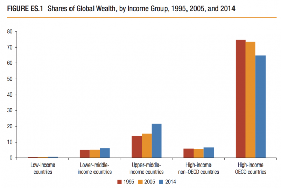
I admit the FT show the results better than the FT do. This is their summary:

Remember, this is a measure of change. But, importantly it's a measure of changing capital rather than a measure of income. That is the difference in approach. And it's important.
Long ago accounting realised that three statements were need to offer a true and fair view of the state of affairs of an entity. These are the income statement (or profit and loss as some still think of it), the cash flow statement and the balance sheet. Each is necessary, with the cash flow reconciling movement in income with movement in balance sheet reserves.. Macroeconomics has for too long looked at just an income statement, and too little at balance sheets. When it has looked at the latter it's also usually only looked at finances.
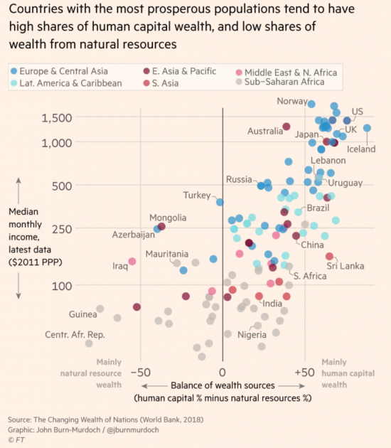
This new work breaks ground by emphasising more than financial capital, and that is important because many forms of capital drive growth. In the process it also emphasises vulnerabilities: mineral resources don't last forever for example, whereas high human capital is associated with high growth:
That clearly indicates the requirement for progress.
Measures are useful for three reasons. The first is comparison. The second is comprehension. The third is as the basis for decision making. What this says is that the best investment in the world is in people. And questions immediately follow, not least as to why so many barriers to education now exist in the UK in the form of student debt, and why have we been so opposed to student migration?
I suspect the report will reward more study. I will be giving it some.
Thanks for reading this post.
You can share this post on social media of your choice by clicking these icons:
You can subscribe to this blog's daily email here.
And if you would like to support this blog you can, here:


Having spent my entire working life as a scientist I believe that communication of information is of the greatest importance. I’m afraid that the graphs you have presented above fail in that respect and that whoever put them together should be ashamed of their communication skills. There are some good books out their on graphical communications …
I disagree
I think they work really well
And I have spent time look8ng at this stuff
I notice you don’t take issue with the data – just the presentation. If that is so bad lets see the way you would present it. There are plenty of free programs which produce graphs ypu cpu;d use. Failing that how about a specific criticism of what is wrong with the above graphs?
When I taught statistics years ago I was fond of showing Dalton’s representation of IQ distribution on crossed axes and comparing that to the same data shown as a ‘normal’ curve. It was very obvious which made the ‘meaning’ of the data clearer and which graph was easier to grasp. So I agree entirely with your view that presentation can make a big difference. But you really need to state clearly what exactly you think is wrong with these graphs if you want people to take you seriously. Just saying they are failures and shameful really isn’t enough.
Look at the WB original and this and you will see who did the better job
Can you name a few please Rod.
I’m interesting in taking a little ok and improving my own!
Thought provoking.
Be careful! This graph will provide ammunition to the racists who think immigration from the ‘high human capital’ countries would make us more prosperous, while immigration from the ‘low human capital’ ones would make us worse off. And it looks like the ‘low’ ones are just the “s***holes” that people like Trump refer to.
Don’t provide weapons to the racists!