The government says it is concerned about sugar reduction. These charts comes from page 10 of their report on the issue:
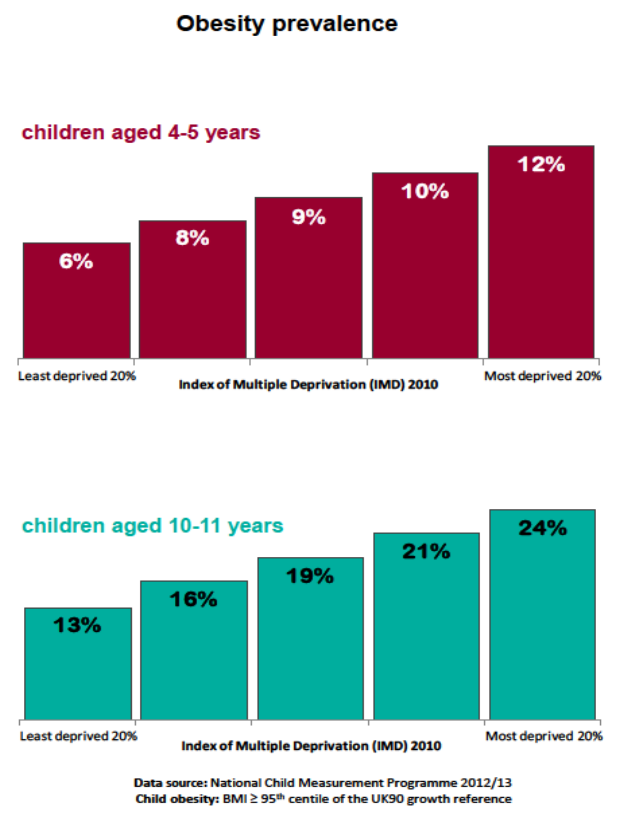
There is the class divide, graphically illustrated.
The government is not, of course, planning any firm action with the food industry to tackle this issue. As the evidence shows, they do not think it is their problem.
Thanks for reading this post.
You can share this post on social media of your choice by clicking these icons:
There are links to this blog's glossary in the above post that explain technical terms used in it. Follow them for more explanations.
You can subscribe to this blog's daily email here.
And if you would like to support this blog you can, here:

 Buy me a coffee!

Is it really the government’s job to tell us what to eat or regulate how much sugar is in foods beyond normal food safety standards?
Yes, for reasons other commentators note
And because we pick up the cost of this artificially created human tragedy
That is rather illiberal is it not?
I can’t see how the government determining what should be in our foods and how much we eat of it is compatible with personal freedoms.
Whilst I understand that there is a human and financial cost to this, I view this as a cost of maintaining those freedoms. I’d prefer if everyone was thin and healthy and cost the NHS less, but I’m not about to take away people’s right to eat what they like.
I should also point out that government control in such matters would be impossible. Is the government going to regulate how much of a particular foodstuff one can buy or eat?
Also note that this is a peculiarly western problem. Asian countries often have the reverse problem – the rich are more likely to be obese than the poor.
Yes
Just as abolishing child labour was deeply illiberal too
How dare we take away their right to work?
Smoking has done more harm than a few nice bits of food. We cant stop people smoking only when it affects other people.
DennisL-I think you conveniently forget that Government tells us all sorts of other things such as the poor/unemployed are causing the recession, that the 375 million bail out of banks was necessary, that 900,000 benefit sanctions forcing people into dire poverty was that a transatlantic trade agreement with supra-national powers (by whom for whom?) is needed. The idea that we are choosing out of freedom and not coercion needs to be dropped and we need to realise there is collective responsibility involved where we are real agents.
OK, well I hope something like this makes it onto the Labour party election manifesto so we can see what the demographics captured by such legislation think of it. I’m pretty sure the posters in favour of it on this site would be in the minority.
DennisL-the point I was making was that often, those that invoke the ‘nanny-state’ meme nearly always use it to limit regulation of corporate power (the companies that produce mass-crap are usually corporate)-their selective filter usually misses other, often highly damaging, ways that Governments control the ideological narrative.
“375 million bail out of banks was necessary”
Actually, that refers to the amount of QE money created to date. The cost of bailing out the banks and the financial sector was a estimated £1.4 trillion.
And no, the above is not an error – I do mean one point four trillion pounds.
As you say, Richard, two graphs that graphically illustrate the class/wealth divide. And I’ve just taken the time to read the report. Two things stand out. First, on page 4 we have this:
‘Evidence shows diet and obesity related diseases including cardiovascular disease and some cancers cost the NHS alone at least 11 billion pounds per year, and are major contributors to health inequality, with the most deprived being most at risk.’
Just to emphasise – AT LEAST £11 BILLION! A truly monumental amount of money and a truly monumental problem.
Second, then we have Public Health England, in the form of the authors of this report, who are clearly forced or choose to start from the premise that nothing can be researched or reported that is in any way critical of the food and drinks industry.
Result, more of the same advice that’s done absolutely zilch of any substance to tackle this problem. So much for public health in England if a body with that brief is so toothless.
Of course, we all know where this is heading. As the NHS becomes more and more Americanised over the next few years more and more poor people will find themselves excluded from entitlement to NHS services (as is currently the case with access to healthcare in the US even after Obamacare). And so obesity will no longer be an NHS problem, or a government one either for that matter. It is, after all, a “lifestyle choice” as I believe Tories like to refer to it. Priceless!
Priceless indeed – like all the externalities of corporate abuse they choose to ignore
A slight problem with this calculation:
“‘Evidence shows diet and obesity related diseases including cardiovascular disease and some cancers cost the NHS alone at least 11 billion pounds per year,”
Obesity, just like smoking and drinking, saves the NHS money. Sure, there are those costs that you mention. But lifetime medical care costs for smokers, drinkers and the obese are lower than for those who are none of those three. Because people who die of diabetes at 70 don’t then need hip replacements at 80.
No, this doesn’t mean that therefore we should be promoting any of those behaviours. Only that the argument that they cost the NHS money is wrong.
Wrong Tim
The most expensive part of care is usually provided in the last six months of a person’s life
All people die
If the average age of death is brought forward those most expensive times of care are brought forward but still happen
On a discounted basis they are therefore much more expensive
You also ignore the impact of the cost of ongoing chronic care – which is much higher in these cases – not least because the obese need hip replacements in their 50s, not 80s, precisely because their weight wears their hips out
On all counts your argument is wrong
Really?
As smokers proceed along lifes path, they tend to develop respiratory problems. While cancer is a good scare, bronchitis kills more. The health costs of chronic bronchitis are eye opening. A months drug cost would be in the order of £100 +, not counting xray/MRI etc.
And they do not die fast.
The Government sees all this like the weather-something that just happens as part of the dynamic stochastic activity of the markets which then create social conditions. This is the dereliction of the concept of human agency.
When people can barely afford housing and heating they are forced to each cheap crap shorn of positive nutritional content. This generates an atrocious environmental as well as personal health cost. This will have an inter-generational cost.
We are living in a lowest common denominator culture.
You could not make it up, the Economics of Poverty. There is a large literature, three examples:-
1. “First, the highest rates of obesity occur among population groups with the highest poverty rates and the least education.
Second, there is an inverse relation between energy density (MJ/kg) and energy cost ($/MJ), such that energy-dense foods composed of refined grains, added sugars, or fats may represent the lowest-cost option to the consumer.
Third, the high energy density and palatability of sweets and fats are associated with higher energy intakes, at least in clinical and laboratory studies.
Fourth, poverty and food insecurity are associated with lower food expenditures, low fruit and vegetable consumption, and lower-quality diets.” [1]
2. Poverty and Obesity in the U.S. Diabetes. Nov 2011; 60(11): 2667—2668. “Are poverty and obesity associated? Poverty rates and obesity were reviewed across 3,139 counties in the U.S. (2,6). In contrast to international trends, people in America who live in the most poverty-dense counties are those most prone to obesity (Fig. 1A). Counties with poverty rates of >35% have obesity rates 145% greater than wealthy counties.” [2].
3. “Relationship between energy density of selected foods (kcal/g) and energy costs (US$/1,000 kcal). Food prices from Seattle supermarkets, 2006.” Lobster was listed at (2006 prices) $100 per 1000 kcal, and at the other end lard, margarine and sugar are pennies per 1000 kcal. My mother told me stories of her being fed lard on toast as a child in the 1920s, and she’s still alive. [3]
[1] http://ajcn.nutrition.org/content/79/1/6.short
[2] http://www.ncbi.nlm.nih.gov/pmc/articles/PMC3198075/
[3] http://onlinelibrary.wiley.com/doi/10.1111/j.1753-4887.2009.00157.x/full
Thank you
“Is it our role to teach the poor how to live quietly on less than minimum standards of health and decency and how to starve on minimum wage? Do we teach them how to budget malnutrition more neatly? Or is it our job to struggle for those minimum standards”
http://www.amazon.com/Roots-Frontiers-Social-Group-Work/dp/0866567275
Obviously our ‘job’ is to teach them to starve in a healthy manner.