Rachel Reeves says her budget delivers stability. The Office for Budget Responsibility's charts tell a very different story. High interest rates, low investment, falling profitability, rising unemployment and no improvement in household incomes. This government is putting finance first, and people last.
In this video, I break down the OBR data — ignored by the headlines — and show what it means for growth, homes, jobs and Britain's future. We can do better. And I've published the budget that shows how.
Download my alternative budget — available here.
This is the audio version:
This is the transcript:
So what did Rachel Reeves's budget mean?
I'm going to ignore all the details of all the announcements that she made because they, in effect, added up to virtually nothing.
I know it is claimed that she increased tax by £26 billion over the next five years, and she increased expenditure by a smaller amount and so on, and there's lots of little details that we could obsess about, but the fact is that in the grand scheme of a budget, which is talking about more than £1,200 billion of income and spending £26 billion is really neither here nor there.
As I said on the Jeremy Vine Show, the only thing that surprised me was that she didn't announce the details of the Treasury's Christmas party because she mentioned everything else that was almost irrelevant.
So, instead of talking about that stuff and the mess up that she made with regard to the whole of the budget being leaked in advance. Let's actually look at what the Office for Budget Responsibility did put out in error in advance of Rachel Reeves talking. And in this case, what I'm talking about is not the details of the budget itself, but the background information that explains the economic context. That is what this video is about.
Ignoring the detail, I want to look at the explanations for what is going to happen and maybe why, to the extent that we have anything to work on. So I am going to discuss a series of charts that have been pulled out of the Office for Budget Responsibility's publication made yesterday, to which there is going to be a link down below, and these charts are those which give a background on the economic assumptions that they have used about where we are going.
Let's start with interest rates because the government is obsessed with them, and I have, as most people on this video channel will know, been of the opinion that they have been far too high for far too long. And the forecast shown here is that this will continue.

In fact, the assumption is that things are going to get worse. The yellow line on all the charts that will follow was the March 2025 forecast, and the blue line will be the November 2025 forecast, in other words, what Rachel Reeves talked about yesterday.
And as you will see, she is forecasting that far from the Bank of England's base rate falling over the next few years, as we would hope, it might will rise. She's expecting a fall now, but an increase over the following period. And she expects that the cost of government borrowing is going to rise significantly. In fact, what we are looking at is a period where the rate will still rise until 2030 and beyond. That is totally unacceptable.
Let's put that into a comparison with other economies equivalent to the UK, which is what this chart shows.
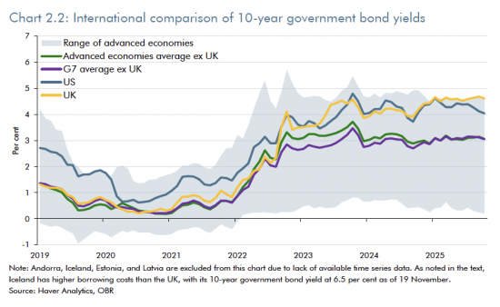
Here, the yellow line is what you are looking at. The yellow line is the UK, the bottom pair of lines converging on a single trail across the screen is the rest of the G7, excluding the UK. And the blue line, which dips below the yellow line as we go into the future, is the USA.
And what you'll see is that the UK is going to have high interest rates continuing into the future with regard to its government borrowing compared to the USA, where it is expected that rates will fall and we will have rates which are much higher - over a percentage point higher, in fact, almost two percentage points higher fairly soon - than most of the G7 countries with whom we compete. And why is that? Because we have a Bank of England that is determined to keep rates high, that is why.
The market is not driving these rates; the Bank of England is by doing quantitative tightening. And there is no indication that the government is going to do anything about that.
So Rachel Reeves might complain that £1 in every £10 that she spends is on interest payments, but the truth is, it appears she has no strategy to change anything, and this is what's going to be reflected in real growth.
Look at this chart of real growth.
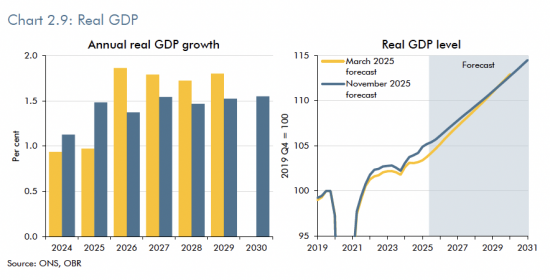
If we look at where figures are going, we are going to see annual real growth forecast in the yellow line, which goes up at present, which is what she trumpeted, and is then very, very lukewarm indeed, maybe one and a half per cent or so at best. And that trajectory on the right does go upwards in the way that every economist likes a chart to do. I often say that economists' charts all end in Middlesbrough, because they head for the Northeast. But the truth is that these numbers are incredibly vague, and nobody knows if there's any reality to them. And this rate of growth is, anyway, down on everything that anybody ever expected and past historical trends.
The real GDP growth fan chart shows that.
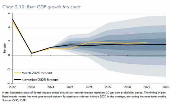
The solid-looking line is the current forecast; in this case, the yellow line was the March 2025 forecast in this case. So what we have seen is real growth forecasts fall over the next several years. In fact, until 2030, we are expecting to see growth, frankly, flatline at well under 2%, and we were expecting it to be a little better in March.
Neoliberalism is failing. Labour's interpretation of that antisocial policy is delivering a failed outcome for the people of this country, and this chart shows it. If Rachel Reeves is wishing to mark her own homework, this would be where she'd pick up not the gold star, but frankly, the mark, which said, "Do again, see me, not good enough," because she's not against her own criteria of growth, delivering.
When we look at inflation, we get a different outlook.

Here, what we see is that the March 2025 forecast is below the current solid line, which is the November 2025 forecast, but both of them merge together by 2027 on an expectation that is mysteriously that we will get a 2% inflation rate from 2027 onwards.
This is complete and utter nonsense and indicates just how flawed the forecasting by the Office for Budget Responsibility is. They assume when they start their process that we will have a 2% inflation rate. They do not, in the process, take into account any of the real-world factors that might seriously change this, like war, like economic collapse, like the failure of AI, or anything else. They just assume a perfect world. And in that true, standard neoliberal, neoclassical, economic modelling sense, they presume that everything will return to the mean. And everything returning to the mean in this case means that we will have 2% inflation, and that I can assure you is not going to happen, which makes everything that Rachel Reevese said yesterday a complete and utter set of nonsense.
Let's look at unemployment.
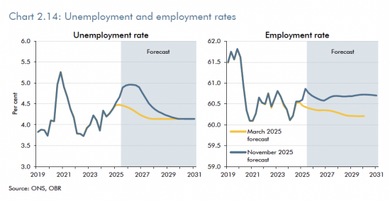
The figures now are in blue, and those from March are in yellow, and as you'll see, the figures now are much worse than we were expecting in March. There is a higher rate of unemployment now in percentage terms than there was in March, and that, however, is going to correct. Again, you can see this tendency for things to return to the mean, which is what the Office for Budget Responsibility presume. They are presuming that about 4.2% unemployment is normal, and therefore that's where we will go. Both assumptions do that. But they won't. That's because nobody's going to be investing and therefore these outcomes aren't going to happen.
And you will look at the real employment rate. Actually, the real employment rate is supposedly going to be higher in the future than it was in March, which, when we've got currently higher unemployment than we did then, seems like the most farcical of assumptions, and I just can't see how anything that underpins these charts makes any sense at all. This is economic nonsense. I do believe that the reality is that we're going to see higher unemployment rates than this because we are going to see lower growth.
And why are we going to see lower growth? Look at these figures for real household disposable income per person.
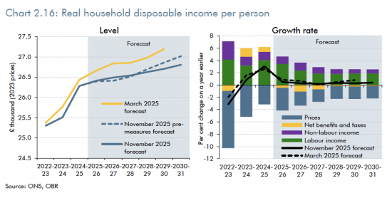
The right hand chart might actually be the most interesting because what it shows is the growth rate, and that black line, which is hovering at near enough zero throughout there, indicates what is actually happening. Once we break down the GDP figures, which are for the state as a whole, down to you and me, and look at what our expectations are going to be, the outcome is that we are expecting no growth rate at all, taking into account inflation and the patterns of behaviour which are indicated on the chart.
Now, those patterns reflect the state of benefits and taxes, and they take into consideration non-labour income, and they take into consideration labour income as well as prices, but allow for all those factors and the to's and fro's between them, and we come out with a situation where basically no one is going to feel any better off. Labour is therefore not going to deliver on any electoral promise that it made in 2024, and that is fundamental. We can guarantee that if this turns out to be the case, Labour will not be reelected in 2029, and that matters because that will be historic, but it also opens the way for a Reform government, which is going to be an absolute disaster. But it also says that Rachel Reeves, again, has no clue what to do and isn't delivering.
When it comes down to real people, the people who hold the votes, she's failing. And her focus upon delivering for the City of London, which is what everything has been about in this budget, has been completely misplaced because they aren't the people who are going to drive her out of office; we will.
Let's now look at the real rate of return on capital, and this does matter.
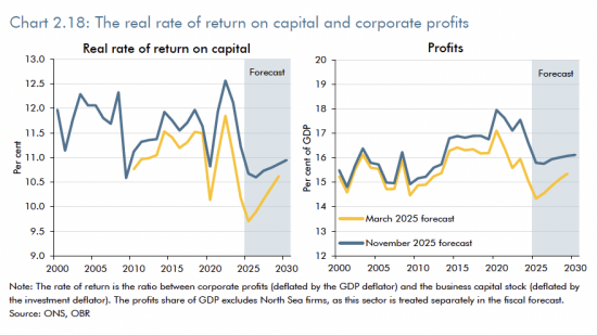
What this indicates is how much money is actually going to be made by businesses on the money that they invest . And the fact is that if you look at the real rate of return on capital on the left-hand chart, you will see that this is going to be at very low levels. This chart runs from 2000 until 2030, and we are going to see just about the lowest period of sustained low levels of return on capital that we have seen over those 30 years, and that is extraordinary. There is no sign of an economic upturn in here at all, which is why I said that the figures for employment just don't make sense.
If investment is going to be low and the rate of return on capital is going to be low, which is what is indicated here, then employment is not going to rise. And that is indicated on the right-hand side. Profits are also going to be flatlining; in fact, they're going to be at levels which we last saw at around the time of the 2008 financial crisis or just after. There's not going to be any hope in here for business at all, and that to me is a real sign that Rachel Reeves has given up hope and that we really do know that the current economic model is failing, as I have said. There is no sign of a return to profits. And that might sound like good news to some people, but it isn't if that results in low investment and low employment, and therefore low wage rises.
Business investment is, in fact, as this chart shows, going to fall.
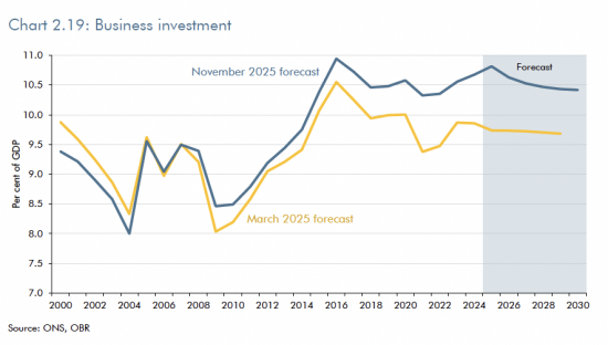
There is going to be a steady decline, as shown by the blue top line, and that blue top line, whilst it looks more optimistic than the yellow bottom March 2025 line, is still going to show a marked decline from where we are on now. The reason why the line is higher is because, in practice, we did see an upturn, a slightly surprising upturn in business investment towards the end of 2024 into 2025, but it's going to go down again, and that is a sign of failure yet again by Rachel Reeves. Time and again, these charts are saying to me, she has no faith in the way in which our economy is going and this chart makes that clear.
This chart repeats that.

This chart is now the chart of international trade, both exports and imports, and you'll note that both exports and imports are supposedly on a rising trend in the current budget forecast. But the forecast for imports is going up faster than the forecast for exports. In other words, we are going to be more dependent upon the supplies made from other countries to us than we are on the exports that we are going to make to them. That is not the sign of a healthy economy, yet again.
So let me come to the final chart because this is the chart that everything leads up to. And this chart is really important, but very few people seem to understand it.
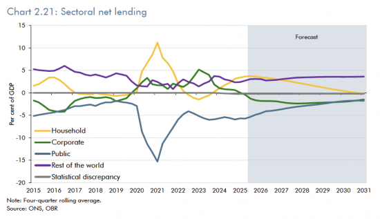
The chart covers the period from 2015 to 2031, so a period of around 16 years, and it's called the Sectoral Net Lending Chart. And this chart is absolutely central to the understanding of the economy in a modern monetary theory world, which is why I always find it amazing that the Treasury do actually publish it, because it does give a lie to everything else they say.
What it shows is that actually, every single time the government borrows, the private sector saves. Take a look at that blue line, which is the public sector, the bottom line for most of the chart, and take a look at the yellow line, which is the household part of the economy, and look what happened in 2021.
When, in 2021, the government did have to, because of COVID, borrow a large sum of money - borrow in the sense of take deposits from the private sector - then there was a matching entry in the private sector, which was saving. The saving was particularly amongst households then, but in fact, every part of the economy, except the government, in 2021 was saving; that is what being above the line represents, being below the line represents borrowing.
And this chart is based upon the simple fact that double-entry says that if you have a borrower, you must have a saver; that is all it's about. So what the chart is looking for is what are the trends in borrowing and saving over time? And what you'll see is that households are at present in a situation where they've begun to save significantly again.
They have actually retrenched because they're frightened of the way in which the world is going, and that's not unreasonable. Why isn't it unreasonable? That's because Labour has been mismanaging the economy, but then so did the Tories before them. So let's just say the single transferable party, which is driven by neoliberalism and anti-socialism - antisocial in the sense that literally, they do not act in the interest of people - those parties have put the fear of God into people, who are saving as a result. That is why the yellow line has between 2023 and 2025 gone up; people are saving because they fear a rainy day.
Governments, on the other hand, have still been borrowing, but there are some other trends in here. The assumption is that business is actually going to borrow heavily over the next few years, which makes no sense at all. That, by the way, is the green line, which dips into negative borrowing territory in about the present moment; it's just supposedly happened. Why is business going to borrow heavily for the next few years when rates of profit are falling and when rates of investment are declining? That's very hard to tell.
There is no logic to saying that business is not going to be investing but will be borrowing; they only borrow for two reasons. One is to fund losses, and admittedly, profits are going to be down, and the other is to fund investment, and that's also down, so does this say businesses are borrowing to fund losses or what? That green line makes absolutely no sense to me at all.
The yellow line is really serious because it says that, in practice, people are going to be moved from saving to having no savings at all in aggregate by 2031: in other words, people will give up net saving altogether.
And there is a reconciling line, and that is the purple line, and the purple line is the rest of the world.
I talked about trade. I said that we're going to be buying more from the rest of the world. The assumption that is implicit in here is that the people we buy from will be paid in sterling, and they'll all be happy to keep their payments in sterling and lend it back to us to keep our books balancing.
Rachel Reeves is going to balance her books on the back of foreign suppliers of goods and services to the UK, not seeking to translate their sterling balances into other currencies, and therefore deflating the pound. This is a wild assumption that, to me, makes no sense at all when we can see all the other information.
The only other explanation for that high purple line is again, in another chart. Remember, I showed you the figures for interest rates on an international comparison. Ours are going to remain high. Hot money is the reason why we may have a problem here.
Hot money is that money that floats around the world trying to find the highest interest rate it can get. It is offered by governments who are desperate to get money from any source they can, whatever its origin, whether legal or illicit, because they're trying to shore up the value of their own currency. Well, that's what the UK is doing, so maybe that is the explanation for this purple line. But if that's what is keeping the UK economy going, God help us because we are basically relying upon exploitative interest rates that are going to leave homeowners in desperate mortgage payment situations, which are going to leave business unable to invest, which are going to reduce profitability in this country and reduce employment prospects in this country, and all because Rachel Reeves hasn't got an actual manufacturing or sales strategy for the UK as a whole to sustain us into the future.
This chart shows a government that has no ideas.
It shows people who will not be able to afford to save.
It shows business effectively, borrowing to support its losses because its profitability will decline.
And there is an assumption that government will borrow less. Look, that's just there because PR requires it. Is that going to happen? No, of course it isn't, it's not going to happen for one moment. That is one of those reversion to the mean figures. Every single chart produced by the Office for Budget Responsibility over many years, which has been of this type, which has forecast sector net lending with figures for the government included in it, has always shown government borrowing falling, but it never has in effect.
Look at the chart for the past periods, and you'll see there's no such trend. This is not the truth. If anything, that overall trend from about 2018 to 2025 for government borrowing, which is net downwards, in other words, increased borrowing rates, is likely to continue.
So this chart, like so many of the others, is complete nonsense, but you can see the acts of desperation that underpin it. The most desperate of all being the fact that Rachel Reeves believes she has no choice but keep high interest rates going in this country, whatever she might say about the fact she doesn't like them to keep money here to support her claims that she can reduce government borrowing, and she can't.
People aren't going to be depositing that money in the UK from abroad.
Interest rates have to come down or she has no chance in the 2029 general election.
And households are not going to be happy to be put under the pressure that is going to exist when their real wages are going to be static and they're going to have to withdraw money from their savings, which is what the yellow line here represents, simply to make ends meet.
This is a set of charts that indicate one thing and one thing only, and that is a government that has no clue where it's going, has no plan for Britain, and is desperately unaware as to the consequences of what it is doing because it is going to leave people deeply disenchanted with their economic situations as a consequence of the decisions that Rachel Reeves has taken.
We are on the basis of her decisions heading for a horrible place. If you want to know how we could head to a better place, download my Alternative Budget from the Funding the Future website. There will be a link down below. We can do better than this. "It wouldn't be hard". That's A fair summary of what you could say in response to that claim by me, but the fact is, I demonstrate how with a vision for something totally different from what she is doing, and that's what we need now.
There's a poll down below. Let us know what you think. Do you think Rachel Reeves is leaving this country in a desperate situation? Do you think that there are better options available? Have you downloaded my Alternative Budget, and do you think it might work? Let us know.
Poll
My Alternative Budget is available as a download here.
Comments
When commenting, please take note of this blog's comment policy, which is available here. Contravening this policy will result in comments being deleted before or after initial publication at the editor's sole discretion and without explanation being required or offered.
Thanks for reading this post.
You can share this post on social media of your choice by clicking these icons:
There are links to this blog's glossary in the above post that explain technical terms used in it. Follow them for more explanations.
You can subscribe to this blog's daily email here.
And if you would like to support this blog you can, here:

 Buy me a coffee!

I’m puzzling over Chart 2.19 that starts in 2000 so history, and yet the lines are completely different from when the Chart was drawn in March of this year, and now. How can that be? Are they really historically revising figures from 2000?
I would have expected the blue and yellow lines to be the same until at least the 2020s as surely we have all the figures from earlier this century fully determined?
I have no idea. Genuinely.