Public sector finance figures are out today from the Office for National Statistics. They are relevant simply because Rachel Reeves is planning to impose massive austerity next week in an attempt to reduce government borrowing, and so this data sets the scene.
This chart is interesting:
You can scroll down it. Four things stand out.
First, the rate of borrowing is fairly, stable despite inflation.
Second, unsurprisingly, given tax rises, public sector receipts are growing.
Third, the public sector net debt as a percentage of GDP is declining.
In other words, if you were so unwise as to think that debt is more important than meeting the needs of the people of the UK, running the economy at full employment and solving the problems within our public services, then you have little cause for concern. Debt is clearly under control.
However, this is the chart people will no doubt obsess about:
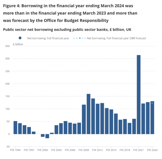
This chart is not inflation-adjusted. Nor is it expressed as a proportion of GDP or per head. It is expressed in pounds of differing periods that cannot, in principle, be compared with each other because they are not the same thing: a pound in 1994 was worth more than it is now. Therefore, borrowing the same real sum now is bound to cost a lot more. That is even true of last year. So, comparing these figures makes no sense, but it will be done as an excuse for austerity and not because oppressing the most vulnerable in our society is necessary.
Where matters are a little more complicated is with regard to interest costs. This is the chart:
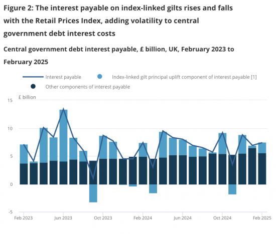
Note that this data is also deeply distorted. The pale blue figures represent costs that will, on average, be settled in fifteen or so years' time, but the Office for National Statistics chooses to claim those figures are current costs so that the overall figures can look much worse than they really are. To account for them now in full in a single lump sum when the only logical accounting treatment - which would be consistent with what markets do, is to spread them over a fifteen-year period - makes no sense at all. This is, then, ridiculous data that is meant to be and is misleading. The real current costs of interest are lower than shown and closer to the dark blue section.
And why is that higher? That's because the Bank of England has chosen to force up interest costs in the UK. That's it. In other words, the rising interest cost of the government is by self-imposed choice. That is the nub of this.
So, is there a debt problem in the UK right now? Yes, but only to the extent that the Bank of England keeps interest rates far too high. That is it. Otherwise, there are no causes for concern here. Everything else that will be said about this is an excuse for action to cut government activity when that is the last thing our society needs.
Thanks for reading this post.
You can share this post on social media of your choice by clicking these icons:
There are links to this blog's glossary in the above post that explain technical terms used in it. Follow them for more explanations.
You can subscribe to this blog's daily email here.
And if you would like to support this blog you can, here:

 Buy me a coffee!

A good post. The govt is rather like those of the 1930s arguing that cuts are needed to save money – complete nonsense but our politicians and media think thats what you have to do. No idea what the answer is politically that is.
Thank your analysis is correct; there is no impending debt crisis…. just a real crisis for many people.
You (and I), in the past, have argued that the inflation uplift on I/L gilts should not be included as “interest” and I wonder whether the final chart is a subtle nod of acceptance of that view. The colour scheme draws your eye to the dark blue block (which is the correct thing to look at) and the line is less important – and no, the dark blue block has not risen dramatically.
Thw whole principle of sovereign Government financing is based on the principle of postponement. Governments spend now and pay much later. That is how it works. To use index-linking in the way the Government DMO insists on doing it is a contradiction in terms; it takes part of the postponement, and tries to fold it back into the present. It is absurd.
This is the tortuous logic the DMO has to use to try to justify the self-contradiction – to itself:
CFM52590 – Derivative contracts: embedded derivatives: index-linked gilts
“the index-linked component of an index-linked gilt-edged security is regarded for accounting purposes as an embedded derivative,
it is not regarded as closely related to the host contract, so that it is accounted for separately, and for the purposes of Part 7 it is a contract for differences, and
credits and debits on the host contract are non-trading credits or debits, in other words the gilt is not held as trading stock.
Note that such accounting treatment would not arise under FRS102 (unless IAS 39 is applied) or IFRS9.
Index-linked gilt-edged security’ has the same meaning as in CTA09/S399 (CFM37100).
In such a case, CTA09/S415 will apply to the holder. For tax purposes, the gilt will be treated as a creditor loan relationship plus a contract for differences, and the latter will come within Part 7. S623 provides that credits or debits on the contract for differences are not brought into account, thereby preserving the tax exemption for the index-linked element of the return from index-linked gilts.” (https://www.gov.uk/hmrc-internal-manuals/corporate-finance-manual/cfm52590#:~:text)
As soon as you see the word “derivative”, fourteen red warning lights should be flashing, deafening horns should be blaring, and you need to start flying drones; because you are now operating in a deadly minefield. But not Neoliberals, who always know what they are doing, even as they are ruining everyone, and everything. Then they stop temporarily, just long enough to allow the Government and DMO to bail them out – and them alone. Rinse and Repeat; endlessly.
Thanks and much to agree with
Therefore, Britain can solve significant debt problems by doing three things only; and it costs the Government absolutely nothing.
1) Introduce Tiered Central Bank Reserves for commercial banks.
2) Change the accounting treatment on Index Linked Gilts.
3) Change the Fiscal Rules.
The Government saves £ Billions immediately, and reduces the Debt problem. The last, on Fiscal Rules allows the government to tackle the real crisis we are in, and not the phoney crisis the Neoliberals have made up.
Correct
No, it is not cheaper for the government to issue index-linked bonds to fund spending versus using nominal government bonds, despite the coupons being materially lower.
If you ignore the fact that the interest rate on those IL bonds needs to include an additional amount for inflation, then you are showing a very misleading picture.
Changing the fiscal rules does not solve any debt problems – we still have the same extent of overspending that needs to be addressed.
Likewise, changing the accounting rules doesn’t create any money, it just moves it on a balance sheet – we have a real spending problem, not a pretend one.
First, ILBs have been demonstrably cheaper over time. You are wrong.
Second, what is this debt problem? Where is it? Do you know that debt is just our money supply?
Is anyone refusing to buy government debt?
You do know it can’t default, don’t you?
You also know that most pensions are based on government debt, don’t you?
Do you also know one third of the government’s debt is owned by the government?
And what is thos spendimng problem. What would you cut, why and with what consequence? How would you manage that consequnce, and the massive falls in GDP and employment you want?
Please explain.
Germany is running into political problems in the EU with Chancellor Merz’s seismic shift from the Schuldenbremse. This is from Politico:
“Now the Germans have decided that they do whatever the hell they want. Since the [EU] rules approved six months ago don’t suit them now, they do the opposite, of course without having negotiated anything at the European level,” said Italy’s Finance Minister Giancarlo Giorgetti at a party event on Saturday.”
None of this applies to Britain; we can do it. But we will miss out on the defence spending uplift which is coming, but will be likely to exclude US and British equipment (it is the infrastructure spend alone that will prove the EU political problem for Germany, I suspect); because of Brexit. but of course Brexit is the real reason we are all in this mess; Putin was first to realise Brexit seriously damaged Europe, and gave him his chance to recover its lost slave states/cordon sanitaire.
The scale of the damage the Britain has done to itself, and later Europe since 2008, compounded in 2016, and continues to do to itself, is almost beyond belief.
Thank you, John.
A few months ago, you said that, unfortunately for Britain(‘s ruling elite), the rest of the world has moved on from paying attention to it and realised what’s going on.
After the British candidate lost (heavily) the contest to be International Olympic Committee president yesterday, comments were made about the candidate, which made me think of your comment. Alternative media here and overseas media reminded of his role in selling tickets for London 2012 (in partnership with a cabinet minister), corruption and doping at the athletics federation, and association with a late gentleman resident on an island in the Caribbean. It was added that the British media won’t talk about the candidate, but will happily talk about other dodgy foreigners.
John – you are correct. Those three suggestions would go a long way to improving life for everyone.
Lindsay, Index Linked gilts may or may not prove to be more expensive in the future – it depends on how inflation evolves. Historically, I/L gilts have proved to be cheaper as inflation has, typically, undershot “break-even” inflation rates implied by I/L gilts. The interesting question is why?… and it is a question of asset/liability matching. There are lots of people with inflation linked liabilities (eg. pension providers) and few with inflation linked assets (eg. revenue to water companies, sort of). This imbalance tends to make inflation linked bonds expensive due to their “risk reduction” characteristics. What about government? Their “asset” is the tax base and this is largely inflation linked so it is not “risky” for the government to issue I/L gilts – they are likely to work out cheaper and offer investors something they want and can’t really get elsewhere in size.
Thanks
Mr Nolan,
I note first that you have nothing at all to say on tiered central bank reserves, the first of the three proposals. None of your arguments apply to it. Second, on IL Gilts, Richard and Clive Parry have already provided the answer that you appear to need.
Third, on the Fiscal Rules. you seem to believe they are substantive, existential phenomena; real things. They aren’t. They are just subjective rules; basically informal political accounting directives. The current ones in Britain are very, very bad. There is a correlation between the Fiscal Rules and the mess we are in. When the current model of Fiscal Rules to serve Austerity was applied by the Conservatives in 2010, after the 2008 Crash, the National Debt was just under £1Trn. We have had fifteen years of relentless application of broadly the same Fiscal Rules, and fifteen years of Austerity by both Conservative and Labour – all to eliminate the deficit, and reduce the National Debt. The result? The Deficit has not been eliminated. And the National Debt? It is now £2.7Trn. An increase of around 170%. The Fiscal Rules, Austerity, and the last fifteen years of Neoliberalism have been spectacular self-inflicted blunders, as measured and evidenced simply by applying their own rules.
The Debt-GDP ratio of the US is around 124%, and of Japan, over 250%. Britain is 97%. Historically, this is unexceptional. For substantial parts of the last 300 years it has been well over 100%; and the bonds were perpetuities. The current obsession is wholly Neoliberal, and you seem to have fallen for the Reinhart-Rogoff fallacy; which was exploded soon after publication, when the paper’s analytical flaws were first exposed. There is no Magic Money Debt-GDP Ratio. It doesn’t exist.
Thanks, John
Thanks for this. I get what you’re saying on the data and I’m a big supporter of your economic take on things. But I have some gloomy questions. Given that adhering to fiscal rules has become a fundamental part of the ‘psychology’ (?) of both Tory and Labour government economic policies to keep financial markets and rich elites on side: how exactly would a true progressive government with MMT beliefs do things differently ? And, as important, how would it make the transition to a new approach without ‘spooking the markets’ and being sunk by the City and the power of capital ? In other words what kind of politics is needed to change the economics ?
MMT says baalnce the economy, not the budget
Then the budget wull look after itself
But let’s also be clear – MMT is not abou politics. It could be sued by the right wing.
So we need a government that cares
If I may chip in, all you need is a politics that is not corrupt.
You have to look at how political parties are funded.
The rot all starts there, it’s where democracy dies.
There is an impending debt crisis, but it’s not the one that Reeves is worried about. It’s the crisis caused by underinvestment, which will make fixing things later so much more expensive.
Ignored minor repairs on buildings are morphing into major repairs for the future. Roads with unfixed potholes will have to be completely resurfaced later. Professionals not receiving the training they need now will lead to a skills crisis later.And so on.
Most of all, failing to invest in green solutions now will require far more expensive and dramatic solutions later.
Very true
If John Warren is basically saying that austerity is being used to prepare for the next private sector bail out by government, then frankly I’d agree with him. It’s all set up nicely for them.
My view is that the OBR should also be made to report the level of private debt in the private banking sector as well – this would have recognised how it all works, that the government sees itself as having an obligation to rich pigs to protect their money in crashes as they take risks to become richer. Since it was the 2008 crash that forced the central bank to put their hands in their pockets, that would have been fair.
But Cameron and Osbourne set the OBR up, so fairness would not have been known to them. It was all about containing a future Labour government. And it has succeeded.
Hmm, “I” own a central bank & “I” like to borrow from commercial banks from time to timeetc. I’m going to get the central bank to put up interest rates so that “I” then pay more on the money that I borrow from time to time. & later, I’ll join one of those commercial banks – after all – you scratch mine, I’ll scratch yours.
Is that about it?
If it is, then Reeves is an enemy of the British state. & I think it is very important that it is expressed exactly like that.
Correct
People aren’t refusing to buy government bonds AT THE CURRENT YIELDS. That’s the point you keep missing, or fail to understand.
However, If the yields on UK government bonds were much lower (as you keep promoting), but inflation was unchanged, then investors would invest elsewhere, as there would be much better value available. It’s that simple.
Just because the UK government can print money and theoretically not default, does not mean that investors will always want to buy the bonds, as the real value of those assets could become worthless if the economy goes hill and the value of the currency reduces.
You are full of broad brush soundbites ‘the government can’t default’ without seeing to understand the detail and the nuance, which is fundamentally important to large investors.
Oh dear, another person putting forward a fasle hyothesis visible from a mile off
If the BoE cut rates the rates in the whole market would fall
Bonds wuild be just as attractive
And you do realise that for the reason you note the governmment need never borrow? It is not in any way dependent on markets but does them a favour by issuing bonds. If they do not want to buy the answer is, so what?
@Colin
I’m just a beginner, but – IF investors don’t want to buy gov’t bonds (and I don’t see the evidence for that btw), why is that a problem? The gov’t don’t NEED to sell them.
I’m sure that if I had done PPE degree I would understand this, so perhaps you can give me the evidence to show that:
1. The market is shunning gov’t bonds.
2. The gov’t NEEDS to sell them.
5 year gilts are offered at 4.25% (yield) at present. BoE inflation forecasts over that period are for 2% – this implies a risk-free real yield of 2.25%… which is high; indeed, so high that it is having a negative impact on the real economy and the finances of companies and individuals (‘cos that is how monetary policy works).
Why so high? BoE base rates and the rhetoric surrounding their expected future path.
If the BoE cut Base rates to a real rate of zero (say 2.5%) I suspect that 5 year gilt yields would drop by 1% pretty quickly.
Thanks, and agreed
Nonsense. The UK has a massive debt issue, and the judge of this won’t be an ill-informed wonk but the debt markets.
And the debt markets cannot get enough debt right now
As Hargreaves Lansdwon are saying, there is record demand for UK debt
So, what are you claiming, and on what evidence?
There is record demand for UK debt at current yields. Appetite for bonds is dictated by the return you are expecting to get from it. Why do you keep ignoring that?
If the yields were cut then appetite would be much less, it’s basic supply and demand. And that’s before we consider the likely impact on future inflation if the government were to loosen monetary policy as you propose. Which would lead to a requirement for even higher yields, not lower!
What you are saying simply doesn’t add up.
You do know when yields fall big capital gains are made on bonds, don’t you?
And like all others, you ignore my call for a general fall in rates – which the BoE can deliver.
I conclude all saying this are too stupid to understand how this market works. I will not be posting more drivel like this, all from first time trolls.
Your bot factory must be working hard today, is all I can conclude.
Yes, but demand depends upon what alternatives are available. By and large, demand for gilts out to about 5 years maturity depends on the question “where will cash rates be, on average, over the next 5 years. 5 year gilts currently yield 4.25% and this is roughly what people think will happen – a modest decline in Base Rate over the period.
That is consistent with the message given by the BoE.
If on the other hand, the BoE said Base Rates are going to go lower more quickly that balance changes and yields would plummet.
So, to say that demand would fall if yields fall is not really true.
The Guardian writes: Reeves to raise spectre of Liz Truss to persuade Labour MPs to accept cuts[1]
Q: Has Rachel Reeves learned the wrong lessons from Liz Truss’s mini-budget?
As far as I am aware and remember, the ‘markets punished her’, because (1) she had a bust-up with UK’s institutions regarding the credibility and workability of the budget (Treasury heads & OBR, even fired seniors). And (2) it was a discredited trickle down tax cut, financed through make-believe “supply side reforms.”
[1] https://www.theguardian.com/uk-news/2025/mar/21/rachel-reeves-raise-spectre-liz-truss-persuade-labour-mps-accept-cuts
Truss was shafted by the Bank of England and quantitative tightening
Anna-Katharina’s issue is key to helping Labour Party members dismayed with their Government but without a clear response to the fear of the markets pushed by Reeves et al. It would be really helpful to have a clear line on how party members can defuse this fear, show how the government can avoid a Truss-shafting, and use the policy space opened up by MMT. Any suggestions anyone?
The team that controls Starmer controls the Party, at all levels. It can expel or suspend members, CLPs, CLP executives. It can withdraw the whip from MPs Peers & Councillors. It controls and can overrule candidate selection at all levels. It monitors the social media past history of new members and prospective candidates. It no longer needs members and conference is an irrelevance, and tightly controlled too, because they decide who can go there, and what can be said when they are there.
I simply see no mechanism for changing the party from inside. Only a mass revolt (and a big change of heart on the basics) amongst the PLP (enough to prevent Starmer expelling them without losing his majority) would be effective.
A small Cabinet coup would simply give us another neoliberal monetarist puppet like Cooper or Streeting, and nothing would change.
Are there 100 Labour MPs out there who REALLY want a big U-turn on macroecomics? I don’t think so but…
Labour is dead – killed by Starmer & Co who run him.
Thanks Robert, you may be right about Labour. Even so, any political response will still need an effective reply to Reeves’ fearmongering over the markets and it’s this that I’m looking for.
Best wishes
Kim
I agree with you Kim, that we need an answer to “the markets”, and the “look what happened to Liz Truss” justification for pursuing a balanced budget.
Because the answer involves explaining bonds and pensions, it’s not one I’ve got confident about yet, certainly not one I feel able to use on the omnibus.
I think some more stuff dedicated specifically and simply, to dealing with the true story of what brought down Truss (which wasn’t that Kwarteng budget), would certainly be helpful.
Maybe simple enough for Nick Robinson and Laura Kuenssberg to understand?
Agreed. And a clear strategy that everyone can use to counter the current government narrative