This is the FTSE 100 5 year chart from Yahoo, just now:
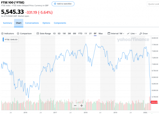
That is what a cliffe edge looks like.
And it will get worse.
Thanks for reading this post.
You can share this post on social media of your choice by clicking these icons:
There are links to this blog's glossary in the above post that explain technical terms used in it. Follow them for more explanations.
You can subscribe to this blog's daily email here.
And if you would like to support this blog you can, here:

 Buy me a coffee!

So, what might be the new reality?
*Food is the one fundamental. everyone still has to eat! But, it will be more bread and beans at home, rather than filet minor at The Ivy.
*One has to assume (and hope) that fossil fuels will never recover.
*Working from home and video conferencing could become the new norm,
* Microsoft, Google, Amazon, Zoom, and the telecom sector have a big win
* But it kills many transport stocks and office accommodation.
*For socialization, home workers might go to coffee shops, and eat light lunch in pubs more, once the pandemic has receded.
*Security of supply chains will be seen as more important than JIT. As the cost of failure will now be seen as higher than the saving in JIT
*National sources of key medical supplies and medicines, as export bans have destroyed the global consensus on trade in these
*Security may be a growth sector if there are large populations of unemployed who are hungry.
*Eventually the survivors in any sector will thrive, i.e. the businesses with big bank balances
* I’ve no idea if mass tourism will ever recover, (nor should it)
*What happens to the big debt/loss companies ( Tesler, Uber, et al)
I am not majorly disagreeing with that
And even now it will take a lot to stop me doing coffee, but I am not around today 🙂
I see this is an overdue market correction to be honest.
It is as though someone has let all the hot air out of a vessel filled with bullshit. Because that is what the stock market actually is and it has been allowed to dominate our lives for far too long.
We need more rationality if markets are going to be better than this.
Once again, the stock market is just an index to demonstrate the value investors place on stocks (in this example).
If the investors aren’t rational, from time to time, then we shouldn’t expect markets to be rationale either.
Oh really?
You know how investment management works, do you?
You know how economics work?
Do you know exactly how the Coronavirus will hit GDP? Are you able to second guess what the Saudi’s are going to do with oil production? Two of the many changing events which influence share prices.. and you wonder why prices are volatile? Because uncertainty is on the rise and because humans panic.
Yes: GDP is going to fall, significantly
And yes, Saudi is going to sell oil come what may, and will try to outdo Russia (what else is it going to do now the cartel has failed?)
Next?
You know do you that there is never ever any global borrowing to invest in stocks?
‘Just an index’?
It is much more than that isn’t it? Whole lives are made and many more destroyed because of the back doors it offers to those who want to make quick money out of value extraction.
‘Just an index’? What about the lies it told about the dot com boom and the institutions that brought down the global economy in 2008?
I wish it was ‘just an index’ believe you me.
Yes, I’ve worked in investment management for over 20 years.
What can I help you with?
Some sensible answers
Unless your can actually provide any I suggest you give up your futile commentary that appears to be based on mythology
What questions do you want answers to?
I have simply commented that, markets can be irrational, given that they are driven by investors who are often also irrational.
Which bit of the above do you disagree with?
Here’s a simple question. If this is the case why do people pay you when you can make no sense of this, very obviously?
Do you believe that Investment managers claim to be able to predict the future?
I know what economics says
What you’re saying is that they’re as useful as chocolate teapots
Both are wrong, but only because in your case there are no chocolate teapots
John – I thought that was exactly what investment managers did claim otherwise what is the point of managed funds or managed portfolios. That is why they are paid such eye watering sums for their skill at knowing what will generate profits and what will not. If managers have no knowledge beyond that of everyone else then why do they exist?
Looking at some share prices, the most you can say is that “the market” i.e. companies that buy & sell shares do not know what is happening. Share prices are oscillating. So probably best to stay well clear for the moment. I can recommend a re-reading of Galbraiths “Great Crash” – which lasted the best part of a year. Most markets are built on some level of confidence, a great deal seems to have evaporated from most markets.
Interesting no one offered any real alternative to my predictions! Nor the two questions:-
* Will mass tourism ever recover, (nor should it)?
*What happens to the big debt/loss companies ( Teslar, Uber, Airbnb et al)?
Peter.
Not sure if this is a game changer or the world will revert back?
Will the global economy ever look the same again?
The government has just shown that there is a magic money tree after all. People have gone hungry and had to use food banks not for lack of resourses or logistics but through policy decisions in government. Austerity is going to be a hard sell in future. (But I’m sure they’ll try and find a way.)
Lots of company’s and individuals are going to become bankrupt. How will the economy restructure itself to cope with this? The insurance industry is going to be hard hit or not pay out. Lots of consumers who will feel cheated. (My daughter’s school ski trip has been cancelled. I can’t see us getting our money back. I bet the small print make reference to terrorism and pandemics)
I think coronavirus will save the NHS. People are going to see the huge value of it. Will the US insurance based health care system be able to cope? Is it designed to pay out to lots of people all at one time? You would be well pissed off if , after paying into it, it then can’t find a bed for you when you need it! Game changer at next US election?
There is a lesson here to humanity and in a perverse way, coronavirus may be the wake up we have all needed. It’s going to be insignificant in comparison to what’s heading our way with global warming. Will we learn the lessons??? Got to hope YES?
Sorry Peter. I’m answering your question with just more questions.
I think mass tourism will recover. Ultimately it will come down to if people will want to. (I think they will (if they still have the money!))
Governments will definitely try and encourage people to.
Big debt/loss companies will need a good shake of the magic money tree. If the they are a critical part of the infrastructure, then they will be kept afloat, but at the cost of being nationalised perhaps?
Government is going to have a major role to play going forward. Is it the death of Neoliberalism?
If the LP were in power we would be hearing about how they caused Covid-19 and crashed the markets, for the next few decades or so.
As it stands, it will all be forgotten in a few months.
Nothing to see here, move along.