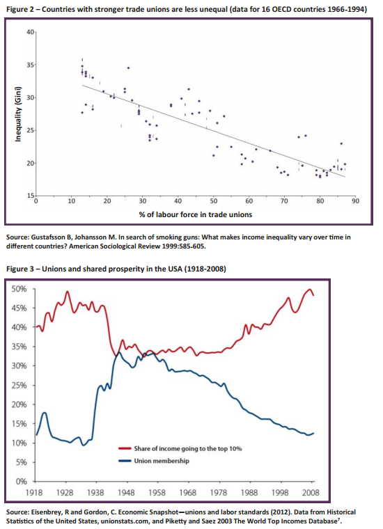
These two graphs come from the report by Prof Richard Wilkinson and Prof Kate Pickett for the Class think tank entitled 'The importance of the labour movement in reducing inequality'. I think they speak for themselves:
Disclosure: I am on the advisory board of Class and work for the TUC, PCS and Unite.
Thanks for reading this post.
You can share this post on social media of your choice by clicking these icons:
There are links to this blog's glossary in the above post that explain technical terms used in it. Follow them for more explanations.
You can subscribe to this blog's daily email here.
And if you would like to support this blog you can, here:

 Buy me a coffee!

Wouldn’t the OECD data be more relevant if it was less than 20 years old?
Are there no more up to date figures or is it that the up to date figures show a different picture?
Besides, the graphs most certainly do not ‘speak for themselves’. ‘Each point is a country at a particular date’. Without knowing which countries and which dates the graph is meaningless. I can see points with 75+% union membership with a higher inequality rating than points showing 30% union membership.
Clearly there are other factors at work here.
I work with what is available
I suspect Richard and Kate do too
Did Pikkety comment on this correlation?
Not sure….