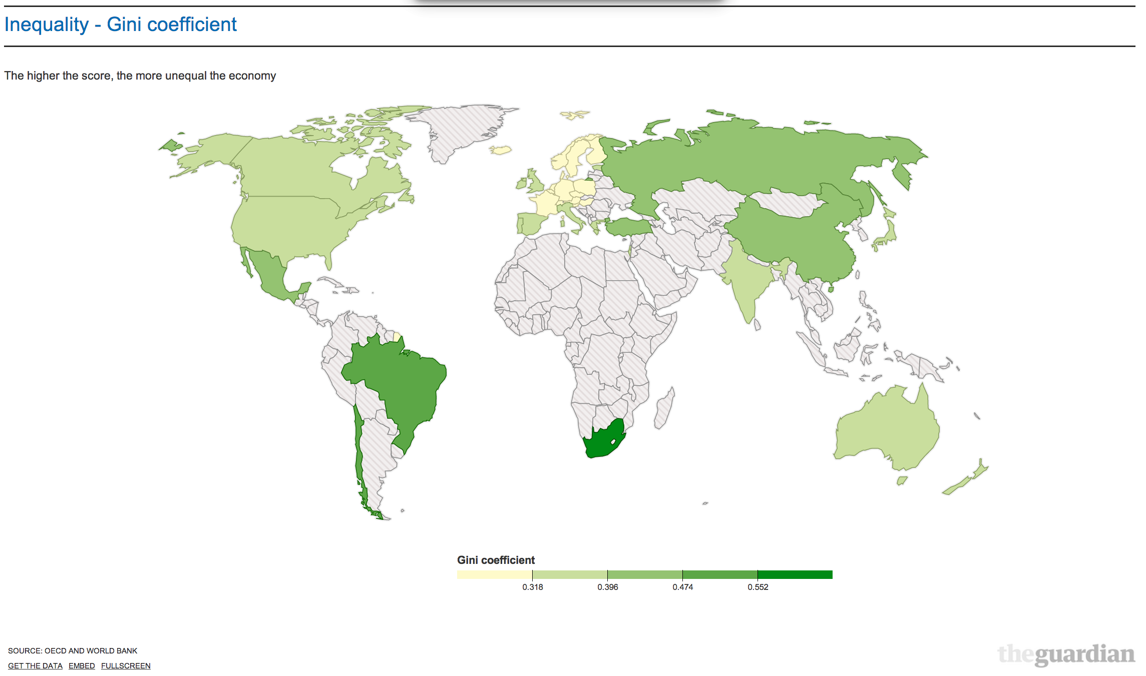
The Guardian has published an interesting world map ranking countries based on the Gini coefficients. This measures inequality: the higher the score he more unequal the spread in the country in question. Grey means no data. Yellow is low inequality. Dark green is a high score:
Now ask yourself a simple question. Where would you rather live? In a more or less equal society? Any why?
What does that say about what you want?
Thanks for reading this post.
You can share this post on social media of your choice by clicking these icons:
There are links to this blog's glossary in the above post that explain technical terms used in it. Follow them for more explanations.
You can subscribe to this blog's daily email here.
And if you would like to support this blog you can, here:

 Buy me a coffee!

Its about time the non doms became real people and paid some tax. We don’t really need Chelsea FC any more!
I am a member of the CFC gym, as it is convenient for me. Not many non-doms there, but loads of tax dodging football agents!!! And I doubt they pay their share of VAT!!!
Good point. I am off to Spain, at least its warmer..
Spain is getting very aggressive against the non-residents! Portugal will offer you 10 year no tax deal and Malta…
Totally agree. Its time the mega corporations stopped using overseas tax havens and loopholes and paid their fair share. Just yesterday I read one big City company sold one of its subsidiaries and paid zero tax on the profits. I can’t do that. If I sell something for more than I paid for it in my business I get taxed on it. Come on GMG (whoever you are) do the right thing and pay up!!!
Apart from Norway and Iceland, the yellow is all EU. Interesting.
Interesting that the EU, other than Germany, isn’t doing so well at the moment.
I suspect the level of equality between countries ranks low in a person’s choice of country (assuming there is much choice for a lot of people).
Issues like family, language, ability to have a decent standard of living and to live in peace and security etc probably rank much higher.
A better question might be about a person’s choice of a place to live within their own country.
You appear to live in Downham Market, which appears an affluent middle class place, with its Tory MP and Tory District Council.
You say you passionately care about the poor and working people and claim to make it your life’s work, but you choose not to live amongst us. Why? What is it about us you dislike?
You have raised the question so it is only fair you answer it for yourself.
You clearly do not know Downham Market!
It is a low income area where rural poverty is commonplace
House prices are below national average
The population is skewed elderly
I think you have your facts wrong. This is not Burnham Market with which many confuse it
http://www.theguardian.com/money/2013/jul/05/lets-move-downham-market-norfolk
Its all here, as per the Guardian.
Pretty fair comment
I live in a rural area (rentier Tory M.P. et al) – there is much ‘hidden’ poverty there -in some villages there is great wealth cheek by jowl with housing association properties and food banks in regular use.
I plugged your postcode PE38 9LJ into Mouseprice.
There are 46 entries.
Old Orchard is comfortably top at £380k. There are only 10 others within your postcode which are more than half that (ie more than £190k), a few of which have an extra bedroom. Even today, that price would rank 4th on Rightmove for 4 bedroom houses for the whole of PE38, and 2 of the 3 above it come with a few acres.
Why do you want to live in a property that is the most expensive in your immediate surroundings, and indeed, more than twice as expensive as 35 out of 45 of them? Do you really need it?
Why don’t you sell up, pay some capital gains tax and move into something more modest? There seems to be plenty available in the town.
I personally don’t care where you live. But you have raised the issue that where a person lives (in terms of the equality of their surroundings) says something about that person.
I think where I live is my choice, and my wife’s choice (for she is my partner in life), not yours
Do you think equality, social justice and social cohesion are relevant factors in your choices (as is the subject of this post)?
Or is it just about what you and your wife want, as your response suggests?
Do you really think a wealthy family from London, moving to the area, cashed up to buy a house that is 2x or 3x the price of the neighbours, not bringing any job creating industry, is conducive to equality, social justice and social cohesion within a rural community?
Do you really believe in these things?
You clearly know nothing at all about my circumstances or what my wife does
Nor do you clearly wonder who the local building community might sell to
As a result your comments are really rather bizarre
No more will be posted as a result
I presume that, based on the comments, a person is entitled to reside their money in whatever country they choose. Its their money at the end of the day. So its not relevant that some choose Jersey over BVI or the Caymans over Luxembourg.
People don’t live in those places – or at least, very few do
It’s their money that hides there
The quote from Lagarde in the guardian article shows no insight into the structural causes of inequality and the role her institution plays in it. These people continually come out with statements of concern and crocodile tears about inequality yet are part of the structures that maintain it – utterly despicable mendacity-the height (or depth) of neo-liberalism creating the illusion you have the freedom to critique it.
Georgia L,
If Richard did decide to “downsize” there would be no capital gains tax to pay on a principal private residence
And my existing house would still be there…..
Of course -the problem is the unearned windfalls from all of this which divides generations and communities by raising inequality.
Sounds like tax avoidence to me…
Excellent, so which country are you going to be moving to, Richard?
The UK
But I could do Norway – even in winter
According to this map the UK is more unequal than Hungary, the same fascist-run Hungary you exposed so brutally a few months back. So I suppose the answer to your question is “Yes please, I would”.
So fascism appeals to you does it?
Please do not call again
Aren’t you reading Ironman’s reply wrongly here?
He says:
– Hungary is Fascist-run, but the UK is more unequal.
– Given the choice between inequality and Fascism, he would prefer to live in the more unequal country
– So Fascism does not appeal to him
OK, apologies: I did misread
If you didn’t have inequality; you couldn’t have superiority.
Quoi?