![]()
From the Real World World Economics review blog:
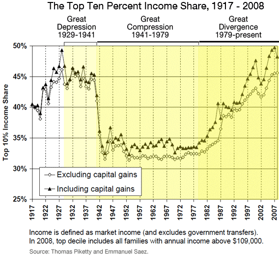
Sometimes a picture is very powerful.
Thanks for reading this post.
You can share this post on social media of your choice by clicking these icons:
There are links to this blog's glossary in the above post that explain technical terms used in it. Follow them for more explanations.
You can subscribe to this blog's daily email here.
And if you would like to support this blog you can, here:

 Buy me a coffee!

Share of Total pretax income of top 10% in UK: 35%
Share of Total posttax income of top 10% in UK: 31%
Share of Total tax paid by top 10% in UK: 54%
Share of Total pretax income of top 1% in UK: 13%
Share of Total posttax income of top 1% in UK: 10%
Share of Total tax paid by top 1% in UK: 25%
http://www.hmrc.gov.uk/stats/income_tax/table2-4.pdf
@Gary Thanks, Gary; That makes the case for progressive taxation beautifully. See how much vital revenue can be taken off the very rich for so little pain on their part.
A similar graph for the Uk would be instructive.
@David Rotherham
So 1% of the population contribute a quarter of EVERYTHING in the public sector (then don’t use much of it themselves by going private for health and education).
What proportion SHOULD 1% of the population bear? what would be fair to your mind?