The Financial Reporting Council oversees the audits by big firms undertaken in the UK. They review the activities of the largest seven audit firms (PWC, Deloitte, EY, KPMG, GT, BDO and Mazars) annually. They announced their findings for 2020 this morning for all these firms.
I downloaded the PWC report to discuss it with a journalist. And I found this summary of the FRC's overall findings
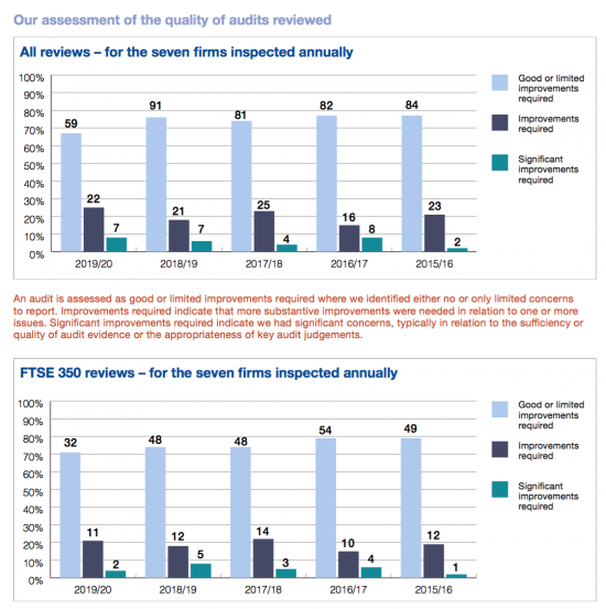
Give that a quick look and all looks great: as one would hope, the overall chart shows a steady increase to the right. It's so ingrained in us to look for this that the message from this chart appears unambiguous: things are getting better.
Then check the X-axis. The timeline is the reverse of that invariably used. The most recent data is on the left of the chart, and the oldest on the right. Things are not getting better. Things are getting worse, and very much so.
That makes me want to ask a basic question. If the FRC is committed to ensuring that true and fair views are given why did it choose to misrepresent the data it is delivering today to imply something that is not true? Why is it presenting its own data, in other words, in a way that is neither true or fair?
If we are to have confidence in a regulator that is responsible for the truth and fairness of data surely we should be able to presume that they will uphold that standard themselves.
PS: Note also the serious decline in audit quality: in itself the FRC makes the case for its own abolition. If it cannot deliver improving quality as a result of its work it has failed. No wonder it's manipulating the data.
Thanks for reading this post.
You can share this post on social media of your choice by clicking these icons:
You can subscribe to this blog's daily email here.
And if you would like to support this blog you can, here:


It does seem a little peculiar to present annual figures like this in reverse chronological order, but that format is not entirely unknown. One wonders why the FRC chose it. Is the format the same for all seven of them? Was the format the same last year?
On the substantive point, is it really the case that things are getting “very much” worse for PwC from this data? Given the numbers of audits in consideration, around 100 or so each year in each graph, and random events, you’d expect the percentage to bump up or down a bit each year anyway, as indeed they do. “Good/limited improvement required” (i.e. acceptable) seems to be generally in the range of 70 to 80%, “improvement required” around 15% to 20%, and “significant improvement required” under 10%. In some respects, this year seems to have dipped a bit. In other respects, it is about the same or better.
Truthful? Are you suggesting the FRC is lying, or attempting to mislead?
I am suggesting that the report is misleading – yes
I showed it to some people – all read it that things were getting better
I strongly suspect this wanted to give that impression
And I can’t recall the last time I saw a timeline in reverse on the X-axis