May was the second biggest month in the history of this blog: there were 327,941 reads of this blog in the month. Thanks to all who did so.
That said, I can't say it was the material written in the month that produced this result. The most popular item in the month was a blog I wrote in March 2016 that explained that however you cut the data the Tories have been the largest borrowers over the last seventy years. It seems people want reliable data that tells the truth and shatters myths. There's a message in that, by itself.
For the record, this is the blog in question:
I was interviewed twice on the radio on Friday evening to discuss John McDonnell's new fiscal rule, once on LBC and the other on Radio 5. In both cases the interviewers were quite explicit in stating that it was known that Labour always borrowed more than the Conservatives and that was why the electorate could not trust them with the economy. I knew that evidence I had prepared a year ago did not support that view in recent years (post 1997) but I decided to see if this claim really had any substance to it all at all. This blog is about my findings. There is a note on data sources at the end.
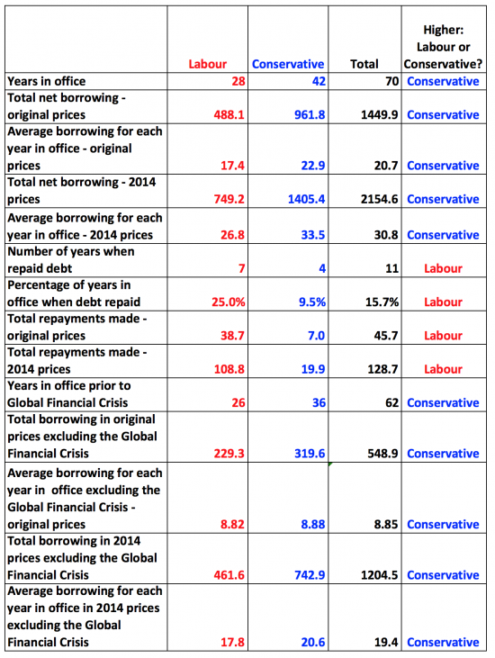
The first task was to secure data on borrowing by year from 1946/47 onwards: this data covers a 70 year period. Labour was in office for 28 of these years and the Conservatives for 42.
The next task was very simple: I calculated the total net borrowing in Labour and Conservative years and averaged them by the number of years in office. All figures are stated billions of pounds in all the tables that follow and in this case are in original values i.e. in the prices of the periods when they actually occurred:
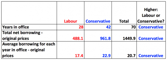
The Conservatives borrowed more, not just absolutely (which is unsurprising as they had more years in office), but on average.
This though, is a bit unfair: the value of money changes over time. So I restated all borrowing in 2014 prices to eliminate the bias this gives rise to. This resulted in the following table:
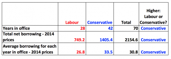
In current prices the Conservatives still borrowed more (much more) overall, and on average, by a long way.
So then I speculated that this may be distorted by events since 2008. That is what the Conservatives would claim, after all: they would say that they have spent six years clearing up Labour's mess. So I took those years out of account and looked at the first 62 years of the sample. First I did this in original prices:
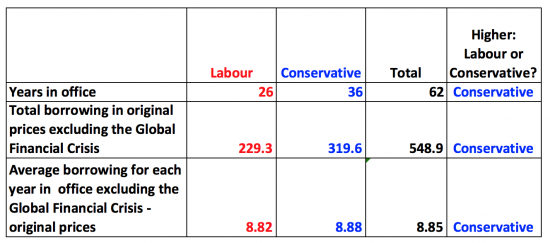
That was close! So I did it again in 2014 prices:
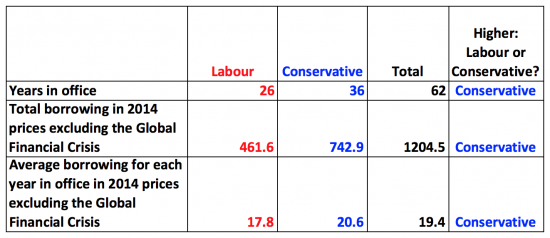
Not quite so close after all: Labour definitely borrowed less.
Then I speculated that this might be because Labour are good Keynesians: maybe they repaid national debt more often than the Conservatives. Or, to put it another way, they actually repaired the roof when the sun was shining. This is the data in terms of number of years:
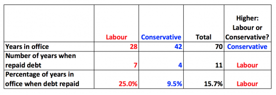
Labour do walk the talk: they repay national debt much more often in absolute and percentage terms than the Conservatives. In fact, one in four Labour years saw debt repaid. That was true in less than one in ten Conservative years.
But maybe the Conservatives repaid more. I checked that. This is the data in both original and 2014 prices:
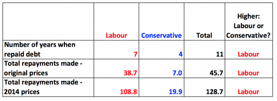
Labour not only repaid more often, it turns out: it also repaid much more in total and on average (not shown) during each year when repayment was made.
So what do we learn? Two essential things, I suggest.
First, Labour invariably borrows less than the Conservatives. The data always shows that.
And second, Labour has always repaid debt more often than the Conservatives, and has always repaid more debt, on average.
The trend does not vary however you do the data.
Or, to put it another way, the Conservatives are the party of high UK borrowing and low debt repayment contrary to all popular belief, including that of most radio presenters. Which means that the next time I am presented with that nonsense I will be very firmly rebutting it.
For those interested, this is the overall summary table: the pattern in the right hand column is really quite surprising:
Data sources
The basic data on borrowing came from the House of Commons Library.
GDP data from 1955 came from the 2015 budget GDP deflators. The 2015-16 estimate came from the July 2015 budget report. The data for the period period to 1955 came from the Bank of England. Data was checked to the Treasury Pocket Data Book: as is usual there are minor differences, but too small to worry about.
GDP deflator data came from similar sources but was estimated for 2015-16 based on 2014-15 and for the period prior to 1955 based on data for 1955 — 65. It is unlikely that this estimate materially changes any finding.
Governments in office for a year were determined in election years by the number of days each had in office: the party with the greater number being attributed the whole year.
Thanks for reading this post.
You can share this post on social media of your choice by clicking these icons:
You can subscribe to this blog's daily email here.
And if you would like to support this blog you can, here:


It was this excellent analysis, shared around on facebook, that tipped me on to your blog. A happy day!
You are right that people want facts. We know we won’t get them in the media.
Some questions I would like some facts on include:
– Despite austerity, the tories have doubled our national debt since they were last elected. What has all this extra borrowing been used for?
– As a counterpart to your analysis shown above, are there any trends or general differences in government spending priorities by party, over the same period?
Having been an analyst for 10 years, I would happily try to answer this myself but don’t know where to find good quality data sources.
The money was spent running givernment services
The priorities ar clear from manifestos but in reality are not as distinct as you might imagine
It is hard to do the analysis – I have not updated mine for a while
Thanks Richard
Hello Richard you’ve seem to have done a thorough job in disproving once and for all that the Tories are Britain’s biggest borrowers. I suppose it’s so they can give their friends cuts in taxation and/or make up the loss in tax revenue. The question the Tories would ask is if you include PFI surely this would disprove your analysis. I don’t really understand how PFI works it seems to me that the Blair/Brown government decided the bank won’t give us any more money so we’ll go to a loan shark and pay a ridiculous amount back. Anybody else would have shopped round and found a bank that would give you what you want. In fact as the government surely it would have been better to raise more tax by closing the many tax loops you’ve exposed over the years. But I suppose Blair/Brown were more interested in warming up to big business than Britain’s finances.
PFI has been used by all administrations since 1993 or thereabouts
The data does not include PFI but I very much doubt it would change it
You are right. PFI does not Change the picture at all. About £56bn capital value in total (under both Labour and Tory Governments.)
“HM Treasury publishes an annual database listing current projects which have already been agreed and signed. The most recent version of this database lists 728 projects, with a capital value figure (total worth of infrastructure assets) of just over £56 billion.”
http://researchbriefings.files.parliament.uk/documents/SN06007/SN06007.pdf
Thanks
As I was having breakfast there was a debate on radio 4 and the Conservative claimed that higher taxes would lead to more unemployment (which we know isn’t true) AND that Labour always left office with unemployment higher than when they left.
That could be an interesting one to check out.
Time….
I know. I wasn’t expecting you to do it but maybe some students out there….?
Too tough an assignment?
I found this one. The 1931 figures reflect the Wall Street crash and the resulting Depression.The 2010 were the result of the Global financial crisis: both failures of the capitalist system. 1974-79 was affected by the hike in oil prices.
The Conservatives’ record is not much better 1979-1997 saw them leaving with higher unemployment.
https://fullfact.org/economy/has-labour-ever-left-office-lower-unemployment-it-started/
Brilliant.
The Guardian needs to see this.
So do our other media outlets.
How?
I have seen this said elsewhere in so many words.
Even if people will argue with your methodology, it still is worth highlighting.
ONS data here – https://www.ons.gov.uk/employmentandlabourmarket/peoplenotinwork/unemployment#timeseries – suggests unemployment rose from 933,000 in March 1974 to 1.415m in May 1979 (rose again to 2.083m in May 1997) and rose to 2.488m in May 2010. It has since fallen to 1.541m. The rates of unemployment (as percentages) change in a similar manner.
Is there comparable data for 1964-70, 1945-51, 1929-31 and January to October 1924?
But you do have to control for changes in definitions
You are of course right that someone doing a more rigorous analysis, like your work on levels of debt, would need to make sure the data is comparable throughout.
The ONS presents unemployment figures as a single dataset, on one graph or time series, so I had assumed they have done any necessary adjustments themselves. This is the Labour Force Survey, not the claimant count. There is raw data here: https://www.ons.gov.uk/employmentandlabourmarket/peoplenotinwork/unemployment/timeseries/mgsc/unem
The fullfact.org page (linked above) starts with same data to 1971, and goes on to look at more historical data.
I have not sought to look at that data
And never claimed I had
What’s amusing is that the Tories could use this data to their advantage, since you have explained that Government debt is a (and probably best) driver of the economy, so by issuing more debt and paying back less, they are boosting the economy and withdrawing less support. But to do so, they would have to admit that Government debt is *not* the thing to be feared, and their policy of balanced budgets/surplus was a mistake. Can’t see them doing that, tbh!
Neither can I
But you are spot on
Great blog Richard, thank you. I am confused about something and wondered if you could help. I understand that when the government need to borrow money they sell bonds or other financial instruments which they then pay interest on. I also understand that the government is quite capable of ‘creating money out of thin air’, as they did for QE for example. This activity appears to have no consequences – the national debt is unaffected. So why do they do the ‘conventional’ borrowing? To boil it down to a simple example, if they want to build some hospitals, why don’t they just deposit some ‘money’ into the developers bank account just by typing some numbers into a computer? After all, that’s how they do QE, or so I understand. I appreciate that you can’t keep inflating the money supply indefinitely, but whilst there are real goods or services available it is not a problem, yes? In summary, I’m beginning to think that any government claiming ‘there is no money’ is making a somewhat bogus claim. Thanks, and hope you can help
Try this
http://www.taxresearch.org.uk/Blog/2017/05/03/why-we-need-more-government-debt-2/
Debt has a value in itself
This doesn’t give anywhere near the level of context required for this analysis to be fair.
Contrast the economy the Tories inherited in 1979 to the Economy Labour inherited in 1997 and you’ll be closer to a fair analysis. What was the average deficit each party inherited vs debt accrued?
What was the average rate of inflation, unemployment and GDP growth in the immediate years before a Govt took power?
This context is required to make the analysis fair.
(Would be genuinely interested to see the findings as a political neutral)
I time lagged to allow for that ‘claim’
It made no difference
In other words, inheritance did not create the outcome
That excuse is bunkum
Are you referring to the accounting for post 2008?
If so, I fail to see how that accounts for the questions raised. How did you account for the relative states of the economy in 1979 and 1997?
I have done the data since 1945
Great, thank you, but you’re still not quite answering my question…
I would be interest to see the analysis broken down into three distinct periods, which I think is the only way to make it fair.
1) The post-war consensus, 1945-79. How much did each party borrow and pay back in this time? And importantly, what was the wider economic climate during this period?
2) 1979-1997, the longest sustained period of Tory Government. What was the deficit, inflation rate, unemployment rate, interest rate when the Tories took over. What did they borrow/pay back in this context?
3) 1997-2008, longest sustained period of Lab Government, taking out years after global crash to be fair. What was the deficit, inflation rate, unemployment rate, interest rate when the Lab took over. What did they borrow/pay back in this context?
Without this wider understanding and context, I fear that the analysis is entirely irrelevant. Happy to understand why you might disagree with this however?
I have indicated my sources
Please feel free to go and do the number crunching
No yes, I do think it’s irrelevant pr Isley because the findings are so emphatic
I will do over the weekend – will be interesting to see what the findings are. Emphatic certainly not the word I would use until full context is accounted for, but really interesting.
At the *very least* one would need to account for the inherited deficit, which you tacitly acknowledge in your post above by excluding the Financial Crash from your analysis.
I did it because people like you asked me to
And it made no difference
Just as lagging did not
You’re looking for what’s not there
Or making it up….
How can I know what is there (or not) until I’ve looked it up? 🙂 Like any good economist, I have a theory, but can not prove it either way until I (or someone else) assesses the data.
I would like to vote for the party that is most likely to deliver some actual austerity. You may not agree with my view, but it’s a democracy and everyone can cast their vote based on whatever they think is important.
So let’s say having austerity is the issue I care about most. Are you saying that on average I should vote Labour.
So you want to vote to shrink the economy
And harm public services
And deny education
Whilst letting people die because the NHS will have shrunk
You can choose austerity
But be clear that if you do this is what you’re voting for