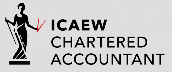
The ICAEW has adopted a new logo:
So now, apparently, we are dodgy looking disco divas communicating a rather unsubtle message accompanied by a threat of impailment on the end of a rather dubious looking blunt stick.
To put it another way, it looks sexist. And the possible suggestion that this might be about measurement comes with an implicit threat not to ask how the answers were reached.
What's a little shocking is that I helped pay for that. I might need to lie down for a bit.
Thanks for reading this post.
You can share this post on social media of your choice by clicking these icons:
You can subscribe to this blog's daily email here.
And if you would like to support this blog you can, here:


A rapier? A druaghtsman’s caliper? And is that a bowler hat I see? With a dress? Someone is having a laugh.
Thank goodness we Scots CAs never agreed to merge with such a bunch of loonies. Haha!
The colour scheme has changed but not the logo. It was like this all through my training contract: https://aceiksolutions.files.wordpress.com/2014/06/logo-icaew.gif
But the colour change is significant and draws attention to things best left ambiguous, at best
Chopsticks and dipsticks?
That’s a nice version
It is a V sign from the Big Four firms to taxpayers.
That’s what it looks like to me
Spot on Prem
That seems to be it, precisely
“To put it another way, it looks sexist.”
It’s exactly as it was before except for a colour change. Was it sexist before the colour change? I can’t work out why this is “significant” and “sexist” but then I’m afraid I’m a little behind with what’s OK these days.
Can you enlighten me, the last thing I want to do is make a faux pas when discussing this.
It seems to me considerably more overtly outlined – the previous version was not full length as I recall
And the emphasis on the calipers is bizarre, as Prem Sikka has pointed out
Is the figure in the logo holding a slapstick? That would be appropriate 🙂
I really like the rebrand. I think it brings the company and members into 2017. The red object is a set of dividers – depicted in images of economia throughout history. Example: https://s-media-cache-ak0.pinimg.com/564x/20/5e/e1/205ee105313a06188a63e58595045d54.jpg
I’m not sure how it’s sexist as it’s basically the same logo with a colour change. Economia has been made to look more “human” – with all limbs now in proportion when compared with the previous logo.
But it’s an outdated image in almost every conceivable way, now looking as if it’s disco dancing whilst sticking two fingers up to the world
Quite why they needed to change the logo only four years after the last change I don’t know. Like you, Richard, I’m not too keen on the idea that I’ve contributed to what looks to me very much like someone else’s expensive vanity project. But then I doubt that ICAEW gives much thought to what the bulk of its membership wants or needs. Howard’s “slapstick” sums it up in several different ways.