The Testosterone Pit (not a name I would have chosen) has an article out this week that shows in just one graph what the US problem with corporate tax receipts is:
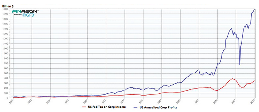
The source is Ralph Dillon at Global Link Data.
That's also a clear indication of where a major source of the inequality problem comes from. The graph starts in 1947 and runs to 2012 (it is a bit hard to read that) and the blue line is US corporate profits and the red line federal corporate taxes. Tax havens, lobbying and tax avoidance fuelled the gap: we pay the price in economic stagnation.
Thanks for reading this post.
You can share this post on social media of your choice by clicking these icons:
You can subscribe to this blog's daily email here.
And if you would like to support this blog you can, here:


Richard
is there a similar pattern in the UK?
Not yet…..
It would be interesting to see a graph corrected for inflation or (better) GDP growth.
Agreed, but the divergence would still be there and that is the key point being made
I once met a lady who confused it with Toblerone. I did not have the nerve to tell her. Apart from that, any statistical corrections, given the stat’s are probably bad distorted will not do much to alter a dynamic collapse of a complex system. Especially if in effect there is no capable government, little real expertise and we do not know where the money is if it is traceable at all. Buy cowrie shells.
Richard
Sorry but I don’t understand these charts at all. Up until 1962 the lines are more or less coterminous but, presumably, the IRS didn’t confiscate 100% of corporate profits, so how do the lines work?
The problem is scale
And actually,the IRS did take a great deal. CT was a massive source of US income at that time
“And actually,the IRS did take a great deal. CT was a massive source of US income at that time ”
Not so much actually. Apart from a blip in the early 50s (Korean War stuff) it was never above 4% of GDP.
It was, however, a large part of Federal tax revenues. Simply because the Federal Government was a great deal smaller back then.
From when was it “a great deal smaller”?
The Federal Budget as a %age of GDP has more-or-less stayed in the mid-20%s from 1960 to the present. It hit a low of 17% in 1965 & a high of 25% in 2008/9 when they bailed the banks out.
It generally comes in around the 22-23% mark.
GDP is important here. I think that posts from Richard and others have shown that corporate profits are representing a steadily increasing proportion of GDP. If at thie same time this component of GDP is making a decreasing contribution to the tax base, then it is bad news for everyone else.
Precisely
It’s a shame that so many appear to be incapable of grasping this obvious point.
If you want to talk about shares of production, why not mention the increasing share going to land owners and when they are going to pay their rightful share of taxes?