The government has published new data this morning on the earnings and tax paid by each centile of the UK population. For these purposes a centile is the 1% of the UK population that falls into each of 100 income brackets of equal size by head of population as determined by the number of declared income earners.
The data is fascinating so I have charted it. First, this is the income distribution in 2013-14 before tax:
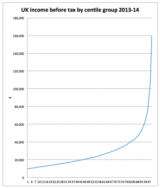
At the 50% midpoint income was £21,900 before tax to give some idea just how skewed this distribution is. Incomes of £50,000 a year are reached at the 90th centile and £100,000 at the 98th centile.
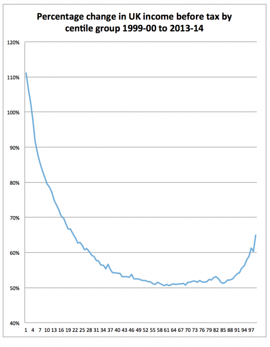
Then I looked at change over time. What I have compared is income before and after tax in 2013 - 14 by centile with that for 1999-00, which is the first for which data was published. First, pre-tax:
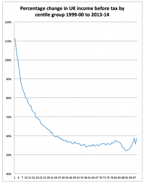
And then post tax:
What's the message? There are three.
First, we have massively unequal income distribution in the UK.
Second, that pre-tax we have done something about that for those, broadly speaking, in the lower half of the income distribution. I have little doubt at all that the minimum wage has been the biggest factor in this, which is why the increase is so marked at the lower end of the distribution. Then those who earn between about £22,000 and £47,000 have overall done worst on pre-tax income changes, by some way. And above that sum the more you earn the more you gained: the maxim that to those who have more shall be given undoubtedly held true. In other words, income inequalities pre-tax over the period undoubtedly got worse.
So what about after tax? The situation is slightly different. The point at which middle ground flat lining began was lower: those earning between £19,000 and £42,000 pre tax were in near enough the same position with about 55% income growth. Those on less did better because their gross earnings rose more. Those earning from about £45,000 to £70,000 did progressively worse the more they earned and then, by and large things improved again: the best off did better from the tax system although by not as much as their improvement in gross income suggested they should have done.
Now a word of warning: this is not the whole story. Some benefits are not included and nor are some tax issues e.g. the highest income earners are also the only people likely to pay capital gains tax and this rate has gone down. They are also the most likely to shelter income in companies at lower rates of tax, giving them an advantage unseen here.
But the message is still clear. First, it is that pre-distribution almost certainly has the greatest impact for those on low incomes: no change in the tax system could have produced the changes shown for them because they just do not pay enough tax for that to happen. And the profiles are far too alike for those on the 40th centile and lower for tax to explain almost any of the change.
Second, we have not in any way solved the problem of income inequality.
Third, of course those in the highest decile pay by far the most tax: they earn by far the most.
Fourth, where you are in the highest decile has a big impact on outcomes: the salaried bottom end of this decile has fared much worse than the top.
Fifth, the data is skewed because the income and tax of the top 1% is almost certainly understated gross with the relative tax rate overstated.
In other words, we still need to pursue the goal of a progressive tax system much more vigorously whilst ensuring that a great many in this country have access to much more income pre-tax, which is something tax cannot achieve by itself. That is the challenge we face, and current government policy makes it very hard to see how it might happen.
NB: Post amended as to time period covered by charts 1t 13.40 when I realised I had repeated an error in the original HMRC table which referred to 1992 - 93
Thanks for reading this post.
You can share this post on social media of your choice by clicking these icons:
You can subscribe to this blog's daily email here.
And if you would like to support this blog you can, here:


I think this only includes the 30 million or so people who pay income tax, so each centile is about 300,000 people. There are another 35 million or so people in the UK who are not included.
So, have I got this right? Pre-tax, even the worst performing group (about 40% of taxpayers from around the 50th to the 90th decile) have about 50% more income in 2014 than in 1992? So about 1.8%pa compounded over 22 years.
Is this adjusted for inflation, which was about 88% (2.9%pa compounded) over that period?
The distribution is extraordinary, really – only about 10% of people with incomes over £50,000pa (and 5% over £70,000).
This is about 31 million people
And this is all in current prices i.e. unadjusted for price changes
Which inflation index did you use?
I just used an online calculator, but I think that must have been based on RPI.
If I do it properly, with figures from the ONS:
* RPI was 138.8 in April 1992 and 255.7 in April 2014 – so that is an increase of about 84%, or 2.8%pa.
* CPI was 62.7 in April 1992 and 100.1 in April 2014 – so that is about a 60% increase, or 2.1%pa.
You inspired me: see the blog
I also then noted all the HMRC data was wrongly titled. Very annoying…..
Oh, 1999-00 to 2013-14. I see you have retitled your diagrams, but the third now says “before tax” rather than “after tax”.
So only 14 years, not 22. Well, the same principle applies, but CPI was 72.2 in April 1999 and 98.3 in April 2013, so that is 36% (2.2%pa) and RPI rose from 164.1 to 249.5 (52%, or 3%pa). So earnings for the middle centiles are flat over 14 years?
The revenue missiles theirs
I realised the mistake
Your best typo in ages, Richard. “The revenue missiles theirs” 🙂
An unintentional pleasure provided!
Thanks for the analysis and commentary, Richard. Much appreciated and very useful.
With the greatest respect, the apparently enormous increase in the income of the low paid is a simple function of the increasing personal allowance. Necessarily, as the personal allowance increases, the lowest earning level at which someone will be a taxpayer increases in step as more and more low earners drop out of the taxpayer population. A simple chart of the two shows this very clearly, the first percentile point of taxpayer income always just above the level of the personal allowance.
I do not agree
Of course the personal allowance has an impact and you can argue that therefore the lowest centile is not comparing like with like; that I do accept
But the NMW did massively increase earnings for the lowest paid over this period and the impact is over far too wide a range of incomes and people for what you say to be true, unless you can persuade me otherwise with data (and I know you might). I would suspect the impact would be massively more concentrated if what you suggested was true
A very useful analysis; I would like to add the following. In all the statistics for income only regular income is counted and the glaring omission is the receipt of inheritances. They may not be a regular source of income but they do have the attribute of certainty – we all die and leave our wealth to others. Rich people mostly leave their money to other rich people. If you take a slice of people’s wealth from the top end of the spectrum, be it centile, decile or quintile, and divide the amount of wealth held by those people by 81 (life expectancy), the resulting figure can be added to the incomes quoted. You will see that the average annual income of these people is grossly understated. In other words, inequality is much worse than what is shown in official figures.
Another tax porky pie from Georgie Porgie….
http://www.independent.co.uk/voices/george-osborne-claims-cutting-the-top-rate-of-tax-raised-8bn-it-cost-the-country-24bn-and-heres-how-a6905836.html
This is nonsense
Jolyon Maugham dealt with it so I have not
Very interesting graph Richard but I worry about the interpretation at the bottom end – if this is income taxpayers only then the rise in the income tax personal allowance may mean that growth at the bottom end is overstated. I am going to run a similar analysis using Family Resources Survey microdata – which does not suffer from the same sample selection issues – and will compare the two graphs. Best, Howard
Note a comment somewhere above Howard – another commentator checked this and reckons both distributions cover exactly the same proportion of the workforce
But do let me know if you think otherwise, but I can’t see the trend working so far up the centiles in that case, even if they are very narrow
Richard
I’ve had a look at HMRC Table 2.1 (which shows number of taxpayers each tax year since 1990-91) and there is a structural break in the series after 2007-08 – first because employment falls in the Great Recession) and then because governments from 2010 onwards start raising the PA by more than inflation. By 2015-16, based on the pre-crash trendline, there should be around 35 million income tax payers in the UK – but instead there are only just under 30 million. That’s a difference which is probably big enough to bias the figures. But if anything it means that growth at the top end is *understated* using the HMRC stats. As I say, it’s easily corrected using microdata. I’ll send you my graph later this morning when I get a chance.
I commented on this in the follow-up blog, here: http://www.taxresearch.org.uk/Blog/2016/03/01/by-how-much-were-you-better-off-in-2013-than-1999/comment-page-1/#comment-748152
By combining HMRC’s count of income tax payers with the ONS’s estimates of the 16+ population, I got a figure for the percentage of the (16+) population who pay income tax in a tax year. If you look at the number of income tax payers alone, part of what you see is population growth.
I’ve now extended this to tax years from 1991-92 through 2013-14: see this CSV file: https://roguedaemon.net/income-tax-payers.csv
The percentage generally rises in the earlier years, from 55% to 66%; then, after the structural break which Howard identifies, it falls again, so far to 58%.
However, it happens that both 1999-2000 and 2013-14 – the years Richard is comparing – have 58% of adults paying income tax.
Thanks
Actually I’ve realised that my last point was wrong – growth at the top end (and the bottom end) is overstated using the HMRC stats (because the population of taxpayers on which the statistics are being calculated is shrinking).
It may be interesting for economists such as Richard Murphy and Howard Reed to discuss the minutae of statistics, but in ignoring the effects of inheritance upon income statistics they are giving validity to statistics that are, in effect, a lie.
That is nonsense
Howard and I have both worked in wealth issues
If you wish to be rude at least get your facts right
I’d agree that just looking at income gives an incomplete picture and we need to look at wealth as well. But this particular HMRC data source (which is the one we’re looking at for the purposes of this blog) doesn’t include inheritances, which HMRC has a separate tax regime for. And if we were to look at wealth as well we would need to look at other components of wealth – in particular property wealth and pension wealth. The ONS’s Wealth and Asset Survey is probably the best source of data for this and as Richard says, both he and I have looked at that before. So I think David Minor is being somewhat unfair here.
My facts are right. This is not merely a wealth issue or, as the ONS call it “wealth transfer”. I have recently received an inheritance. That is income for me but it is not included in any statistics for income. If it not included, the income of the mostly wealthy people who receive inheritance is grossly understated. I have no intention to be rude; I simply cannot understand why you think that income statistics that exclude inheritance have any relevance.
Because transfers. Of wealth are not, ever, income
Hello again, Richard. You say that transfers of wealth are not income. Does that mean I cannot spend the inheritance I recently received? Consider it the other way round. Surely all income is a transfer of wealth from one person (or legal entity) to another. I know that you and Howard Reed have studied wealth inequality. Any transfer of wealth (Howard Reed mentions others but inheritance is the main one) is income for the recipient. The ONS tells us that wealth inequality has increased but income inequality has not.This is incongruous. The policies of this government are geared towards greater wealth inequality and reducing the tax on inheritance. It is important that people realize the effect this has on incomes.
You might think it income
But no income was created
You just spent wealth
Perhaps there is a Professor of Logic at your educational establishment who would be prepared to adjudicate. All I can do before I give up is reiterate my previous comment (which you did not respond to) that all income is a transfer of wealth from one to another.
If you argue that wealth is retained income, yes
But you did not earn anything by being given that wealth
It was a gift
Not income