The data I have already referred to today on income by centile for the period 1999 to 2013 - 14 from HM Revenue & Customs gives some clue as to by how much people were better off over this period by centile, assuming of course they did not change centile over the period. The Bank of England suggest inflation over this period was 51% so I compared this with changes in income by centile as shown by the HMRC data to get this chart:
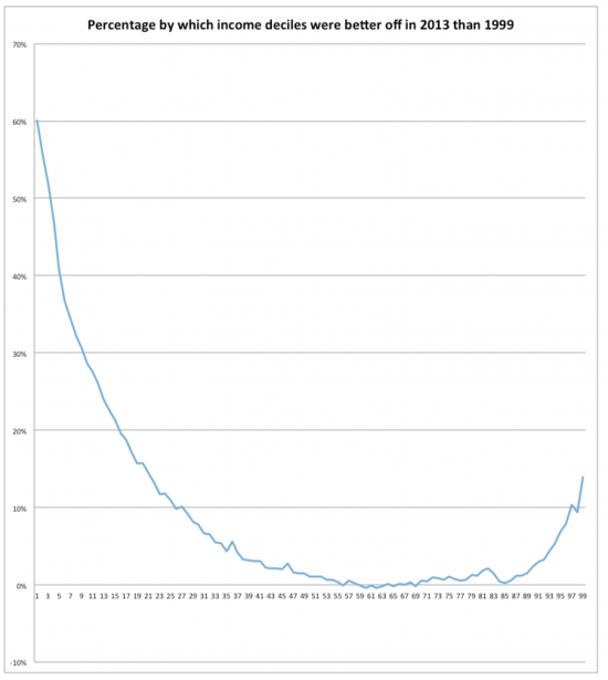
Do remember that someone on about £21,000 was on the 50th centile on this chart. And note from there to about the 85th centile (or £42,000 of income or so) real income did not appear to change in this period.
It did at the bottom: I think that mainly due to increases in minimum wage but it has also been suggested that changes to the personal allowance could have an impact on this: I think that mush less likely but note it.
What is unambiguously clear is that those on higher income did better than all on middle income, who really did not do very well at all.
The measure is not perfect (but then, none is) but what is unambiguous is that we have a real divide in UK society and that for many the economy has really not worked at all well over this period but that government policy has helped some (although most of then will still be in poverty) and for some at the tope of the income range the market has delivered.
Thanks for reading this post.
You can share this post on social media of your choice by clicking these icons:
You can subscribe to this blog's daily email here.
And if you would like to support this blog you can, here:


To expand on the point already made by Richard, a 60% increase in a very low income still leaves a very low income. A 14% increase in a very high income is a massive increase in cash terms and a 0% increase in a middle income is ….. a 0% increase. Sorry I know this is obvious but felt obliged to emphasise the point.
And you are right to do so
Well worth saying, Richard, but perhaps you should have left it for a few days. There is a danger that the worthwhile thread in the previous post, The Story of Inequality (especially my contribution), will not be followed.
I’m loads better off. That’s because in 1999, despite a decent job, I had debts plus a mortgage and an out-of-work husband. Today I have a work pension, no dependants (except elderly dog on medication) and no mortgage.
It’s the paid for home which makes the difference. Not only do I have an adequate income I also own an asset which gives me choices of how to manage my life.
My first thought was that the rising personal allowance meant that this isn’t comparing like with like. However, on investigation:
HMRC have 30.4 million income tax payers for 2013-14. In mid-2013, the ONS estimated the population aged 16+ at 52.0 million. Assuming there are an insignificant number of income tax payers under 16, that implies that the data covers the highest 58% of incomes (of people aged 16+).
In 1999-2000, HMRC had 27.2 million income tax payers. And in mid-1999, the ONS estimated 46.7 million aged 16+. Which implies the data covered the highest 58% of incomes: exactly the same percentage.
So you are comparing the highest 58% of incomes in 1999-2000 to the highest 58% of incomes in 2013-14. Perfectly valid. (Though comparing different pairs of years could be less valid. I imagine – i.e. I haven’t checked – that the percentage paying income tax will have risen, but subsequently fallen again, between 1999 and 2013.)
A pity we don’t have similar figures for the lower 42% of incomes. Presumably they will also have benefited from the minimum wage.
Thanks
I was a little concerned about that: you have laid that to rest
I’m curious to know whether the adjustments made for inflation include house prices. Is this the case?
I’ve always wondered whether higher house prices erode the benefits seen in wage growth over the years and have yet to come across any analysis to put it to rest. If you can answer or point me in the right direction I’d be much obliged.
House pricing is not in inflation
Thanks.
I did know that house prices aren’t included in CPI or RPI, just didn’t know if there were other measures that I’d never come across. Will go off now and figure out how to take house prices into account.