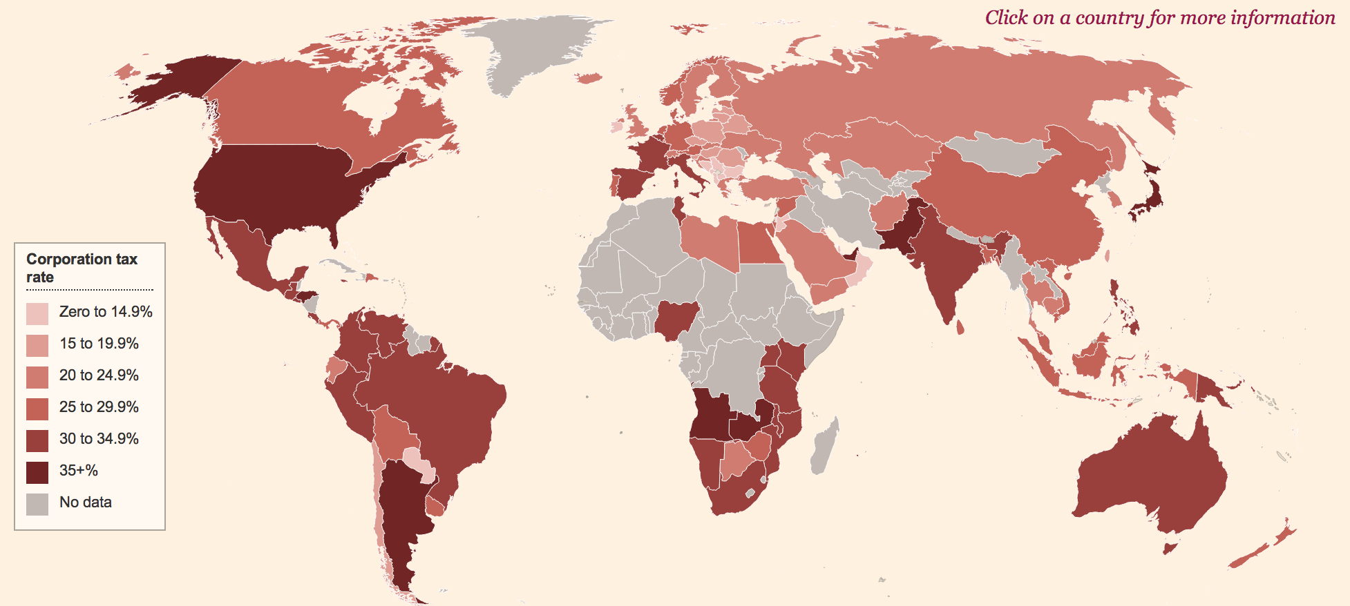
Why does the FT's new interactive corporation tax map (of which this is a screen shot, not the real interactive thing):
1) Use some very odd PWC data which, for example, portrays Ireland in an absurdly favourable light?
2) Not let me click on Luxembourg?
3) Ignore all the smaller tax havens?
Could PWC be helping the FT tell a story that's not all it might seem?
Thanks for reading this post.
You can share this post on social media of your choice by clicking these icons:
You can subscribe to this blog's daily email here.
And if you would like to support this blog you can, here:


Perhaps it’s a bit like the Reinhart-Rogoff spreadsheet? We ought to forward it to say the University of Glasgow, so that an undergraduate there can find the errors… 😉
http://www.gla.ac.uk/undergraduate/degrees/accountancy/courses/advancedtaxation/