
I wrote recently about a question asked on this blog about whether more state spending does produce benefit for those living in a jurisdiction.
I said that it seemed very obvious that there as considerable advantage to living in a state with higher spending because on average those states were better off.
I thought it worth checking the data. The data I used, all taken from Wikipedia — using in turn sources such as the CIA Factbook — is available here for the sake of the record.
I extracted data on GDP, state spending as a proportion of GDP and population for 170 states. I then calculated GDP per head to normalise the data and multiplied the tax as a proportion of spending ratio by 1,000 to make presentation easier when plotted.
Using the data set as a whole the following graph resulted, with income per head increasing progressively and with a linear regression line of best fit added to the plot of the tax as a proportion of spending plot to make the trend easier to discern:
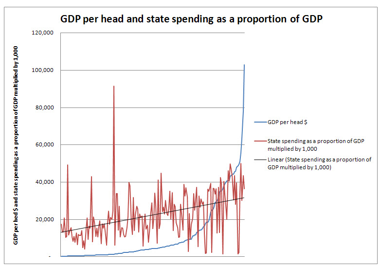
There are clearly some outliers, like Luxembourg with absurd GDP per head and Kiribati with absurd tax spending, according to the data source. And candidly some small states make this data hard to use — especially when asking questions about the UK and similar economies.
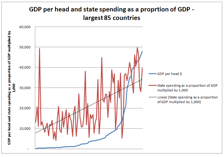
To give better indication of major state data I split the sample about the median, based on population. This split the data at a population level of just below 10 million. This gives better evidence for larger states — including the UK. The following graph then resulted:
What to conclude?
Well, it’s very obvious that higher income either results in higher state spending or higher state spending results in higher income. I do not suggest causality, but unambiguously there is a link.
Equally, oil states apart, higher income is always linked to higher state spending. The same appears much less clear in states with lower income.
And yes — there is room for variation — as I have acknowledged.
But even so, you cut state spending at your peril if high income is your aim, is my suggestion.
Thanks for reading this post.
You can share this post on social media of your choice by clicking these icons:
You can subscribe to this blog's daily email here.
And if you would like to support this blog you can, here:


I thought we placed too much emphasis on wealth and income?
The more one delves into the data, the more the case for neo-liberal laissez faire crumbles to dust.
And yet we’ve had thirty years of fruitless neo-liberal experimentation and are now lumbered with a government driving at even greater purity.
What a strange species we are!
Looking at that top graph there’s so much variance there I’m not sure you pull out any correlation.
The following was sent to me by email by someone who wanted to remain anonymous
So I’ll post it instead:
“Richard,
I’m very interested in what you’re saying, but a little confused by your graphs. What is the x-axis?
I not sure why you have a line representing GDP. As you’re trying to demonstrate a link between public suppressing and GDP per head I would have expected to see public spending as a proportion of GDP (not multiplied by 1000!) along the x-axis and GDP per head up the y.
Furthermore, the series should be represented as dots rather than linked by a line, as there is no ordinal (I think that’s the right word!) relationship between the data points. A line of best fit can then be added.
It would also be useful to know if a statistical correlation exists.
In short, these data are crying out to be represented and analysed in the same way as the data series in “The Spirit Level”.
I’ll happily have a look at this this evening, but right now I need to go to work…”
Happy to see it, I say!
Hi Richard.
I opened up your Excel document. I clicked on your Linear Line, then right clicked on it. Excel gives the option to format that trendline. At the bottom of the list of options is the option for Excel to display the R2. One just clicks the box for Excel to display the R2.
The R2 is 0.3963 for the largest countries.
As a non-acccountant to an accountant, how would you advise interpreting this? Should we conclude that there are other factors at play here, or is 0.3963 enough to fully justify the link (although not the causality as you say).
‘Cos so far this data seems to say that state spending accounts for less than half of the story. What do you think the other (larger?) part of the link is?
@Gary
PS: It’s probably obvious, but I am asking in a personal capacity. I am not actually formally for business advice, and I am not speaking on behalf of my employers, whose views I am not seeking to represent, etc
Thanks.
Is the X-Axis by country?
Surely to show any trend, and assess any correlation, both axes need to be numeric?
This is weak analysis. Can you please label the x axis and reverse the labels since they are the wrong way round. The other weakness is that there is very little, if any, correlation present here.
@Gary
It would be absurd to say that state spending does explain the whole story. It’s also absurd to say that a statistic of this sort is complete. Clearly it isn’t.
The fact is though that state spending does explain some – even a significant – maybe the most significant part – of this story.
But of course other factors play a part. I’ve already explained this at length – including an example based on US health care and the success (or otherwise) of the private sector to capture the state – both of which are obviously significant factors. I’ve also explained that your dedication to a literal interpretation of this issue is very obviously absurd.
Of course factors like the presence or not of natural resources, and how the resulting income is distributed, has a major impact on this issue. It certainly explains some of the quite significant variances noted. So too do the issues noted above.
I’d suspect better data might help too – the Heritage Foundation supplied the tax as a proportion of GDP data and I note that less comprehensive data sets did on occasion provide quite different ratios.
But let me tell you something really important as an accountant and one time auditor that you as a non-accountant need to know. That is that data whether it be accounts, stats or anything else, and any model, whether of economies or anything else, is a remarkably poor substitute for sound judgement. And sound judgement says that the association obviously exists. And sound judgement would also say that variations between countries and economies are also inevitable. But that this does not alter the very obvious conclusion I came to.
Of course you may exercise unsound judgement if you so wish. That’s your right.
But it won’t change the reality of the conclusion I’ve drawn.
Two suggestions for improving this exercise, one simple and one very difficult.
1. remove from the graph countries where the informal economy is thought to be over (say) 20% of GDP. A high informal economy – as in most developing nations, and Italy/Greece – clearly cripples both tax revenues and GBP growth generally. Once we control for that, what correlation do we get?
2. You are comparing GDP/head – something that has developed over decades or centuries – with a snapshot of today’s state spending. Would be more realistic to look at a blended tax rate over a longer period (although I suspect compiling this would be a huge task).
[…] one commentator — who has for reasons he has explained to me wished to remain anonymous — decided […]
[…] put up a blog yesterday under the title ‘Why you’re better off under a high tax state’. I was pretty happy that the data I presented showed in the way I presented it the story I wanted […]